Are the fonts you pick actually any good? And I don’t mean if they fit the topic or the aesthetics of your project. I mean the quality of the actual font. Is it well-made? To help us with that, I invited type designer Alanna Munro.
Alanna Munro is an independent type design and lettering artist from Vancouver, Canada. To me, her typefaces incorporate something playful while never losing their utilitarian purpose. She caught my attention with her type design livestreams on Twitch and recently with her Letter Nerd publication. In a little 16-page booklet, Alanna gives you a quick overview on how to design and spot if it’s a quality letter.
You will learn
- How Alanna combined a passion for gaming with type design.
- The problem with marketplaces
- The three most important things to check if it’s a quality letterform
- About optical illusions and type design
- What curve speed is
- The difference between a font and a typeface
- We assess five fonts, going from bad 😕 to horrible 😱
Listen to the talk as podcast
Next to the video on YouTube, you can also listen to this episode audio only. You can find it on Apple Podcasts and Spotify, or simply listen to it here:
Talking Points
00:00 – Intro
01:44 – Welcome, Alanna Munro
05:39 – Type design for video games
09:06 – What’s a good font?
18:10 – Three most important things to check
24:03 – Optical illusions in type design
29:30 – Bad font #1
36:03 – Bad font #2
40:57 – Bad font #3
43:55 – Bad font #4
46:06 – Bad font #5 (worst!)
47:42 – Difference between font and typeface
49:19 – Final tips
53:28 – Closing
Six things to check for quality fonts
In our conversation, we dive into these six things to check, when assessing the quality of a font:
- Check where the fonts are coming from
- Spacing because on the web you can’t change kerning and spacing.
- Check combinations like capital V and A, like in ELEVATOR
- Check if the curves are really smooth when you zoom far in
- Check if the horizontal, vertical and angled strokes are even by comparing H V W
- Check the curve speed
Assessing 5 fonts, from bad to horrible
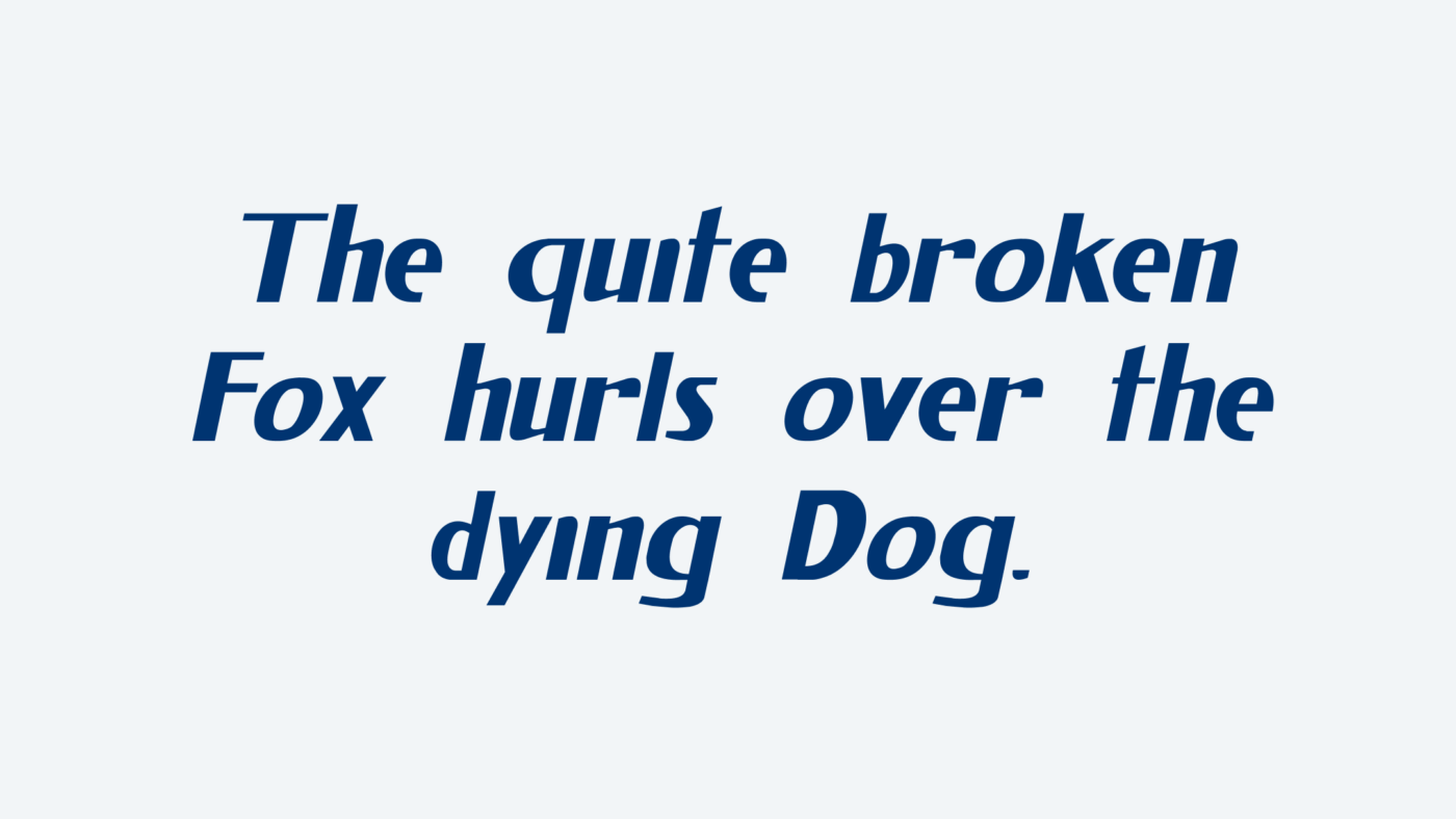
Time to get practical and assess five typefaces, starting with more subtle problems and ending with very obvious issues. Here is a quick summary, click the links below to jump to certain parts of the videos and hear all our comments.
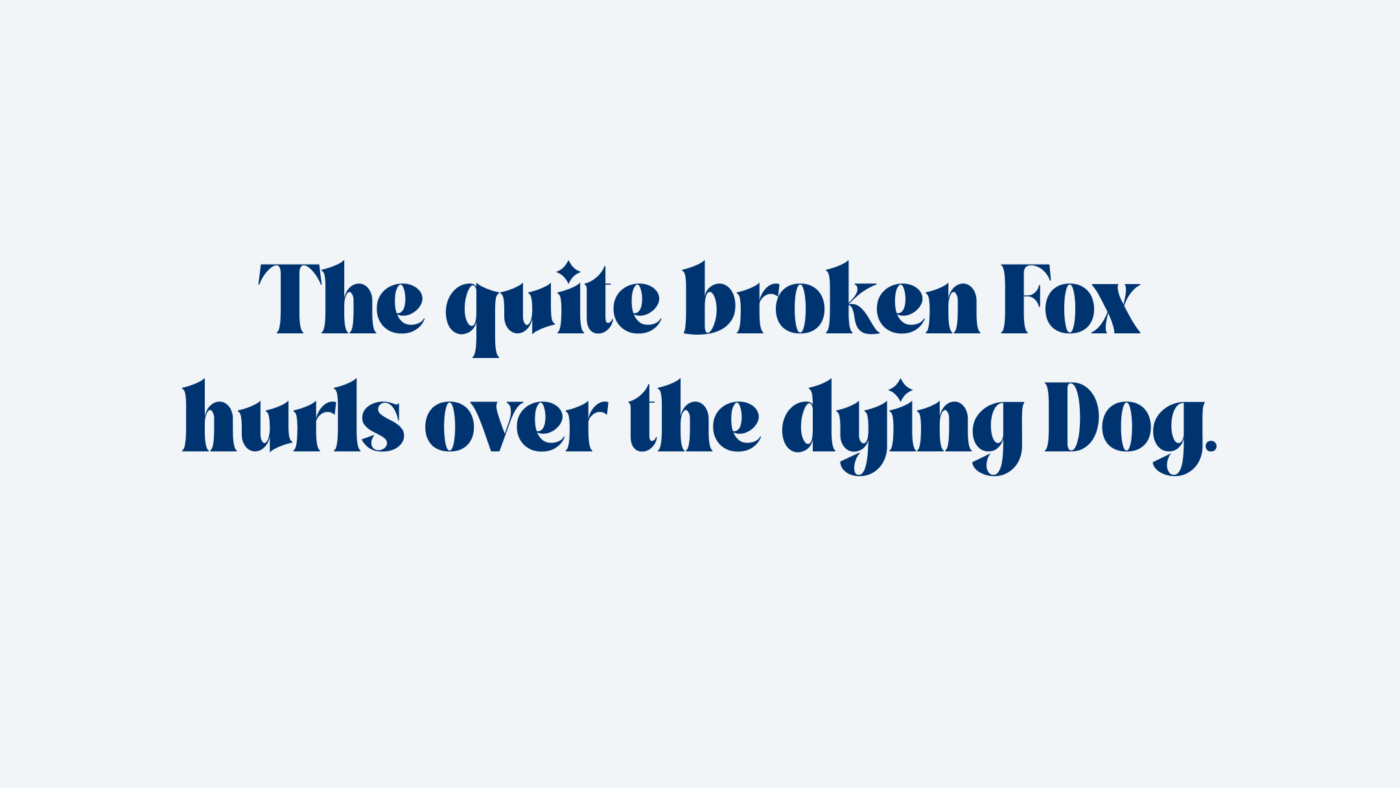
Our first example shows the spiky typeface Crima. Not too bad on the first sight, but there are some subtle issues.
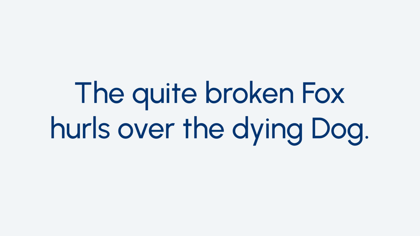
Urbanist, a geometric sans-serif Google font, is our next stop. Also, quite neat on first sight, but the curves don’t really connect that well with the vertical lines.
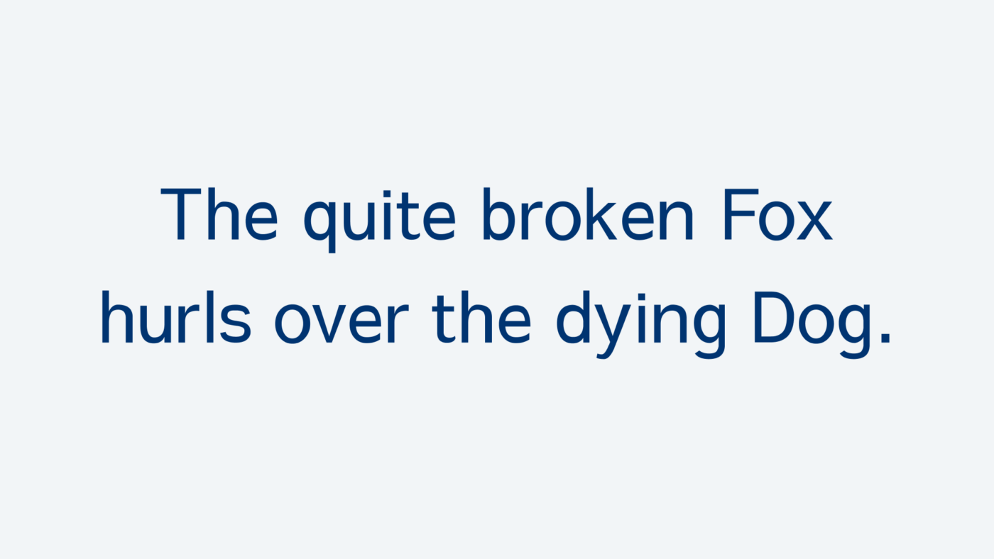
The sans-serif Google Font Sawarabi Gothic is the third example and shows some problems with consistent strokes, especially the lower case “e”, while also the diagonals are off.
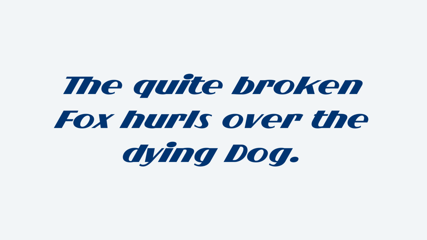
With number four it gets really broken with Flighter. This typeface seems to be stitched together. Mos striking is the “e” with an underbite.
If you thought the previous one was bad, think again. In our final example, FatFontGrotesk, everything looks just broken. Besides the poorly drawn letter shapes, the spacing is completely off too.
Quotable Quotes
“It does take a little bit of time to sort of train your eye and figure out what you’re looking for in a typeface. I certainly didn’t figure it out until I became a type designer.”
“The type industry has exploded and opened up to so many people being able to make fonts, which is great. But you know, you do end up with some that are maybe a little less quality than others, which is, you know, it’s just part of a marketplace opening up.”
“As soon as you want to put it on the web, you don’t have control over that anymore. You can’t change kerning and spacing when it’s live text.”
“You need to be more critical in a text situation rather than a display situation.”
“Anything with an angled stroke is very tricky to get, because there’s an interesting little visual thing that happens where horizontal strokes, if you make them the exact same as vertical ones, they will appear heavier.”
“You can make everything the same mathematically, and then it’ll look wrong to our eyes because we’re not mathematic creatures.”
“You’re creating a vertical rhythm. So you want all your vertical strokes to be sort of a similar weight.”
“The typeface is the thing that you see, and the font is the thing that you use.”
I found the missing quote about shoes. It’s by the Belgian graphic designer Yves Peters, who said in a tweet about type choice:
“Think of it like shoes: you can attend a wedding in hiking boots (text fonts) but don’t try rock hiking with delicate fancy shoes (display fonts).”
– Yves Peters
Links
- A list of independent quality foundries on Type Foundry Directory
- Alanna’s Booklet Letter Nerd Volume One
- All fonts on Alanna Munro’s website
- Alanna on Instagram: @alannamun
- Alanna on Twitch: @alannamun