
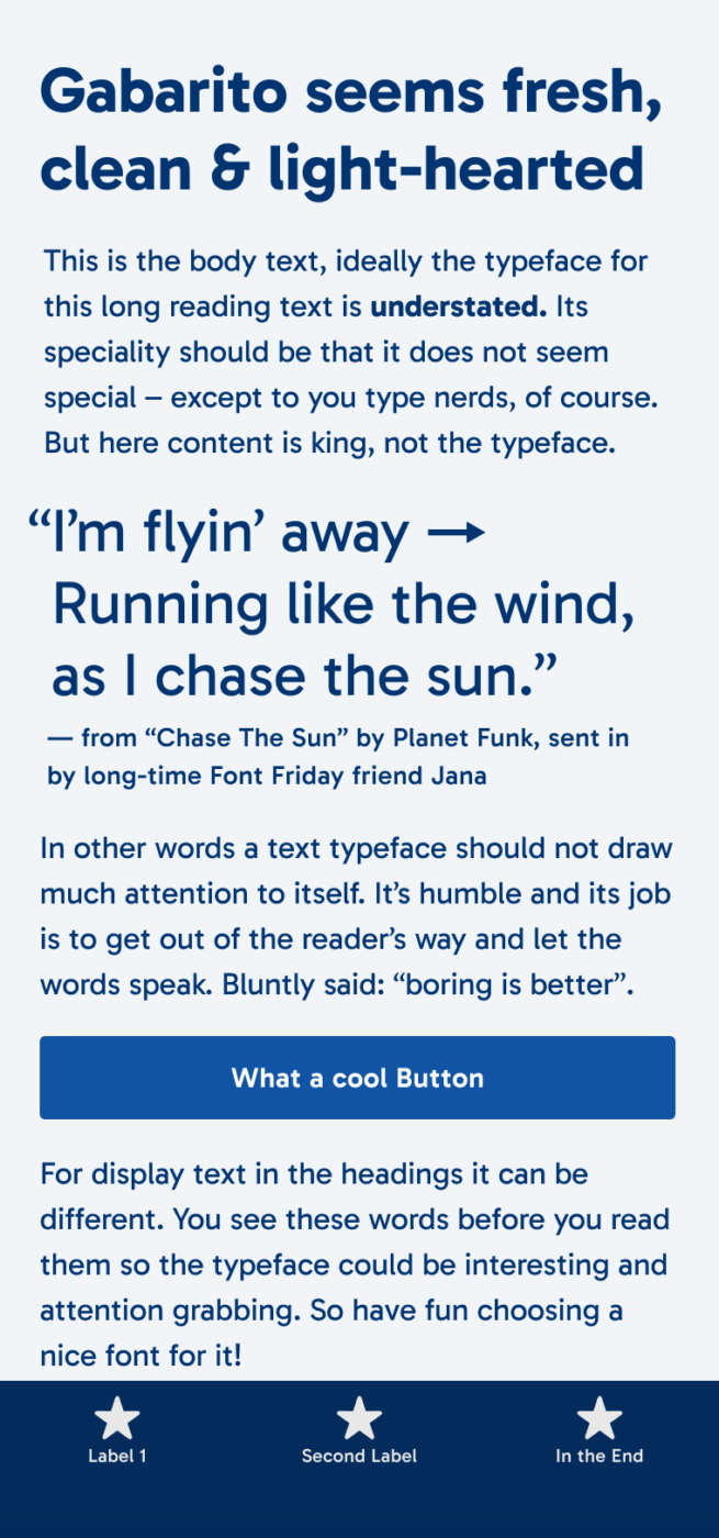
My Gabarito Font Review
Geometric sans-serif typefaces tend to feel very tidy, dry and restrained. This is definitely not the case with this week’s free font. Gabarito, or “Gabby” as Álvaro from Naipe Foundry called it emailing with me, is charming! And it’s also a solid all-rounder: sturdy, legible, clear.
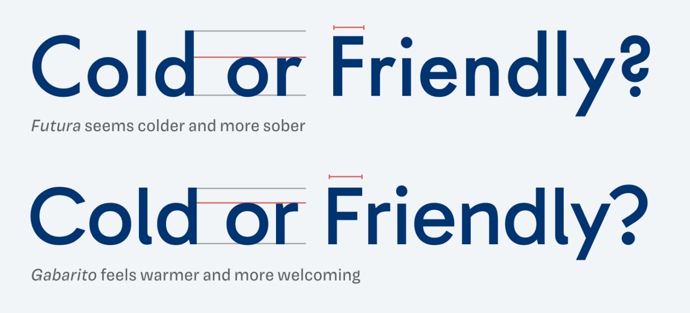
To understand why Gabarito feels so approachable, let’s compare it to the mother of all geometric sans-serifs: Futura. Besides the fact that Futura has a vintage touch for contemporary eyes, the very simplistic letters (look at the lower case “l”), narrow proportions, and short lower case letters give it a dry and more noble touch.
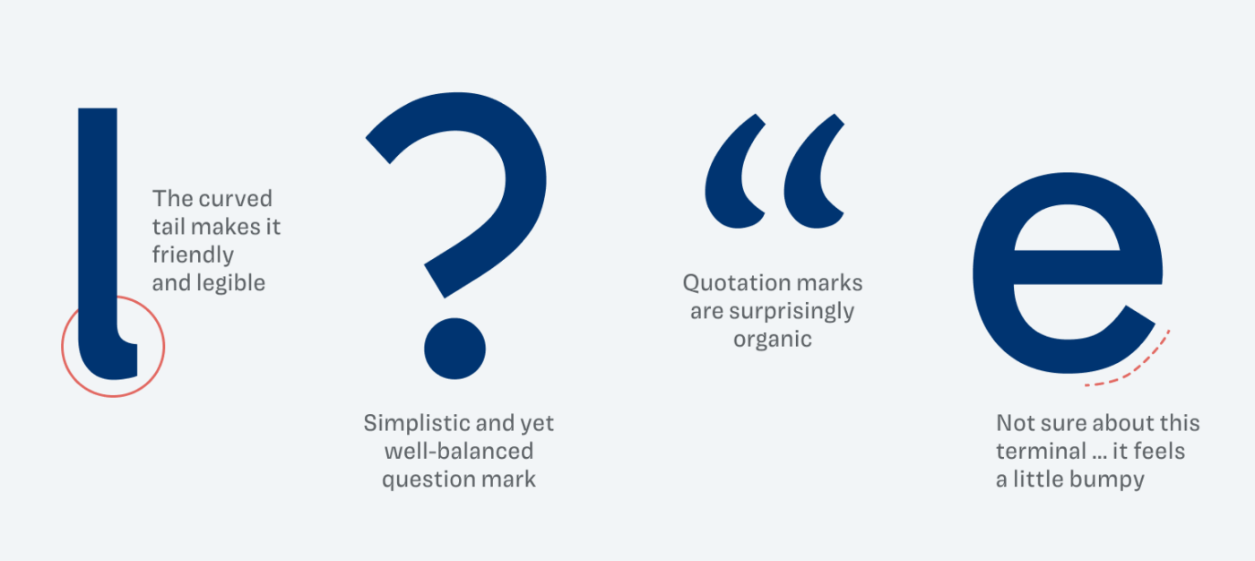
Tiny details like the curved terminal of the lower case “l”, that adorable question mark add to that impression. Also, the quotation marks (and the comma and apostrophes) are surprisingly tender with its dynamic shape. I only have an issue with the terminal of the “e”, it seems a bit bumpy and unbalanced, not in a drastic way, but it struck me.
A lovely additional feature you need to know about, are the various styles for numbers, see them in action here on Patreon.
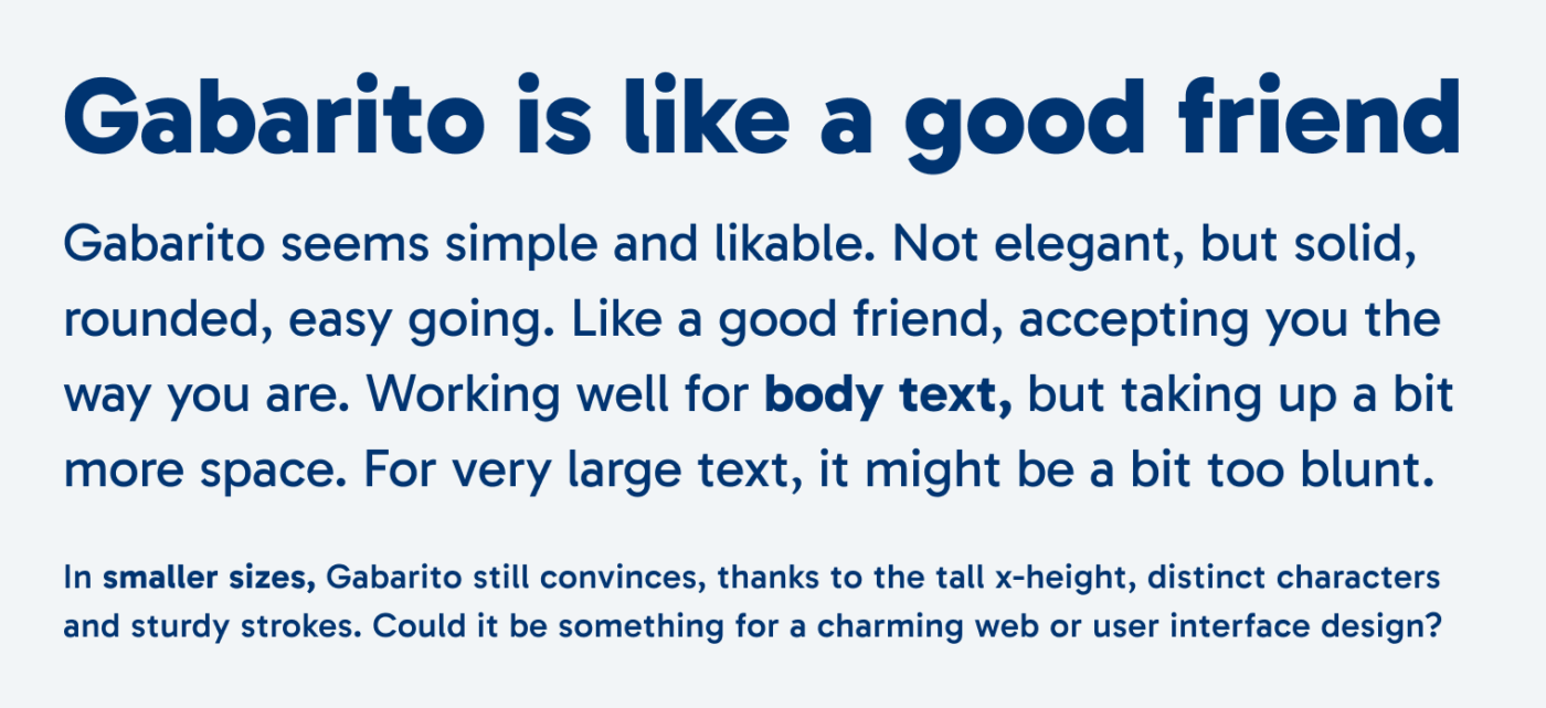
In my opinion, Gabarito works best for web and UI design. For lager text, a light weight would be great, also italics are missing to seriously consider it for a lot of body text. Maybe in this case similar Capitana or Grato or Gratimo work better.
Font Pairings for Gabarito
If you want something striking for your headings, mystic Avona would make a contrasting match. Pairing it with wild Roba will emphasize the geometric features of both typeface.

- Headings
- Copy
- UI Text


Learn more about pairing typefaces using the Font Matrix.
What do you think? Does Gabarito seem nice and approachable to you as well? Or is it too casual? Tell me in the comments! Also, if you have a suggestion for a future Font Friday review.
What a great example about how the look and feel within large typeface categories can differ so much! I was just working on a lesson for my students about this for next month so I will definitely use the Gabarito as an example, thanks!
Wonderful, Andrea! Happy you found a good example in it 🤩! Another good example could be Dalton Maag’s Objektiv. The Mk1 style is very cold, Mk3 is very friendly and more legible.