Serif typeface

from Latinotype
designed by Alfonso García

6 Styles

5 Weights: Regular to Black
Regular with a matching italic

Best for

  • Headings (display text)
  • Long reading text (body text)
  • User Interfaces (functional text)

License starting

below $40 (one style)
below $130 (bundle)

Specialty

What I love about Árida is its calligraphic nature. You can truly feel the lively broad pen writing, when looking at it. It creates a noble, and classy atmosphere, while the regular weight appears a bit softer, and the stronger weights become very sharp and contrasting.

My thoughts on Árida

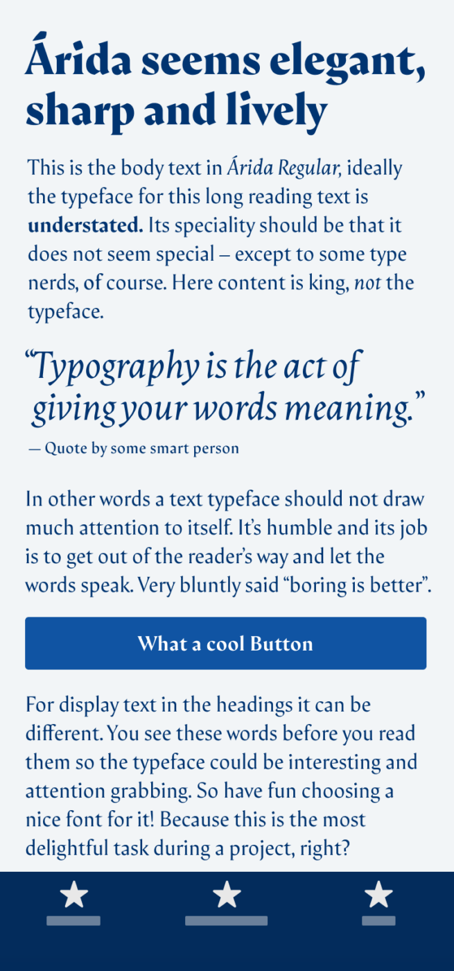
What I love about Árida by Alfonso García is its calligraphic nature. You can truly feel the lively broad pen writing, when looking at it (see angles and the contrasting stokes). It creates a noble, and classy atmosphere, while the regular weight appears a bit softer, and the stronger weights become very sharp and contrasting.

”Elegant and smooth” set in Regular. “Pretty sharp and lively.” set in italic. “Contrasting and pointy.” set in Black.
Árida Regular, Italic and Black. Especially the black weight in larger sizes fills my heart with joy when looking at it! So contrasting, so pointy, so beautiful!

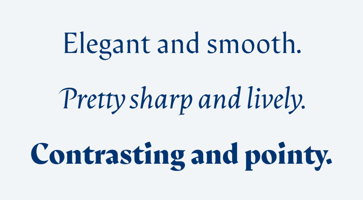
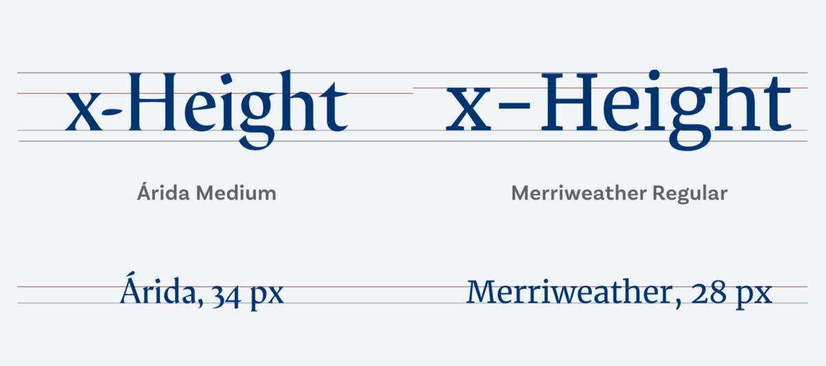
Due to its classic look Árida might be associated with print and editorial design, but why shouldn’t you use this gem in a digital application? When you do, consider the typeface is pretty narrow, and has a relatively low x-height. This means the lower case letters are quite small compared to the uppercase letters (as a comparison see this tremendous x-height). So it is beneficial to set it in larger sizes, I’d go for 15 to 20% bigger. Using Arida for titles and headings – ninguna problema. For body text – perfecto! But for UI and functional text – no way, José.

x-Height of Árida and Merriweather in comparison
The impression of the font size is mostly crated by the height of the lower case letters. To make low x-height Árida look the same size as larger x-height Merriweather, increase Árida’s size until the lower case letters are almost the same height.

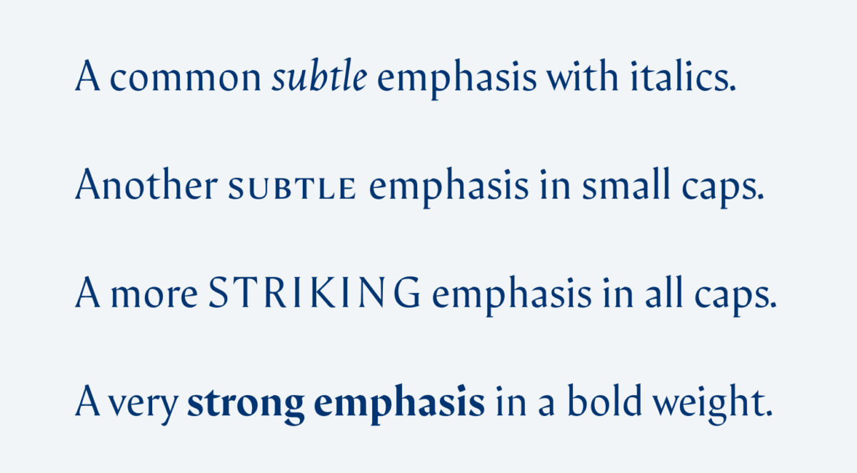
Árida offers you a lot of alternate characters, and includes small caps in every weight. Small caps are not just scaled down versions of upper case letters. Yes, they have the same shapes, but they are slightly wider and most importantly their stroke weight fits the lower case letters. I also like the almost upright italic which is only included in the regular weight. This and the different weights give you a lot of options for text emphasis from subtle to very strong.

Different ways to emphasizes parts of your text from subtle to strong. In the end it is always about creating contrast. Árida offers a rarer used option for subtle emphasis with its beautiful small caps. They blend in nicely with the mixed case body text. But remember to increase the letter space.

Is Árida, the elegant typeface with a calligraphic appeal, something for your next project? Write it in the comments blow!

Typographic power to your inbox

  • Font Friday: I recommend one typeface per week, free fonts included.
  • Type Tuesdays: articles & videos that up your design game.
  • Join 2500+ typography enthusiasts, unsubscribe anytime.

Edition #16, published

Leave a Reply

Your email address will not be published. Required fields are marked *