My thoughts on West
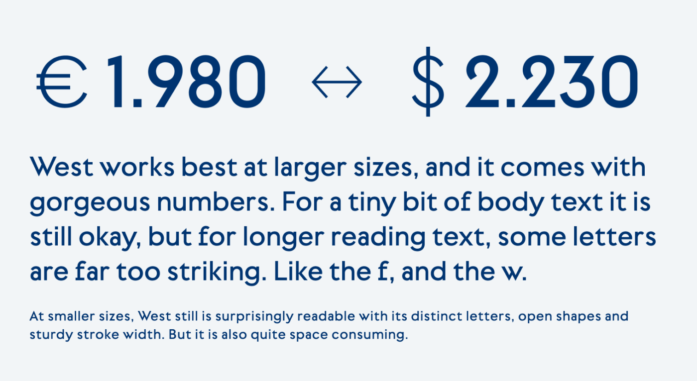
Categorizing typefaces is always hard, but with this one it’s a special challenge. I’d say West by Daniel Perraudin is a sans-serif display typeface. This means it works best in large, short text. But not only, which makes it so interesting with its unusual mix of styles. West has many visual idiosyncrasies. Some letters are pretty wide, like the g and the e, others are surprisingly narrow, like the lower case a, or just very unusual (f and w). This all makes it unsuited for reading text, the letter forms are just too striking.

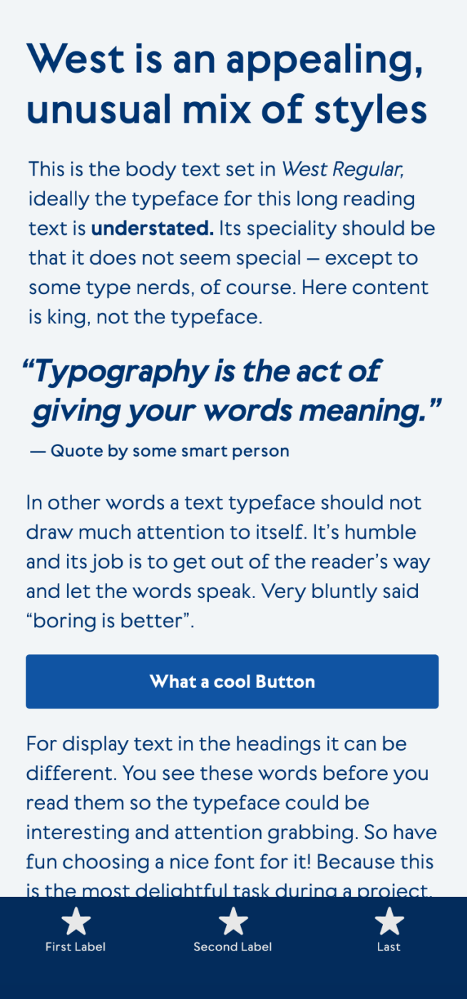
For functional text in a user interface, it still might work. The typeface is very even, and still readable at smaller sizes, even though it consumes a lot of space. I could imagine West as a typeface for an app design that does not need a lot of text, maybe mostly numbers? The numbers are just so beautiful, that it almost makes me weep for joy ! Look at that lively 2 and that strict 3. 😍 What a mix!

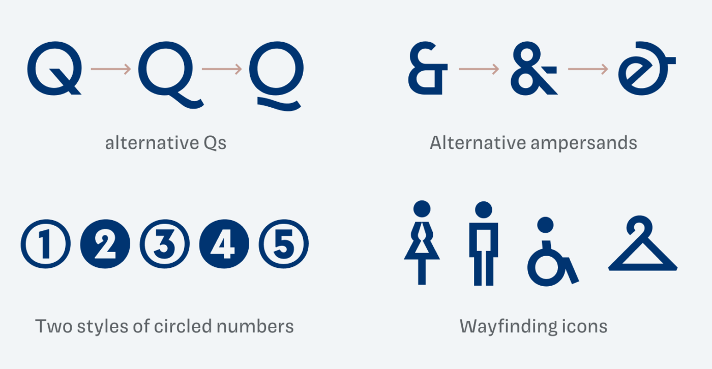
There are plenty of alternative characters available, and the variable font gives you the possibilities to tweak the weight to your application’s exact needs. I also appreciate the wayfinding icons, crafted to fit the stroke width and style of the text, so useful when it comes to signage. And finally, West has one of the most badass promo videos for a typeface, I’ve seen. So check that out 😉.
Font Pairings for West
West is a geometric linear sans-serif typeface. If you want something contrasting and wild for headings, choose the very different dynamic serif typeface PP Migra.
- Headings
- Copy
- UI Text
Learn more about pairing typefaces using the Font Matrix.
What do you think? Is West something for an upcoming project, or have you used it in the past? Tell me in the comments below!


Yeah, no.
Display type is tough for me on the web since you really don’t have total control over the final rendered size. Agreed, West feels like it should always be BIG. It’s too blotchy in color at anything other than a headline for my eyes. I do like it at the larger sizes and yeah, those alts and icons *are* pretty interesting.
Thanks for the post.
Display really is challenging. In this case though, I think it would be still workings, because it’s not depending on the larger size to be well displayed. But yes, the more text set with it, the blotchier it gets (didn’t know that word, thanks for teaching me it).
Return of the Blotch – I think I really wanted to use “splotchy” but the feeling is the same. Too much dark vs light in the “color” of the text.