
My thoughts on Shantell Sans
The free typeface Shantell Sans is based on the handwriting of the artist Shantell Martin with type design and font engineering by ArrowType. It has an easy-going, approachable and fun vibe to it. When you look at Martin’s wonderful art, you can see how her handwriting is reflected in it, especially in the caps.
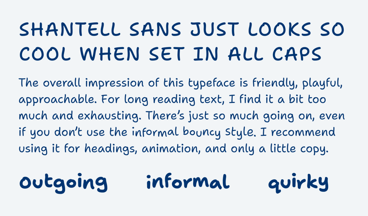
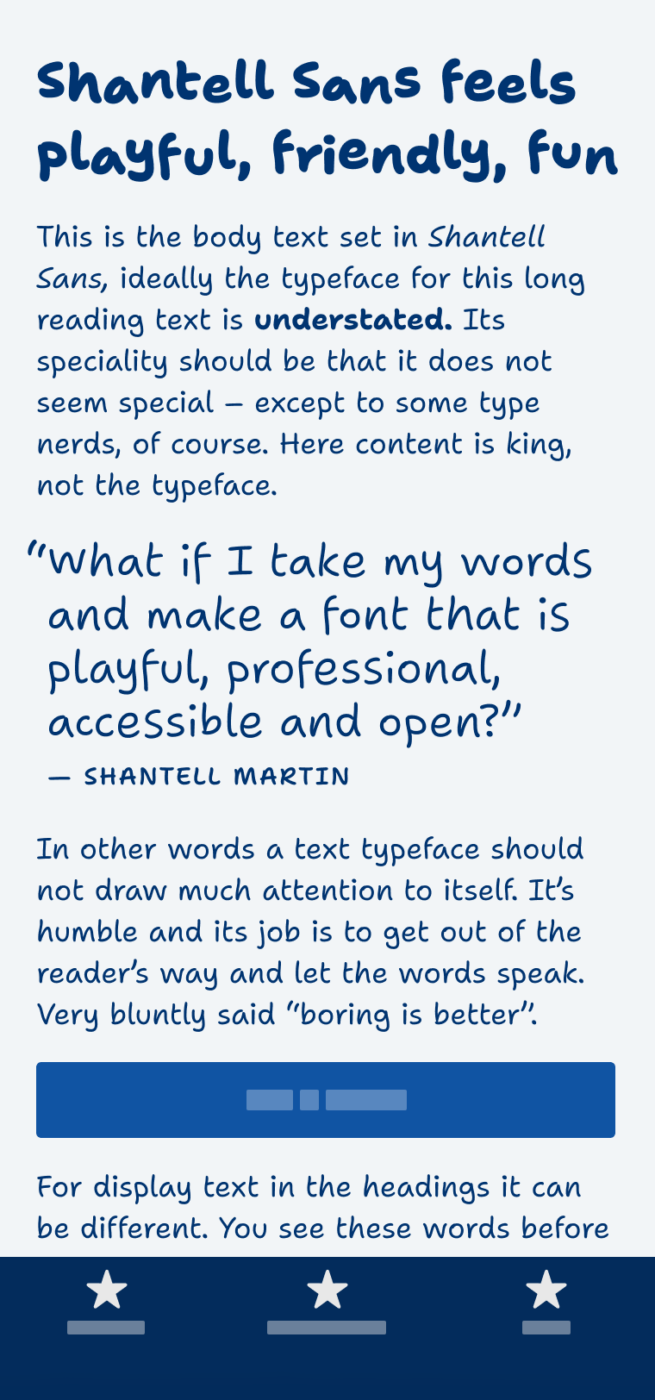
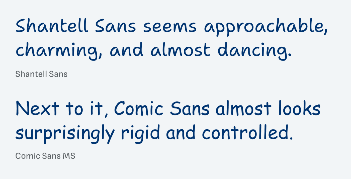
The typeface is obviously inspired by Comic Sans, as Martin describes: “Since I was a kid, I have liked how playful and easy it was to read text in Comic Sans, especially for me as a dyslexic.” But Shantell Sans takes it a step forward, looking much more organic and playful. This is a strength, but also a weakness when it comes to longer reading text. And while the variety of handwriting can be felt, it is a bit disappointing to see that the individual letters are exactly repeated.
The biggest asset of Shantell Sans is the informal and bounce axes coming with the variable font. This can compensate a bit for the lack of character variation, especially when used in animation. The clever programming behind it always creates a wavy pattern for the bounces, which is truly inspiring for web or app design.
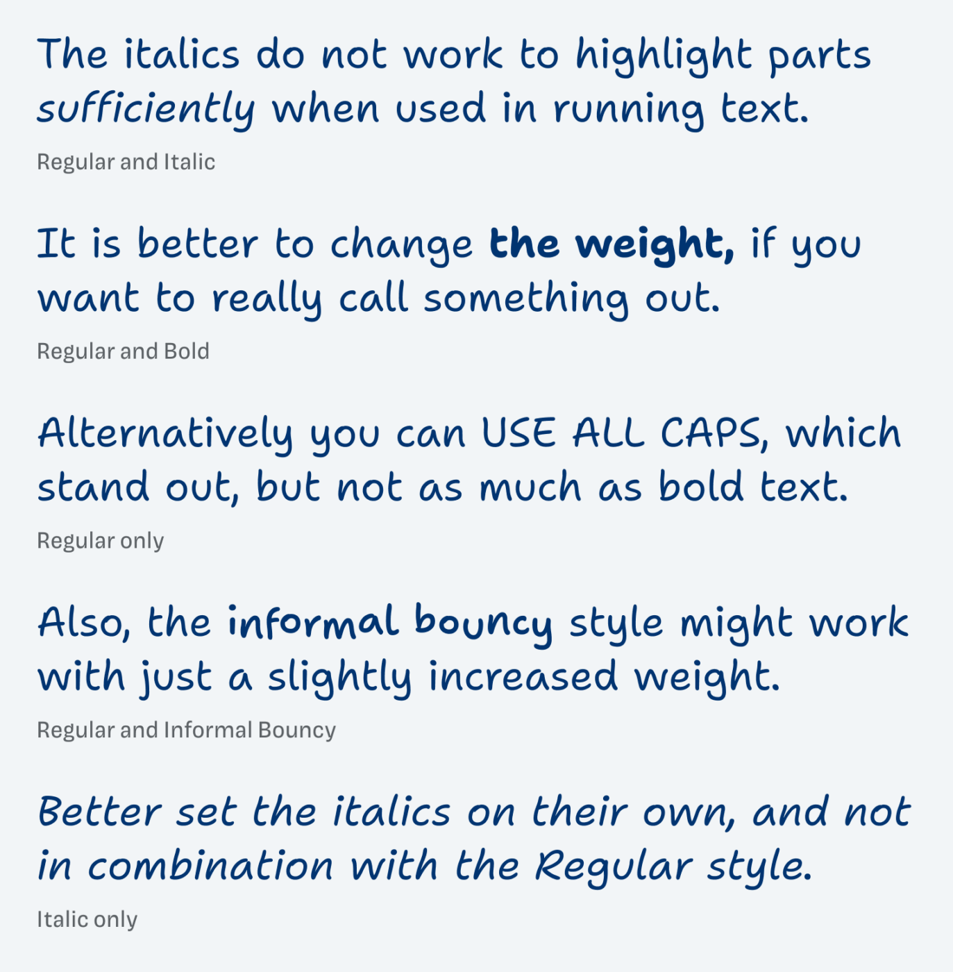
In a more practical use case, the typeface sets its own rules, especially for text emphasis. As you can see when reading the interesting design process, the italics do not really work to highlight text. This is because of the overall very informal construction of Shantell Sans. Here you can see some different approaches you can use for text emphasis.
Clearly a lot of thought, love and attention for detail went into the creation of Shantell Sans. It is a wonderful alternative to Comic Sans, much more sophisticated, very legible, but maybe not the ideal for longer text. Give it a try, use it for captions, titles, pull quotes, and play around with the possibilities the variable font brings.
Font Pairings with Shantell Sans
Shantell Sans is linear handwritten style typeface. Pair it with other linear typefaces for body text, like a clean geometric sans-serif.

- Headings
- Copy


Learn more about pairing typefaces using the Font Matrix.
Thanks to Lorcan for pointing me to this typeface. If you have a recommendation, write it in the comments below!
I installed Shantell Sans, and unlike other large-family typefaces, the light, medium, semi-bold, and extra-bold did not show up in my word processing program. Even with only a third of the fonts (R/RI/B/BI) it was a welcome addition and worlds ahead of Comic Sans. Now it we could only fix the naming conventions, so I could enjoy the rest of the fonts….
Interesting, Steve. It might be because of the variable font? Not sure … Maybe you could give them feedback on Github?
I’ve been looking for a “handwritey” font for my diary blog headings for a while and this one looks great! Thanks for the suggestion.
https://diary.uncountable.uk/
Very nice, Chris! Very curious how it will look, so if you’re comfortable with it, share it!
I’ve uploaded it on my website now, just for the post headings as you recommend:
https://diary.uncountable.uk/
The body is Poppins with a very slight increase in gap between the letters. I maybe might switch that to something a little different, but I don’t want that too fancy.
Very cool, Chris, thanks for sharing! Totally changes the vibe. Some unsolicited advice, if I may 😉. In your overview, you could go for
font-weight: 500;andline-height: 1.2;. This way it will become more compact and stand out a bit more. Here a quick Before and After.Also, now it kinda clashes a bit with the handwritten style typeface in your page title. Maybe you could address it as well. Just some thoughts 😉.
Hi Oliver,
I made the changes you recommend, and also some more subtle changes to show this font consistently throughout.
I’m really happy with the outcome and the new look is here: https://diary.uncountable.uk/
I’ve had a lot of feedback from readers over the weekend and they like the new layout much better
Hooray, Chris! Happy to hear that! Now if your cards would use a light background, it would be even better. Since it is a bit hard to read when it comes to contrast. Keep it up!
Chris, from what I saw on your blog, Shantell aesthetically articulates your storytelling. I’d swap Poppins for some quieter and conserved type. Poppins is more for agencies or publishing media – creative industries, while you use real-life, nature-inspired visuals. You need something more organic and grounded. And let the Shantell shines in the headline, turning the readers’ heads.
thanks Jana … yes I do need another body font. Now that Shantell is nailed, I’m going to try some different options
Not so naive and easygoing, Shantell Sans, my dear 👸🏻
She looks gorgeous in her adventures with weight changes, but more so bouncy moods. And when Oliver throws in some funny content, every type gets the character amplified.
Shantell smells like cardboard writing or sticky note on the fridge.
Speaking of Comic Sans, I appreciate it now more than before.
Enough of brb, I’m going to download it now 🏃🏻♀️
“Smells like cardboard writing” 😅 Love your sensual descriptions, Jana!
Oh, and I’m diving deep into Shantell’s work. The jigsaw puzzle is a real challenge to piece together with her line art, quirky characters and free-going letters.
Thank you for shedding the light on her Oliver!
Here work is brilliant right? So approachable, but still profound!
I think the accessibility element is important. I wonder has it been evaluated in this context. From the website: “I later discovered I was dyslexic and recently, I thought, ‘What if I take my words and make a font that is playful, professional, accessible and open?’ I was inspired by Comic Sans because I have always liked how fun and easy it is to read, especially for me as a dyslexic.”
Yeah, I frequently hear that Comic Sans is easier to read for dyslexic people. But have not looked for proof around that.