
My thoughts on Majör Mono Display
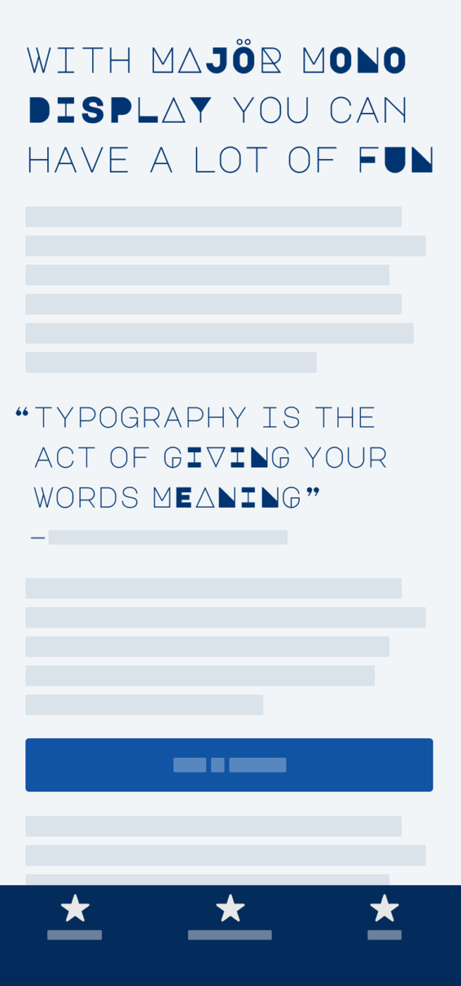
Majör Mono Display is the name and also the game. This monospaced all uppercase typeface is made for display purposes, very geometric but still friendly. I like the squarish and yet rounded look, and how elegant the light weight seems at very large sizes (40 px and above).
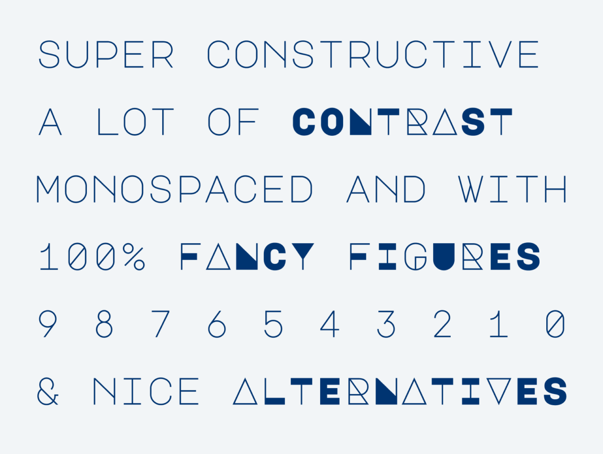
When you write it in lowercase letters, it would even work for a short paragraph and looks quite uniform. But Majör’s superpower are the very funky and funny uppercase letters. Some characters become extremely bold and contrasting (like the N), pretty subtle (like the A that turns into a triangle), a bit unclear (like the H), unbalanced (like the F), or rather complex (like the R). Looking at the figures brings me joy with this slashed zero.
Majör Mono Display is available on Google Fonts and could be a great pick for a project that wants to create friction, appear a bit off and yet unique, and show this in a title or the headings. Happy to read your thoughts on Majör in the comments below!
Recommended Font Pairing
What typeface for body text would fit here? Due to the geometric, constructed nature of Majör Mono Display, it pairs well with another geometric sans-serif, like Mona Sans. But also squarish, rational Gloso works very well.

- Headings


Learn more about pairing typefaces using the Font Matrix.
My first reaction was dislike. But it reminds me of notebook doodles, so I’m warming up to it. Maybe for headings in a casual blog?
Yeah! It’s always about the application 😉