
My thoughts on Fragen
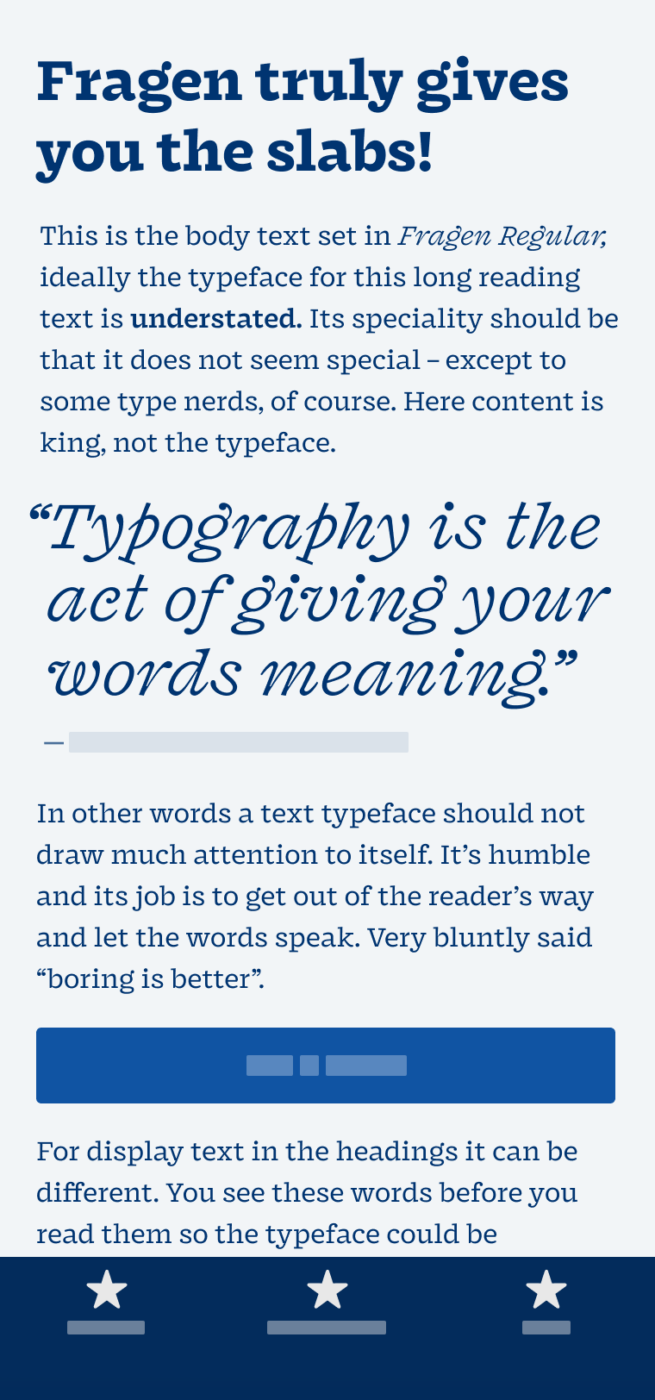
Fragen is a text-display hybrid. Not one of those horrible car hybrids that claim to be environmentally friendly when they just want you to continue destroying our planet, while making you feel a bit better about it. This just makes me 😬 … okay, back to the font now. Hybrid means that it mixes the expressiveness of a display typeface with the calmness of a text typeface. It comes with a strong slab flavour, and these super vibrant italics! God, just look at them!
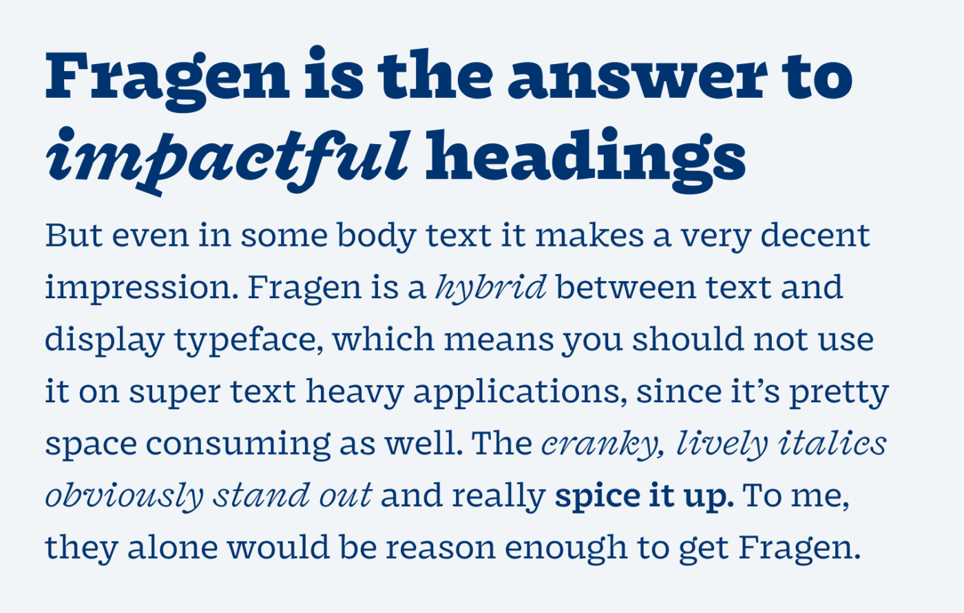
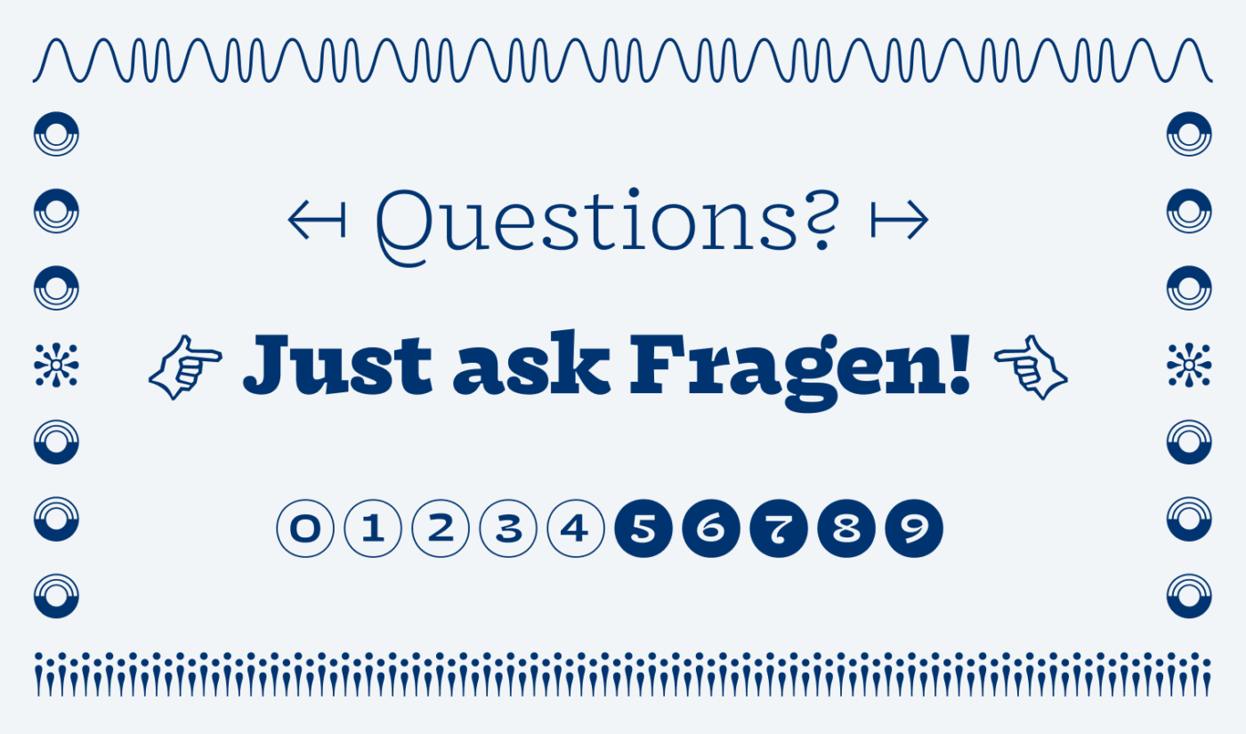
A very cool additional feature is the big number of symbols and patterns that come with Fragen. Especially on the web, these can be handy for common icons. And who would not love a nice custom manicule? Yeah, there’s a term in typography for these ☛ hand symbols. I recommend Fragen for websites or apps that want to stand out, show character and be different. For long reading text or small functional text, it’s not that suited, because it is rather wide.
Recommended Font Pairing
Fragen is a quite dynamic, quite linear serif font. If it’s too much for running text, combine it with something simpler, like quite geometric Capitana, or a dynamic linear sans-serif, like Asap.


Learn more about pairing typefaces using the Font Matrix.
What do you think? Is Fragen something for an upcoming project? Tell me in the comments below!
🤩I actually think that Fragen is functional in the copy (short form texts such as posters, album covers, product packages), in a regular weight, and for brands that are courageous and experimental. Punctuation! leaves a rather silly impression so not every brand/company could use it.
It’s character is the most vivid in display heading version. I’m not a lover of the slab but Fragen might change my view on it.
All these letters together look to me as a group of adolescence hanging after classes on a Friday night. They’re free, on their own. Look at the little y, makes a foot forward with a descender, an attitude! F is some shy guy in the group, while b and h are the loudest kids with a bowl to the up.
When I was in elementary school, a teacher would ask a (usually) boy with ugly writing: Have you written with legs or with hands? So this came to me when I saw it. Kinda ugly but actually quality quirky.🦄
Many aspects of Fragen took my attention. 101% agree on Italics, they’re like a special edition! Plus creative symbols. Fragen is a real slab surprise, Oliver. 10/10
I just looove your well described comparisons 😂! Thanks for that, Jana.
Quite a remarkable typeface this time. I adore its versatility being a display and text in the same time. Thanks for such discovery
I think the italics are like a type-hurricane (typicane?😂) but i love it. So fresh and memorable. After reading your thoughts i had to try some font combinations and i think the free font Amulya could also be nice for copy text. Thank you for presenting such a great font!
Of course, Alex! Happy you’re enjoying it!