
My Young Serif Font Review
As one of the earlier Google Fonts, Young Serif might be nothing new to you. But what’s definitely new is that this typeface just got updated and extended from one style to a complete font family. This makes this eccentric display font with a vintage touch now a serious consideration for plenty of applications.
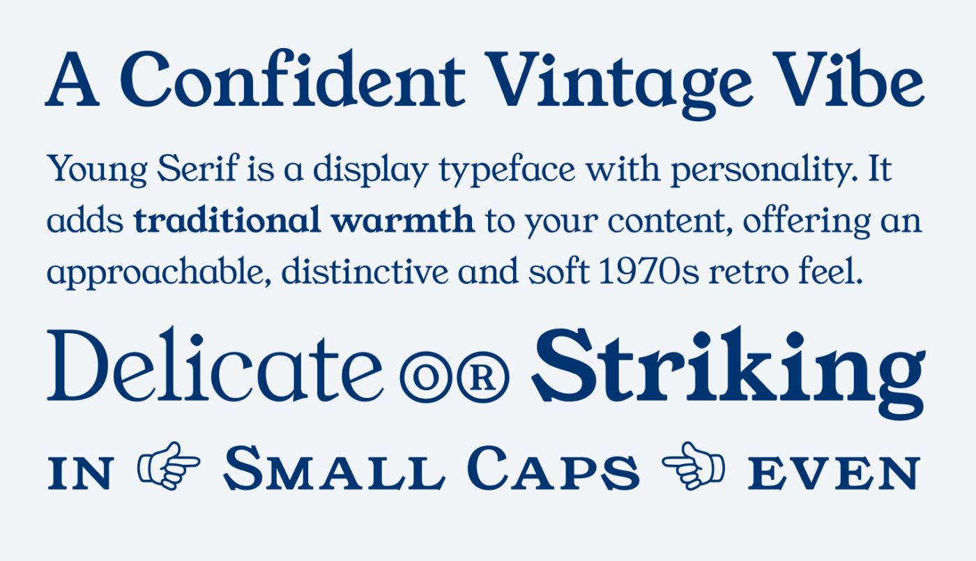
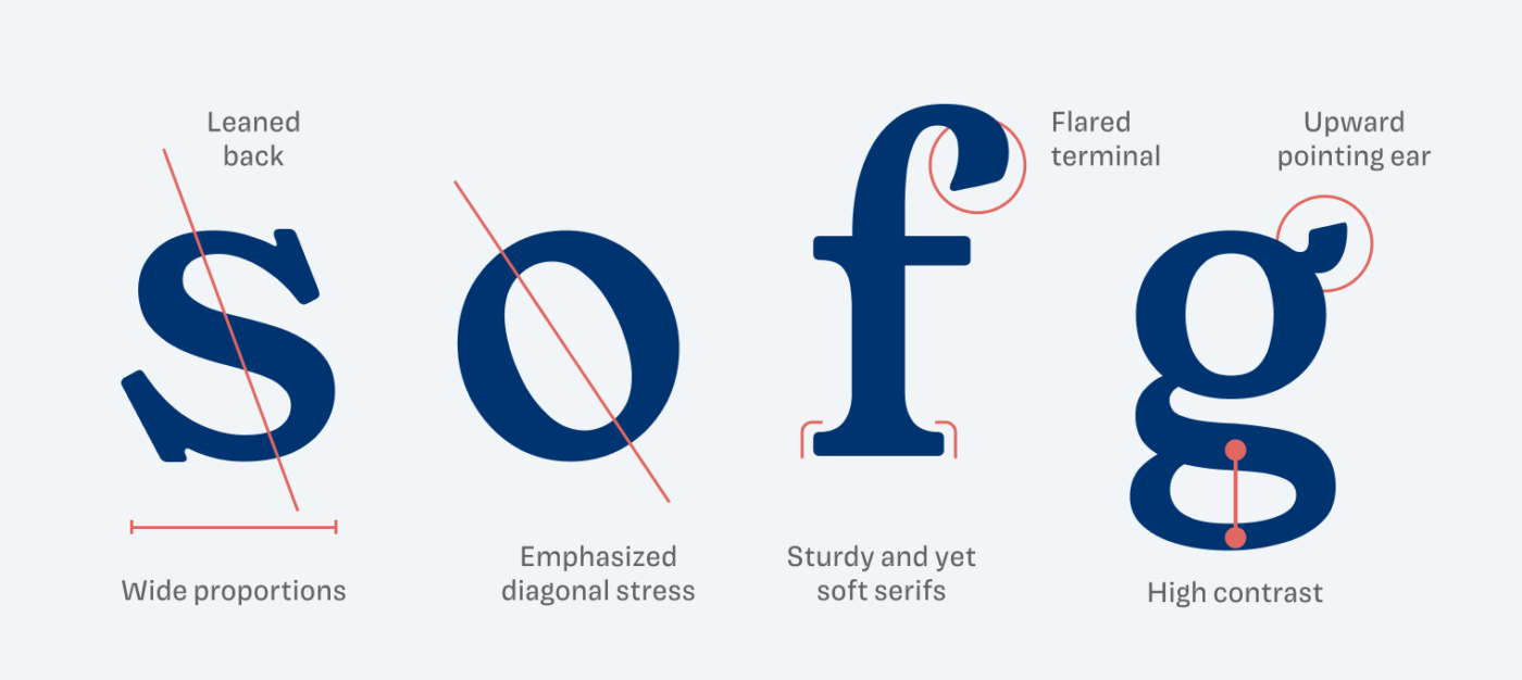
What makes Young Serif so interesting are the emphasized contrast and diagonal stress, its wide proportions and the leaned-back attitude – looking at you, lowercase ‘s’. It has its sturdy yet soft serif, flared terminals. My personal favorite character is the lowercase ‘g’ with its adorable upward pointing ear. These details add up to an overall striking impression with a retro touch – something playful and still confident.
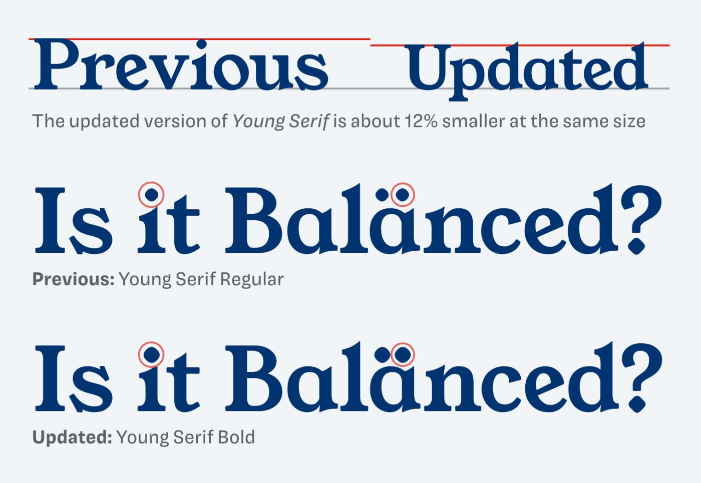
Originally, Young Serif was available in just one style: Bold. When comparing the two versions, the most noticeable difference is that the updated font is roughly 12% smaller at the same size. The dots also have been enlarged, while the overall appearance seems more balanced. One thing that still bothers me is that the capitals have slightly thicker strokes than the lowercase letters, making them stand out more. You can see this when comparing the stem of the ‘I’ and ‘t’ below.
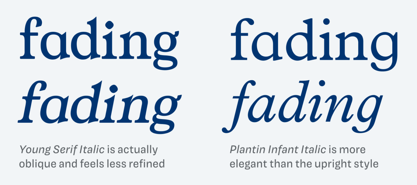
Another issue is that the italics are actually just obliques. While obliques aren’t inherently a problem, they don’t quite fit an old-style-inspired typeface. One of its sources of Inspiration is Plantin Infant where you can see how the italics get narrower, more elegant and show single-storey shapes at the ‘a’ and ‘g’. This is not the case with Young Serif. The obliques feel a bit stiff and rigid, also the weight of the ‘g’ appears a bit too light.
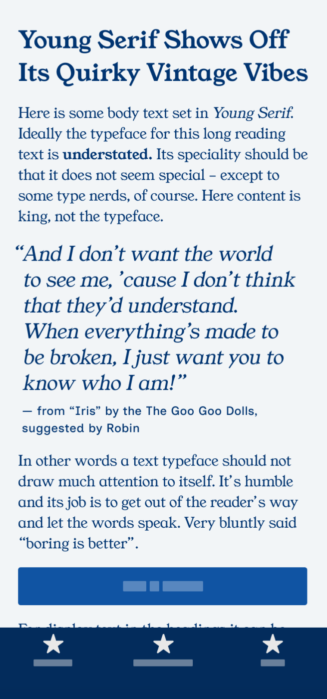
What does this mean for using Young Serif in UI or web design? With its strong contrast and narrow spacing, it’s best suited for display text above 20 px. I wouldn’t recommend using it for more than one or two paragraphs, as its distinct style can draw too much attention for immersive reading. However, when paired with the right typeface, it adds a unique, soft, and interesting touch to any project.
Please note: at the time of writing, the Google Font has not been updated yet. To get the full font family, you’ll have to download Young Serif directly from the foundry’s website.
Font Pairings with Young Serif
Young Serif is a quite dynamic, contrasting serif typeface. Here are some font pairing suggestions for smaller body text and functional text.

- Headings
- Copy


Learn more about pairing typefaces using the Font Matrix.
A big thanks to Hal, one of the Font Friday Newsletter subscribers, for tipping me off about the update! Now, let me know in the comments – what do you think of Young Serif?
I love how you dissected Young Serif! My favorite details are the upward-pointing ear on the “g” and the diagonal stress on the “e.”
What’s interesting, Oliver, is that Young Serif is aptly named—it’s young. In our early 20s, we are often imperfect, and similarly, Young Serif still has a long way to grow. This is just the beginning.
Due to its “imperfections” (it honestly seems to reflect only about 30% of its full potential), its safest application is in branding, particularly for very short wording or consumer product packaging moments.
I absolutely share your opinion, best use it for a little, large text. Now that you said it, it actually feels quite young 😊.
For a font pairing I recommend the font “Kabala” on http://www.softerviews.org/Fonts.html. I ran into Kabala in the wild as the body text in my Daughters story book along with some Trojan-esque header font. I knew Young Serif would work better, so I threw together a HTML with them and.. magic.
Interesting pairing with Kabala. Well since it’s a very geometric one it might work. Also Outfit would come to mind 😊.