

My thoughts on Spitzkant
Spitzkant is an interesting, sharp serif typeface by the lovely Julien Fincker (who long time subscribers might already know from Garino). Due to its contrast and pointy serifs, it sets a confident, elegant, maybe also a little restrained mood. Julien writes, that he focused on creating a display typeface first, and then continued to design a text version as well. This is represented in the different optical sizes, too.
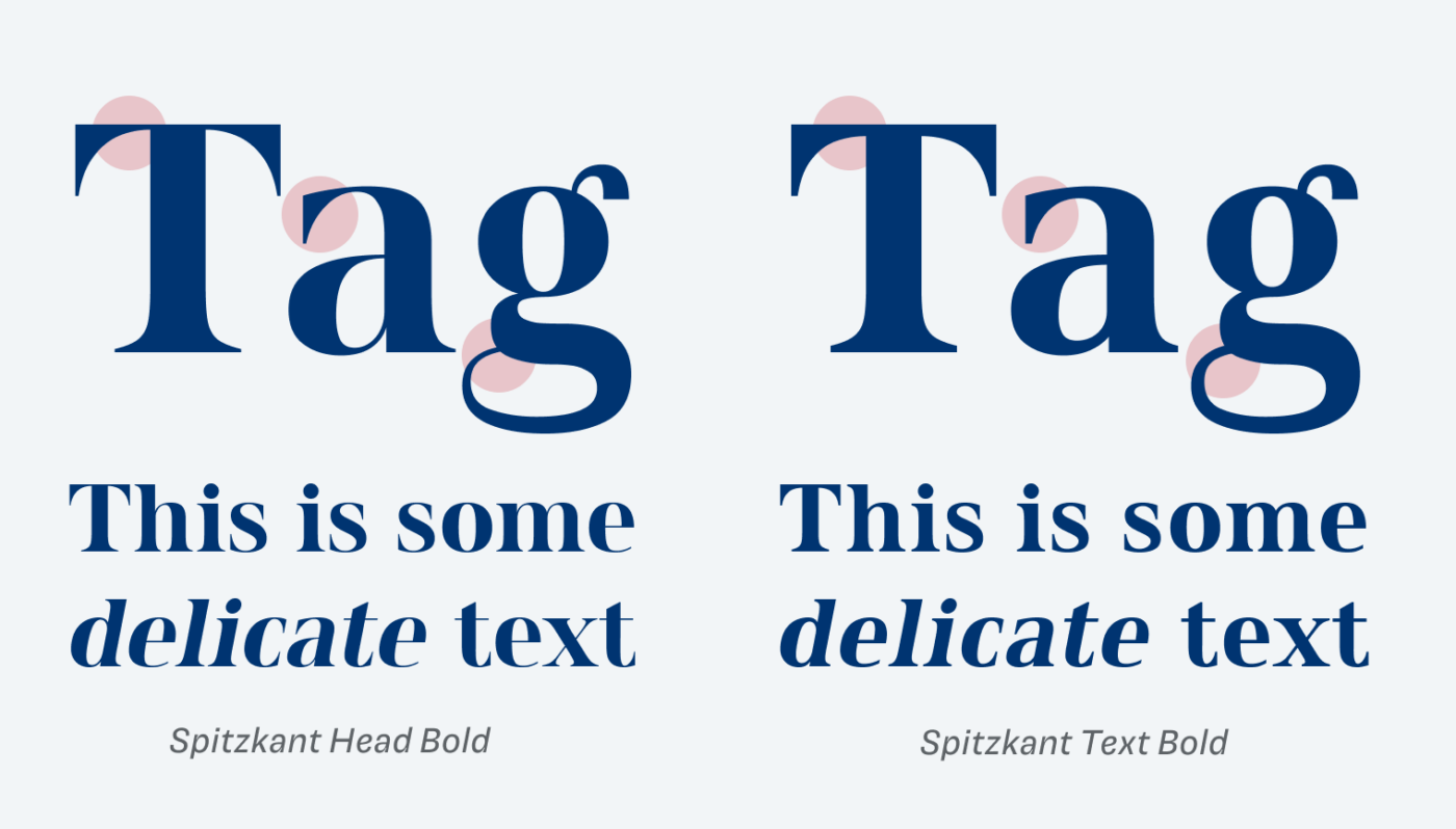
Spitzkant Head is very delicate and super contrasting, also the spacing is tighter. Spitzkant Text is a little sturdier, without losing its overall character. However, I feel I could have been a bit stronger, still. Seeing it for body text on screen, it still feels too noisy for longer reading text. So I would recommend setting it above 20 to 24 px, at least. Also, the obliques feel a bit off to me. It kinda leaves me with a distorted taste, not sure why.
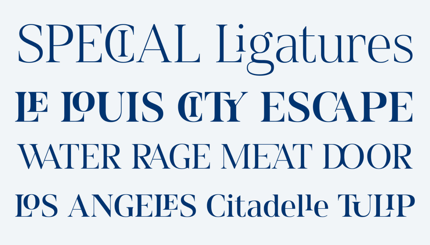
Julien is a graphic designer and created a ton of special ligatures for Spitzkant. Some of them are really cool and helpful for striking titles or logotypes (like RA, or WA). Others are a bit over the top and controversial, like the elevated letters above the L, the extended arm of the E at the EA ligature, or the too closely cut of Y in the TY ligature. You’ll have to decide, in your particular use case, if it fits or distracts. However, to me the superpower of Spitzkant lies in the display styles, the many alternate characters and ligatures, and the overall very contemporary, edgy feeling to this serif design.
Font Pairings with Spitzkant
Spitzkant is a rational, contrasting serif display. Pair it with quite similar Briccolage Gortesque for a little body text or headings.

- Headings
- Copy


Learn more about pairing typefaces using the Font Matrix.
What do you think? Is Spitzkant something for an upcoming project? Tell me in the comments below!
I applaud every designer who opts to create a type, bravo! It’s easy to see in this case it’s the designer’s artwork, a lot of freedom and play. Sometimes we need that Oliver! Even in functional typefaces. The best letters: g, r but I’m noticing c is narrower than others🤔
Between the headings and text, I’m definitely for the heading! That contrast gives much character and is elegant but not weak-feminine, it’s a font with a statement. NO to slanted version.
In special ligatures, he gave it all – meaning that he introduces everything that came to his quirky mind but that corrupted Spitzkant from its first and foremost character. Elevated letters with L are a true design thing, like a magnifier! E is strange like it wants to hug A but A is reserved. D&O oh no, too close. But love the WA combo, on the logo way!
Each person new preference, anyway, this is a good example of a type whose author is designer!👏🏻
“E is strange like it wants to hug A but A is reserved.” 😂 You always come up with such great, tangible descriptions, Jana! Thank you!
I have the full set with all 20 styles, which I picked up as part of a bundle a while back. It was on my shortlist to use for headers on a website I am building for myself at the moment.
So far I have stuck with Bodoni* but reading this has made me want to try them side by side again, especially now the website styling has started to emerge more broadly.
Thanks for sharing this, Ashley! I’m currently in the process of redesigning my portfolio site as well and about to change typefaces there (of course 😂), so I can relate to that. On your site Spitzkant would be a great choice to make it a bit more spicy! Let me know, once it’s out 🤘!
OK, if Spitzkant has the “Oliver” vote of approval I definitely have to look at it seriously again! I was planning on using this with Captura Now Light for the body text.
Cool, curious how this will look like! Check, if the body text is not too delicate in the light weight to be readable enough. 😉
I forgot to add that I enjoyed your YouTube video on space around headings in web typography.
Thank you! Glad you found it helpful 😉.