
My thoughts on Sora
Sora is a free and open-source typeface that was commissioned by the Japanese company SORAMITSU. Designed by Jonathan Barnbrook and Julián Moncada, it is available as a variable font and listed Google Fonts as well. It has a geometric design, seems clear and a bit technical.
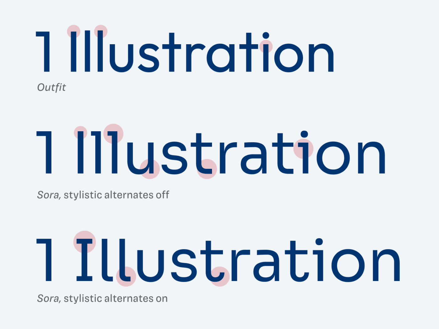
These kinds of typefaces often come with legibility issues, but not in this case. The serifs on the lower case l and i make it more distinct and remove ambiguities. Additional stylistic alternates give it a different touch and make it even more distinct. The italics, which are actually obliques, seem very dynamic with the subtle serifs on those characters.
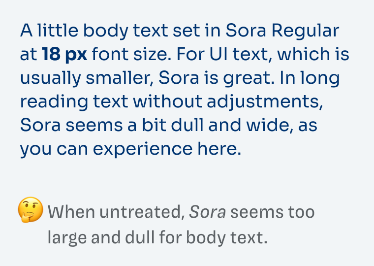
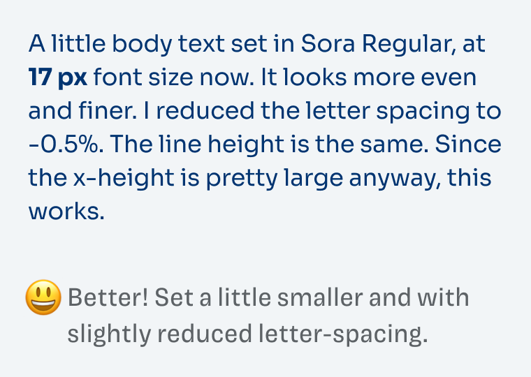
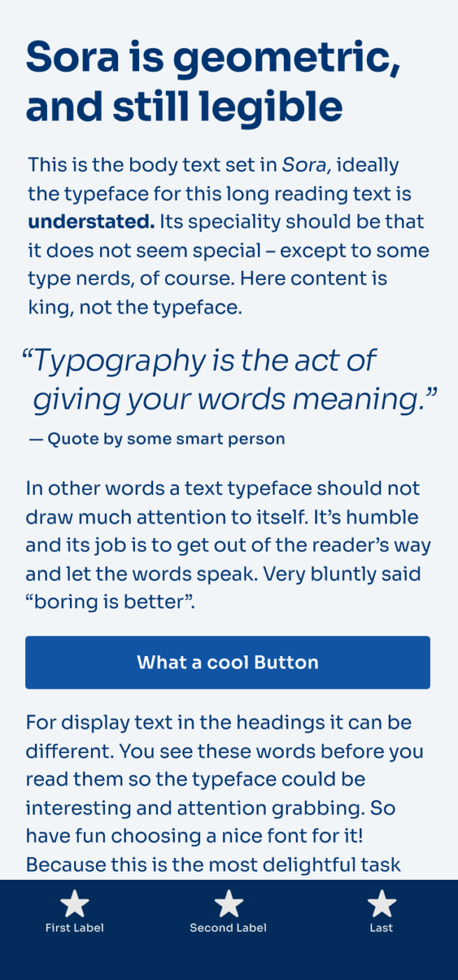
The sturdy strokes and the large x-height make Sora ideal, if you use it in the smaller functional text of user interfaces. But for body text, it might seem too rough, when untreated. I recommend decreasing the font size slightly and making the tracking a bit tighter. Overall, a very beautiful typeface for screen design, but not only.
Pro-tip: to get the additional medium weight, and the italics, you have to download it from Github and check out the fonts/tff/v2.1beta subfolder, since on Google fonts those are not available (yet).
What do you think? Is Soar something for an upcoming project? Tell me in the comments below!
Just a quick point for others that if you download this font from the GitHub page the 16 style variations are found in the 2.1beta ttf sub folder, otherwise you will only see 7 styles in the main folder.
Great addition, Ashley! I’ll update it in the post!
Sora, a true Lady with generic dignity. No, she is not one of these, copy-cats all around the www.
Am I the only one seeing letters hugging each other? Looks so amiable and warm, despite its geometric cuts. My impression of Sora is that everything is in symphony, a hoslistic font, whose letters are in cohesion, singing to each other while not looking frivolous. Geometric but not boringly generic. I’m a ‘big perspective’ person, speaking from the right brain and I learn a lot from ‘attentive to detail’ left brain of yours, Oliver!
I see it best in a UI text, and with a little tracking, it will work in long forms of content.
Again… Stealed my heart with the origin of its naming.
I love that, Jana! The bows of the r and a and all the apertures are very open, connecting – this is hugging! Brilliant 😍!
Beautiful Sora! It has this blockchain techy feeling I love 😍
I’m curious, is there any reason why you won’t use it for Headings?
Which font will be the right one to pair with this beauty?
Glad you like it, Mary! Regarding the headings – it’s not horrible, just a bit wide and spaced out for larger longer headings. It will work, but it Sora’s strength more in functional or body text.
About a good font pair – it depends on the mood you want to create and for what kind of text you need it. If Sora is the body text, it would pair well with Neumond, Faune Display, Style Script, or Sniglet for display text. Whatever then fits your project’s topic. Newsreader would work for body text when Sora is set in a heading. If this is a bit too generic advice to you, tell me a bit more about the circumstances?
Hi, I’m a little late to the discussion, but I am looking for a perfect display font to pair it with Sora in body text (the examples you named won’t work for my medical-tech project). Do you think Newsreader will do the trick if used for display text?