

My thoughts on Neumond
You know me for constantly talking about what makes a display typeface a display typeface. Very briefly, it’s a typeface that is made for short large text. And if something is a display typeface, this week’s pick, Neumond truly is, while it demands to change my definition to extremely short and extremely large text.
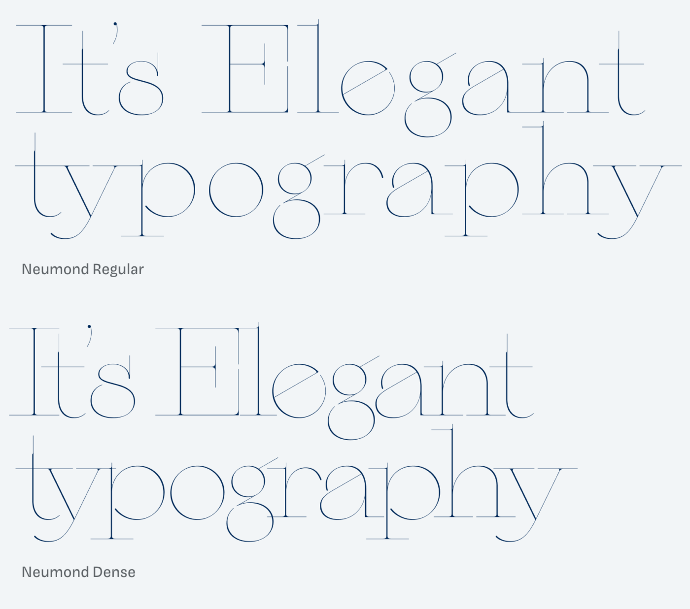
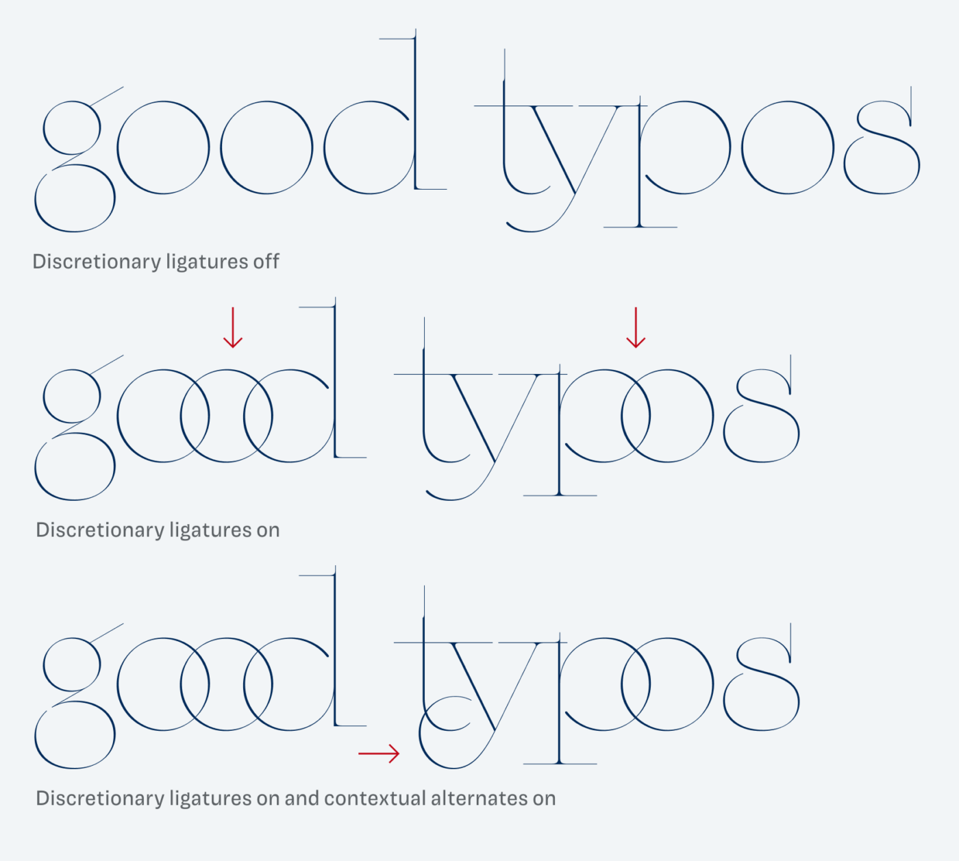
Neumond by Dalton Maag was designed by Samir Reis and my good old friend Lukas Paltram, with whom I shared an office with for 11 years. So I had the pleasure to see how this project evolved over the months. Often Lukas excitedly showed me Neumond’s ligatures and how the super crisp serifs change their length when you switch from the Regular to the Dense style, so that no weird overlaps happen.
This super thin, geometric and slightly contrasted typeface it is one of the most beautiful, elegant and finest designs I’ve ever seen. Neumond creates a rhythmical pattern of visual joy. Ideal for editorial use or poster design, when it has enough space to breath. For web or app design, I only see very limited areas of application, since anything below a font size of 120 px won’t work. It was challenging to apply it in my templates here, and I challenge you to use it in more than a one-letter word for a mobile design 😜. But maybe this is all you need in your next luxury space agency job?
What do you think? Is Neumond something for an upcoming project? Tell me in the comments below!
I wouldn’t be a brand strategist if I don’t fall in love with the naming! Neumond, sounds like, an otherwordly font type!
You hit the nail on the head Oliver with ‘a rhythmical pattern of visual joy’. It’s so artistic, applicable for Vogue magazine covers, nothing less! It’s a double edge sword if used in some trending-blending creative publishing. It won’t distinct. This is gold.
I also see it in the service of a retail brand logo, at the entrance of the store. What a sophisticated surprise, in these crazy world times O.
P.S. While writing this comment, Grammarly is notifying me that I made a spelling error, not Neumond but Diamond! 🤣
Ain’t Neumond a Diamond? 😉 I knew you would like it!