My thoughts on Mazius Display
There are good fonts and there are bad fonts out there. But what does “bad” exactly mean? Besides the aesthetics, it means that they are poorly drawn, miss characters, or are not spaced properly. Each Font Friday, I sort these fonts out and don’t even present them to you. But this week I’ll make an exception. Why? For three reasons. First, I want to show you when something does not work and why. Second, I want to tell you how you can fix it, so you can also use a non-ideal font in some cases. And lastly, I really, really like the design of the typeface, this is why I’d rather educate you on it than keep you from it. After all, you could make it work.

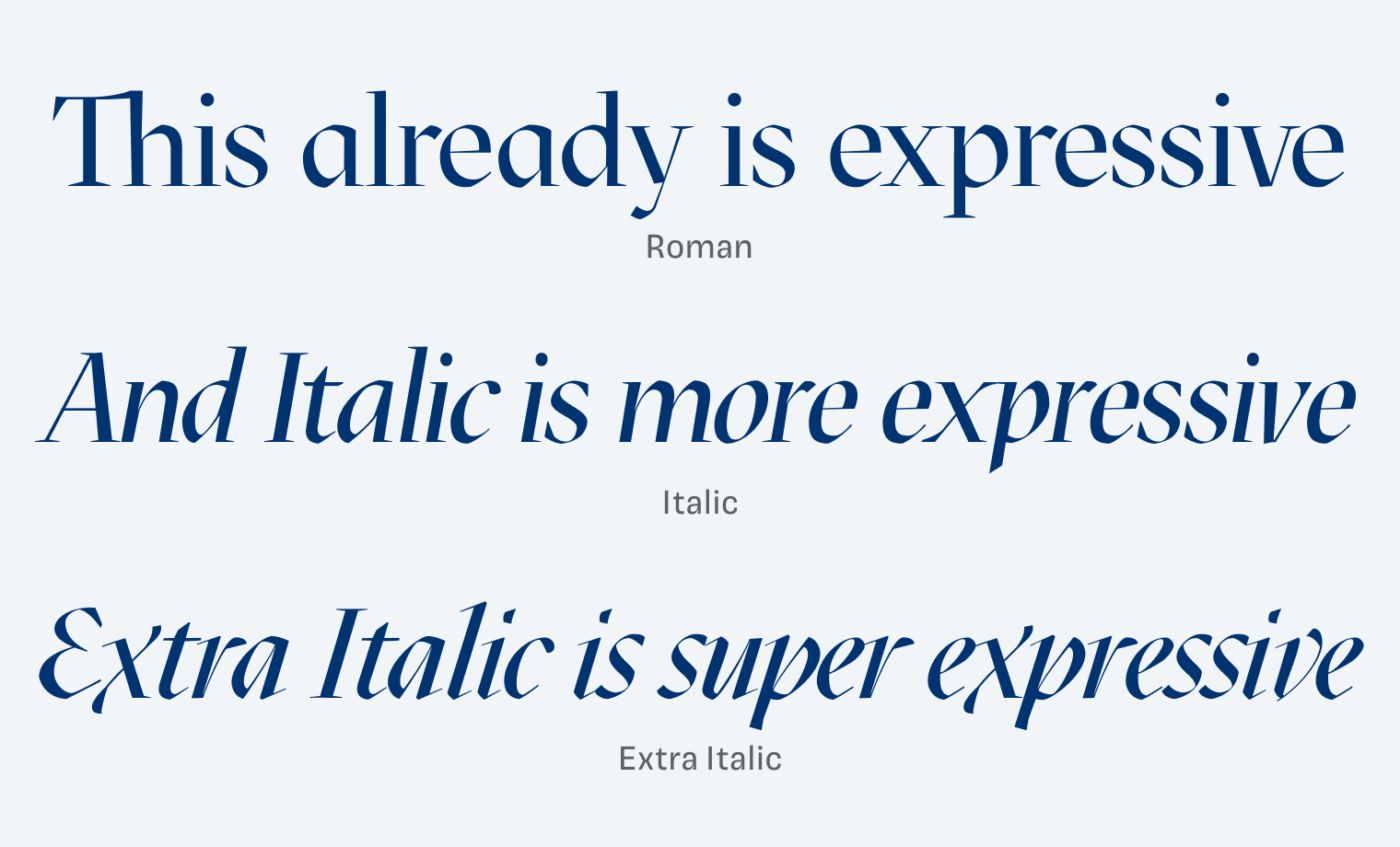
Mazius Display is a contrasting free display typeface that comes in three styles. The Roman style has something noble and authoritative. Extra Italic on the other hand is very spiky, lively and calligraphic. I love characters like the x or the v 😍, looking at them just makes me happy. In between lies Mazius Italic which is more of a slanted version of the upright.

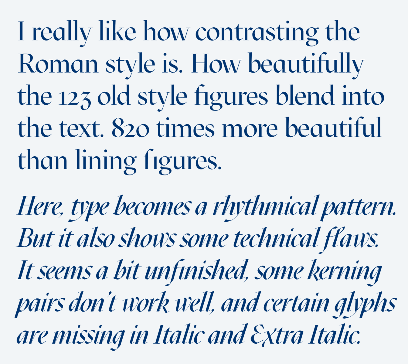
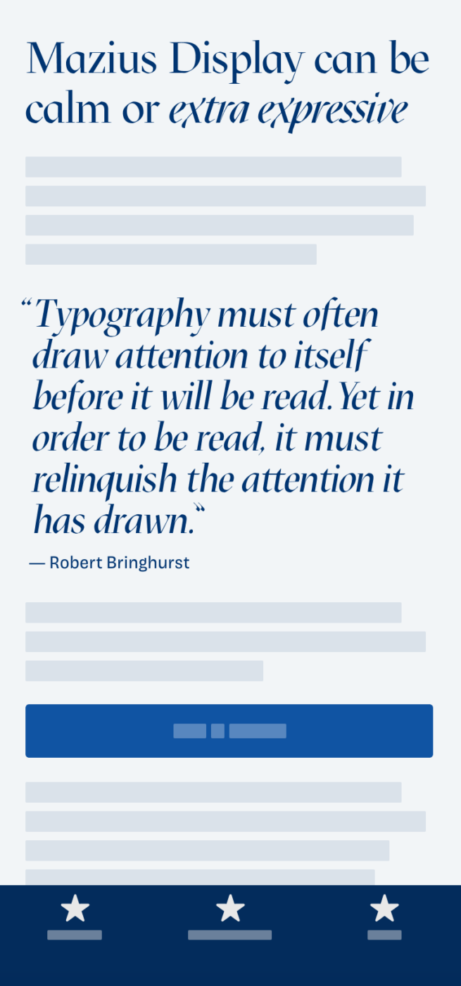
Now as the saying goes, type is a beautiful group of letters, not a group of beautiful letters. It is a system where individual characters become a whole. The biggest influence here has kerning, which is the spacing between adjacent characters. In Mazius Roman it’s mostly okay, but in Italic and Extra Italic it really went wrong. Besides that some characters are missing or false (see the quotation marks), it lets certain words falls apart or become uneven.
Never trust a font, trust your eyes. When you use Mazius Display in a logo, or an image, dare to adjust the kerning manually in your design tool. But this only works, when your text is not dynamic. On a website or app with changing text – forget about it. There it has to work out of the box.
I don’t want to pillory the designer here, after all, this is a free font, open-source even (so you can edit the design files). We don’t know in what state Mazius Display was released, if it’s still in progress or if the designer decided to better put it out there unfinished than never. So when a font does not work in a certain situation, you’ll have to consider if it’s still usable for your project, if you can and want to manually adjust it, or not. Just be aware of the circumstances. And finally, this happens with paid fonts as well. But then you can reach out to the foundry and ask them to fix it 😉.
Update: I really appreciate all your emails and feedback! It motivated me to make a short article on how to fix bad kering.
Font Pairings for Mazius Display
This dynamic, contrasting, serif typeface pairs well with calm dynamic sans-serif typeface Georama.
- Headings
- Copy
Learn more about pairing typefaces using the Font Matrix.
What do you think? Did you ever manually adjust a typeface to compensate for its flaws? Tell me in the comments below!


This is a very good idea, opposite to the usual. Beyond expected, the place where we mostly learn.
Even as a laik, Mazius in each form, especially Italic feels off – unequal, not balanced. Look the word “expressive”, Where X takes up much space while the other part of the word is narrowed.
And elsewhere… I hear E’s saying: “hurry up guys” or “Run y, run!”.
Anyway. Thank you for dissecting it professionally and as said, it’s not to blame the authors, some fonts are just arts. It definitely can be used in graphic design, freestyle branding. Somewhere playful.
Interesting take, very instructive – thanks!
Thanks for letting me know, Benjamin! Happy to hear that 😉.
Very good advice here on adjusting the kerning when necessary. I have done this a couple times recently and it felt like heresy, as though I was not respecting the original intent of the font designer, however it enabled better legibility.
Thanks for sharing your thoughts with me. I felt similar, but as I learned it’s not about the way a font is put out, it’s about what you do with it 😉.