

My thoughts on VCTR Mono
VCTR Mono is a monospace typeface, currently still in progress, but already available on Future Fonts. A monospace often feels very cold and technical, VCTR Mono is different. It was inspired by the engraved text on the lenses of old manual cameras, and still has a certain warmth to it.
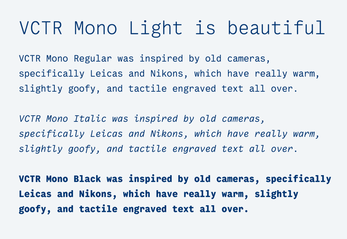
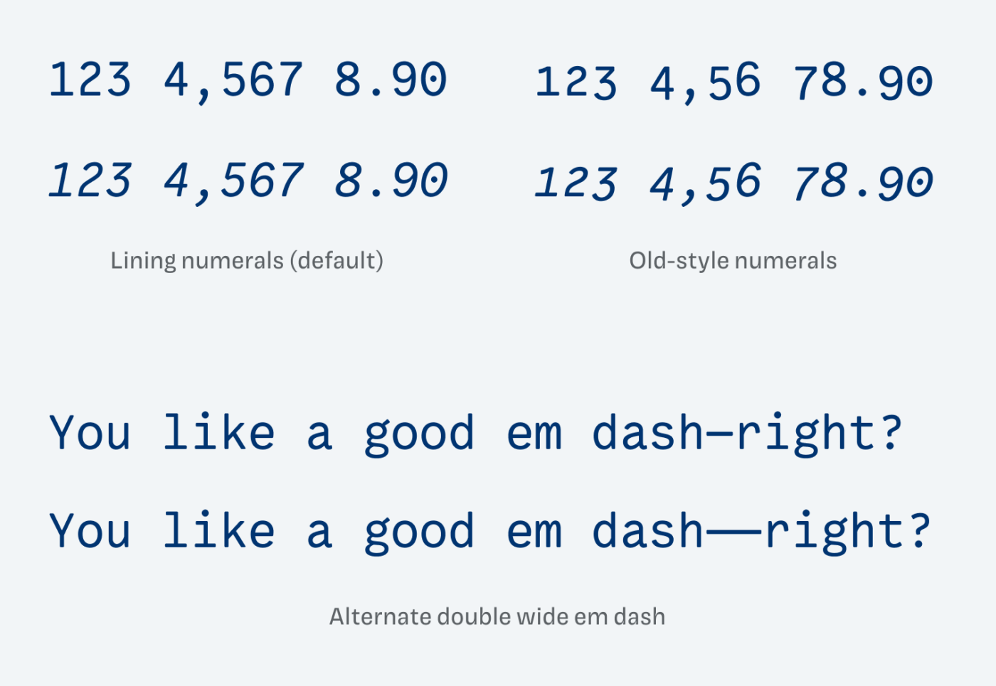
The Light weight has a noble, simplistic look, especially in larger sizes. I love the double story g in its elegance and how the italics are lively, spiky, but not too much. The italic k with the loop makes me happy. Many of these tiny idiosyncrasies are carefully sprinkled in without overwhelming you. Like old-style numerals or an alternate double wide em dash.
When it comes to applying VCTR Mono it’s the same with every monospace font. For coding or drafting content, it’s a good choice. Helps you focus, and it’s very legible. When it comes to long reading text, it also might work, but it naturally needs a lot of space. For display text, it’s hard. A monospaced font just looses its coherence when scaled up in font size. At least you will have to decrease the word spacing, if not the letter-spacing slightly as well. So keep that in mind. I touch on how to treat monospace and monospace alike fonts in this tech blog review.
What do you think? Is VCTR Mono something for an upcoming project? Tell me in the comments below!
Monospace typefaces are my secret love, Oliver! They remind me of an old typing machine and I miss everything vintage (fashion archiver). Not as many uses for monospaced types, however, they have a special charm when put in a certain concept. With mono, everything actually depends on its setting.
Monospaced fonts are practical when you want to bravely arrange opposite styles where mono takes 20-30% of the primary typography group.
VCTR Mono or some other will definitely be chosen for my next -personal website redesign. (i.e. footer)
Cool, curious how your Footer will look like in monospace! Let me know, once you’re done 😉