You know the saying that there are no bad fonts – this is actually wrong (and yes, I said that). On an aesthetic level you can debate, but on a technical level there are some basic requirements. And besides not missing characters, one of them is proper kerning. In this short video and article, I’ll share with you how to spot bad kerning and how you can adjust it manually.
What is kerning?
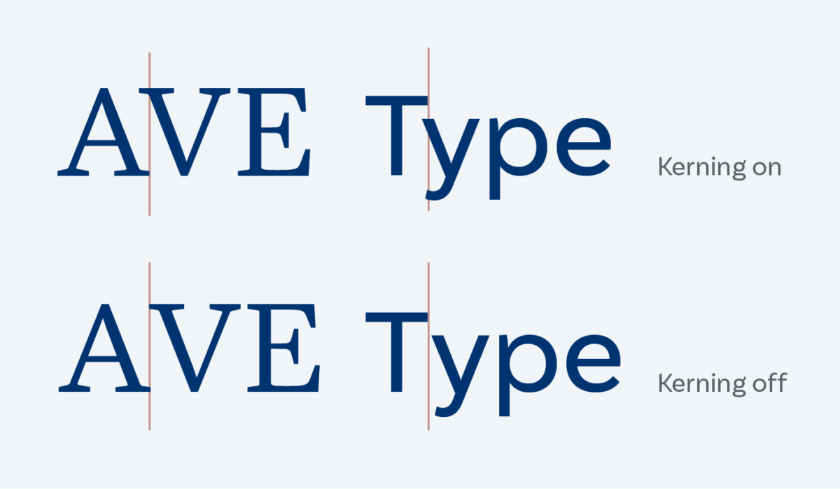
Kering is the spacing between two adjacent characters. Across the whole typeface, it should be perceived as calm and even. Type designers have to address any kind of letter combination to ensure that. They also have to add conditional rules for certain letter combinations, like Ty or AV.
How can you spot bad kerning?
When a certain combination of letters seems to be too close together or too far apart. Always trust your eyes first and not the font. In some cases there are errors, in others the font was not crafted well. But this does not always mean, that you have to reconsider your font choice. In some cases, you just might fix it yourself.
When should you fix it?
If it’s only some static text, maybe for a logo or a short title, then you can manually adjust the kerning in your design program. When it’s about more than five words, pick a different font. Also, if it’s dynamic text in an app or web design. In these cases the spacing should work out of the box, since you can not anticipate the content.
How to manually adjust bad kerning
In Adobe Illustrator, InDesign or Photoshop, click between the specific characters and adjust it by holding the alt key and hitting the left or right arrow key.
In Figma, you’ll have to adjust the tracking for this specific section, since you can not change the kerning.
In CSS, you don’t have a convenient option to adjust the kerning between two characters, except a bulky workaround using span and letter-spacing. But let’s not got there …
Pro-tip for InDesign
After kerning a character pair, copy that pair to the clipboard, search for that pair in body text, and replace every occurrence with the contents of the clipboard. This way the kerning will be applied as well.
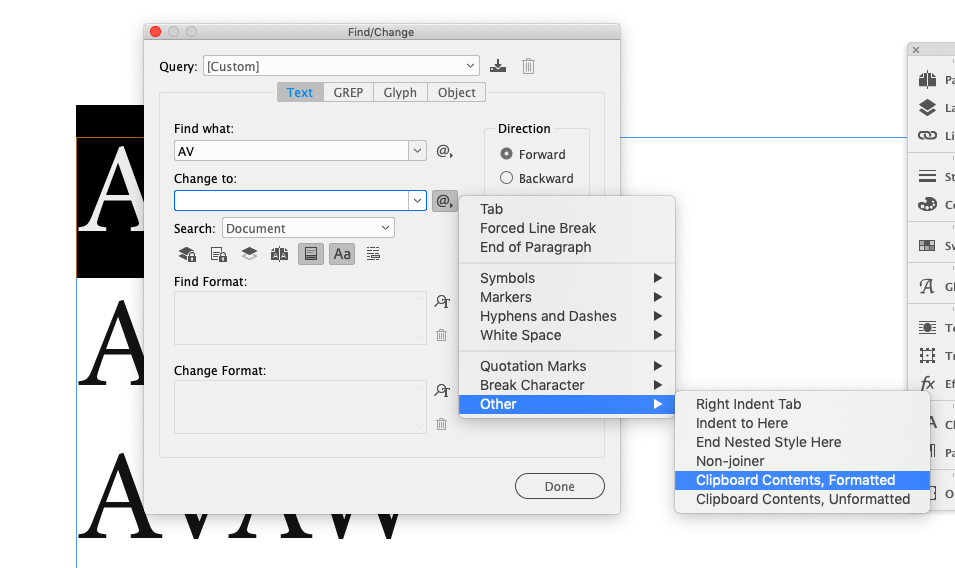
Step by step:
- Copy the kerned “AV” to the clipboard.
- Search for all “AV” in Document, Case Sensitive, and replace with Clipboard Contents, Formatted.
- All “AV” in the document are replaced with the kerned “AV” that was copied to the clipboard.
And there are also some automated ways, like this one using GREP in InDesign by Ralf Hermann. Many thanks to Richard Strauss, one of my lovely newsletter subscribers, for providing screenshot and for sharing this.
Adjusting the font files
You could also adjust the font file, if it is open source or allowed by the designer (always check the licensing here). I won’t go there, since this is something I’m not an expert in, but maybe I’ll take a look at that in an upcoming article or video. If you are interested in that, let me know!
The whole issue came up with Mazius Display, one of my Font Friday recommendations. Thanks a lot for all the comments and emails! If you want to learn more about spacing text, also covering tracking, check out this video and article: How tracking and kerning improves all caps text.
What do you think? Do you manually adjust the kerning of a typeface? Let me know in the comments below!