My thoughts on Gelasio
Before web fonts gifted us with the glory of typographic individuality, you only had a handful of pre-installed fonts to choose from. One of my favorite system fonts is Georgia – it’s classy, but not dusty. Such a wonderful text typeface with a large x-height and great legibility. While Georgia was ubiquitous back then, things have changed, and it is harder to use nowadays. This is because Android doesn’t come with any of the common system fonts. So no Arial, Verdana, Times New Roman or Georgia for roughly 45% of global internet users.
Gelasio to the rescue! The typeface was designed by Eben Sorkin, who is also behind popular Merriweather. It is metrics compatible with Georgia, so you can switch between these typefaces without having to worry about reflow. Why is this important? As mentioned before, Georgia will be replaced on Android with Noto Serif, the operating system’s default serif font. And this looks quite different and also needs more space (see above).
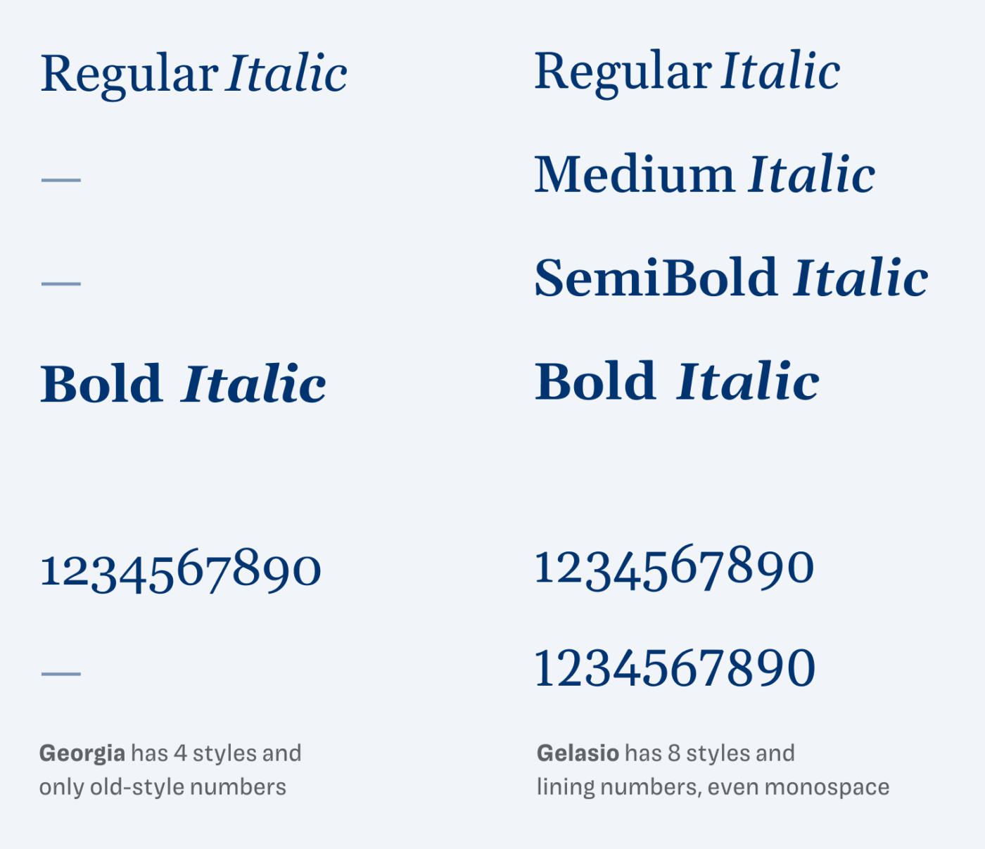
So if you have a website that is already set in Georgia, use Gelasio as the fallback to make it more consistent across platforms. Or better only use Gelasio, since it comes with more styles and also additional numbers (not only old-style figures).

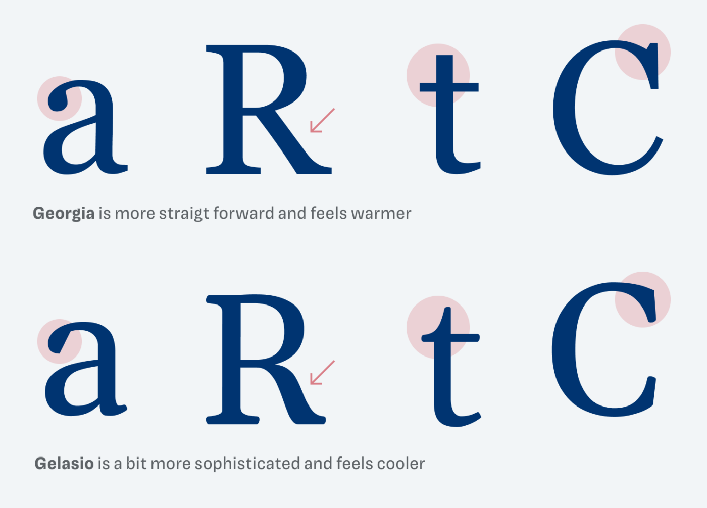
Even though both typefaces are very similar, there are some difference if you look for them. Georgia is simpler and warmer, Gelasio is a bit stricter and more sophisticated. This only really sticks out, when you compare the details. Overall, I think Gelasio is a great continuation of the spirit of Georgia, available as a modern web font with more styles and ideal for long format reading. So give it a shot for your next blog design, maybe?

Font Pairings with Gelasio
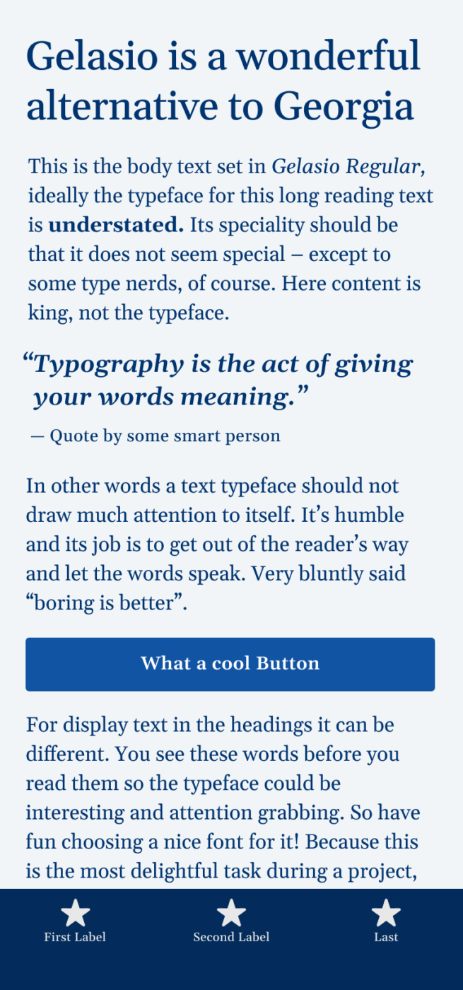
Gelasio is a rational, contrasting serif typeface. If you look for something more striking in headings, pair it with or one of my other suggestions.
- Headings
- Copy
- UI Text
Learn more about pairing typefaces using the Font Matrix.
What do you think? Is Gelasio something for an upcoming project, or do you have a font recommendation? Tell me in the comments below!


I really love your weekly Newsletter with all those free and valuable font-suggestions! Besides that I love your humor! You always conjure up a smile on my face … and that’s the best right before the weekend! Thank you!
Your comment made my day! Thank you so much, Nicole 😍. Glad you have fun reading them, I smile when writing them.
Thanks again for your Font Fridays! There are times when I want to use Georgia in projects but feel like I am neing lazy and not creative. Thanks for highlighting this alternative, will try this out when we have the urge to use Georgia again.
Yes, go ahead! 💪 And share it with me, once it’s out!
It depends on the context! Some classic fonts surprise us in a totally different environment that you might not even recognize.
No kerning is a deal breaker.
Fair enough and thanks for bringing it up, Steve.
Definitely not ideal in some cases. In most situations the serifs make it less problematic, but of course (especially in German) where there are a lot of caps used, it can be troublesome.
On Github I see that there are plans to add kerning, but it’s uncertain when.
Probably because Georgia doesn’t have kerning (or didn’t—Georgia Pro apparently does).
Hi Oliver!
Interesting timing to present a nice alternative for Georgia! You warned us, grateful subscribers to your much appreciated FontFriday mailings, several times for typing mistakes you might overlook, so I am happy that you did not accidentally used the name Giorgia.
About the Gelasio alternative: I do like Georgia but as I would probably use it for body text in a font size close to 16px, Gelasio’s benefits would for me be mainly be in its additional features. like tabular numbers.
Hooray, no typos in the name 😉. 16 px is a good value for this typeface to start at. If you need something like Georgia cross-platform, Gelasio is a good choice. Or using the web fonts of Georgia, if they are available.
Whenever I see Noto Serif I think of someone, maybe a horse, with a big jaw and overwhelmingly big teeth.
Pardon my comparison, no upon intended.
Georgia is a gentle lady, her beauty shines despite the years.
Gelasio is so compact but I’d love that is softer, feminine-like. Georgia has a soul, white Gelasio is a modern techy guy. But it’s okay Oliver, I’ll use it! Better than Playfair Display anyway😣
Cheers! For 15€ you’d get 5 beers in MNE😜
Wow, five beers! I’d have to come there. 🍻 In Austria it’s around 3 beers. As always, I love your descriptions. So tangible. 🤩
I used Georgia in a PPT today for the headings (with Verdana for body – decided to have a Matthew Carter phase) but still time to change before the presentation. Will try this one for comparison. Looking forward to whether PPT uses the old style or lining numbers.
Cool! I thing it will use the lining numbers, Stephen, which are the default one in Gelasio. However, you can change them in PPT too.
Great font. Georgia is better that Times New Roman for me 😉
But in my blog i use Lora.
Shapes is some similar like Gelasio in letter K, R.
Cheers!
Absolutely. Lora is nice as well, and feels a bit more contemporary. Good choice, Łukasz!