My Gambetta Font Review
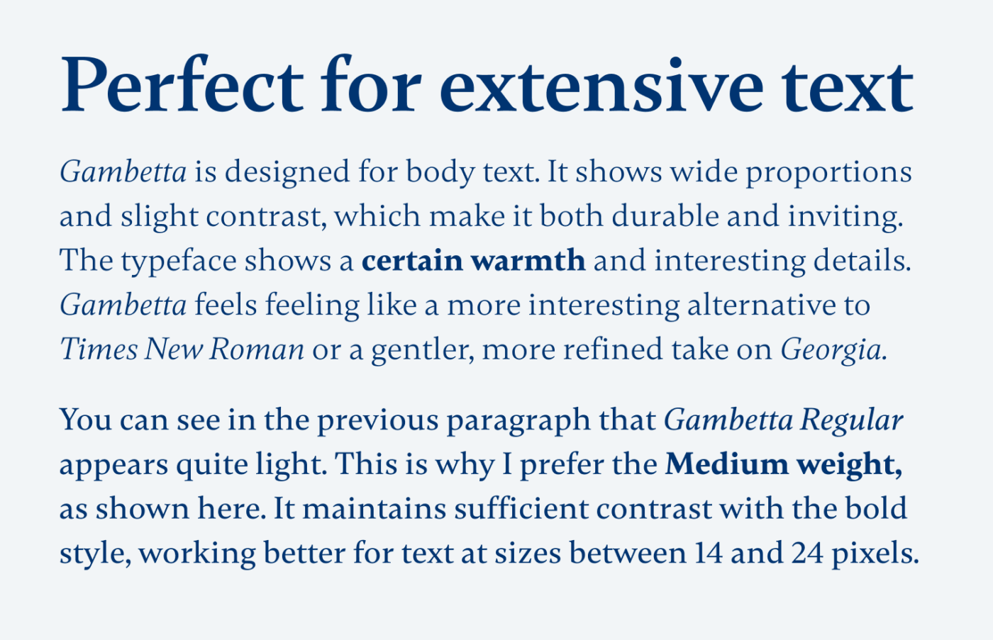
We live in a sans-serif world. But when it comes to extensive text, serif fonts still lead the way for immersive reading. Let me introduce Gambetta, a wonderful free font that will make your text look so much … betta 😉. Its wide proportions make it durable, while the slight contrast adds a touch of elegance without feeling old-fashioned.

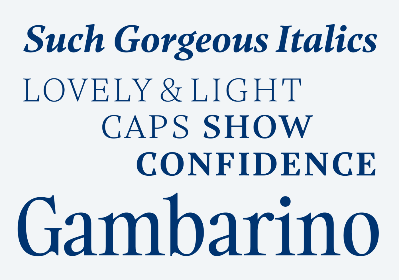
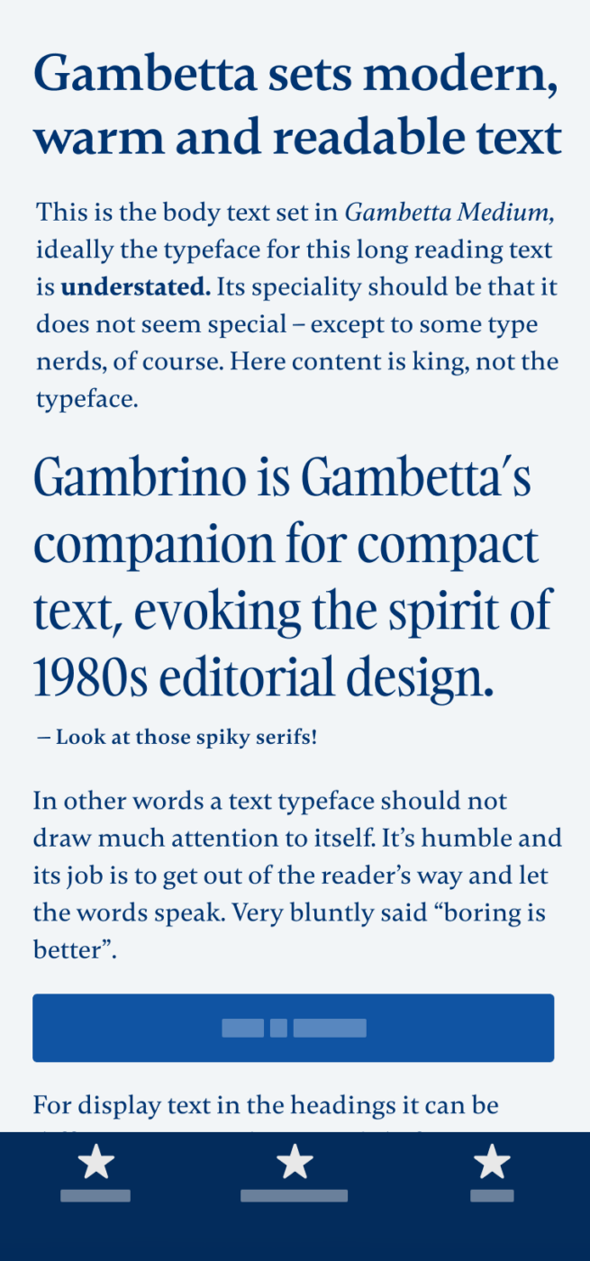
Even though Gambetta is made for body text, it also works for smaller display sizes. But if you’re really going big, choose its companion Gambarino. It’s a narrower and shaper serif font tailored for display purposes.

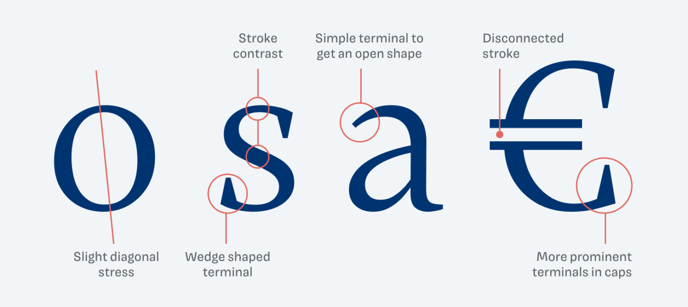
Examining Gambetta’s details reveals its characteristic slight diagonal stress and stroke contrast. It features sturdy wedge-shaped terminals, particularly pronounced in the capital letters. However, at times they are removed, as in the lower case “a”, to maintain a simpler, more open shape.

So next time you feel tempted to use Times New Roman or Georgia, why not giving Gambetta a shot? Try it out and see how it transforms your text with a contemporary flair, while retaining the classic appeal of a serif font.
Font Pairings with Gambetta
Gambetta is a dynamic, contrasting serif typeface made for copy. For headings and large text, pair it with Gambarino, or one of my suggestions below.
- Headings
- Copy
Learn more about pairing typefaces using the Font Matrix.
Is this a font for you? Write it in the comments Also, if you came across another typeface that I should review in the future.


These terminals are gothic-y Oliver. And the contrast is big, you can see it in a Regular weight when it fails to deliver a readable experience.
I love the light all-caps option! And companion Gambrino has little “a” almost the same as the EB Garamond.
Gambetta requires adjustment in spacing – between the letters – otherwise, those terminals gonna catch on each other 😉
PS I don’t know why we get 1/2 of the Newsletter in our inboxes. Maybe that’s the “formula” but I’d love to immediately land on your lovely website and enjoy reading! For me, link is just enough