

My thoughts on Avona & Avona Serif
Alanna Munro says behind the design of Avona lies the question “If a font were magicked into existence, what would it look like?”. And it truly conveys that magical vibe. You can see it was inspired by fantasy games and calligraphy, and it is aimed toward flavorful user interfaces.
I appreciate the combination of its two different styles, Avona and Avona Serif. This gives you the flexibility to best express your typographic voice. Avona is a display typeface for your headings, or titles with interesting and lively shapes. It immediately draws you into a medieval fantasy feeling, and prepare you to slay a dragon. In the spring of 2021 it only supports English, but Alanna announced to extend the character set by fall.
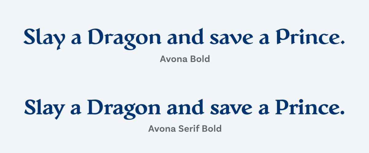
Avona Serif for you running text is calmer, but definitely not quiet. It performs well for some paragraphs, not being too distracting. For super text heavy applications, like a blog, I think it would be too striking. And the typeface has pretty wide proportions, which means it need more space. For functional text in your UI this is rather unusual. But it always depends on your project. It still has a sturdy stroke a large x-height and is well readable. If your labels aren’t that long, you won’t have a problem, my fellow knight. It supports 219 different tongues, and comes with all sorts of OpenType spells.
If you take one thing from this post: it does not always have to be a sterile sans-serif for an interface or functional text. At times, it pays off to be brave, go out there and face the dark powers of bad typography – with proper type.
Font Pairings for Avona
Avona is a quite dynamic typeface. If you are looking for a contrasting, more modern body text, I recommend pairing it with geometric Gabarito or Gratimo.

- Headings
- Copy
- UI Text


Learn more about pairing typefaces using the Font Matrix.