My Bay Sans Font Review
At first sight, you might think that Bay Sans is like many other sans-serif fonts. Just another Helvetica or Roboto, right? Wrong! Because this typeface has so many interesting twists and pleasant options, that I can’t wait to tell you more about it.

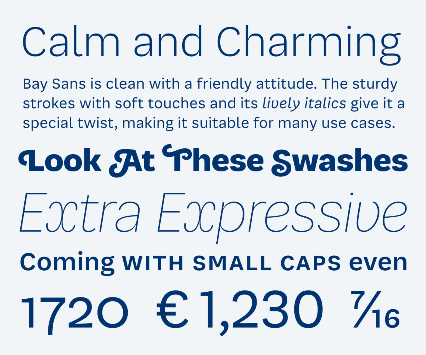
Bay Sans combines friendliness and versatility with a distinctive personality. Take for instance the optional swashes at the capital letters, followed by lively italics, small caps and charming numerals. These all add a certain finesse to your designs. But to see how interesting Bay Sans actually is, let’s compare it with boring conventional Roboto.

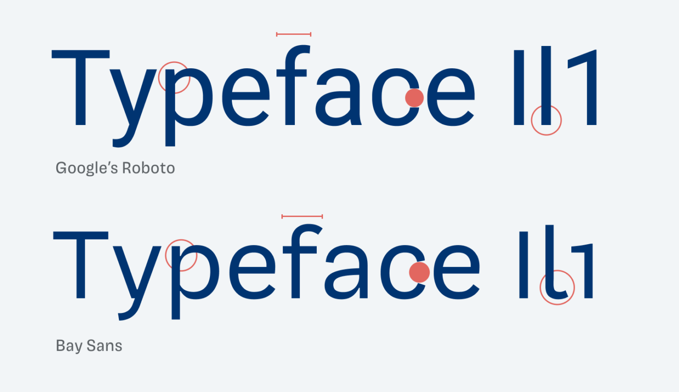
Other than Roboto, Bay Sans shows a little stroke contrast (see the “p”), has wider proportions (compare the “f”), more opened shapes (look at the “c”). It is also more legible thanks to the hook at the lowercase “l”. Another interesting design decision are the default old-style numerals (which can be changed).

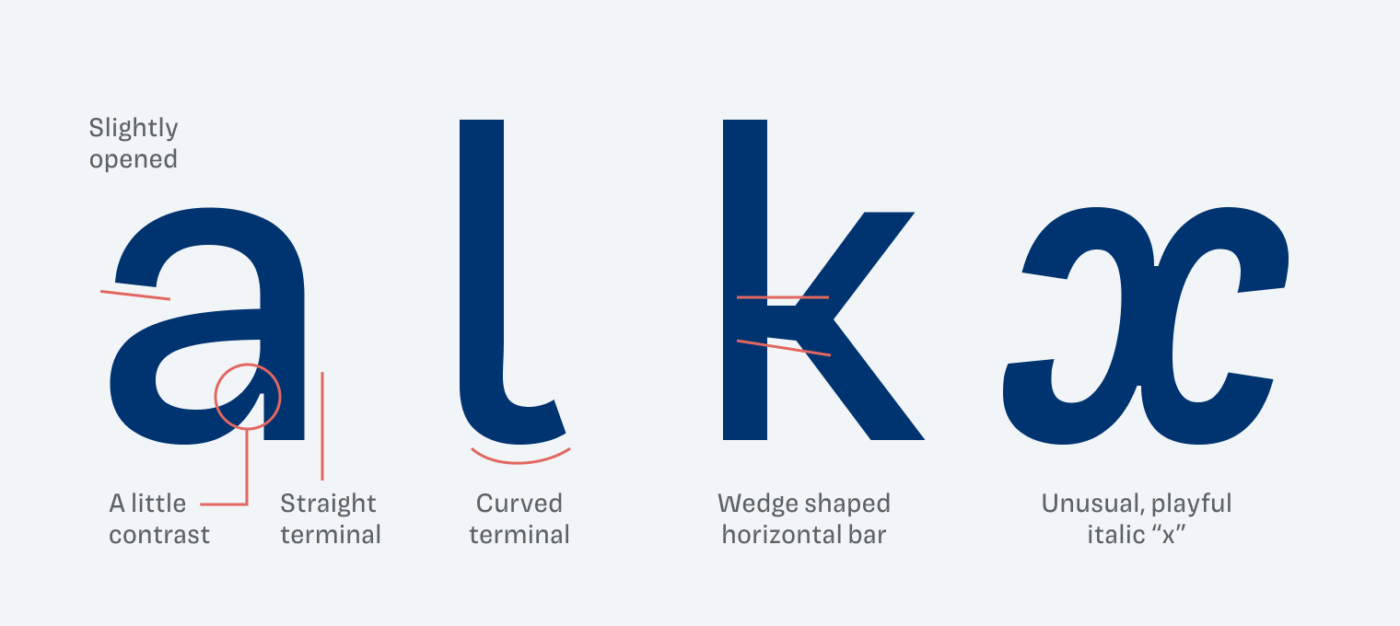
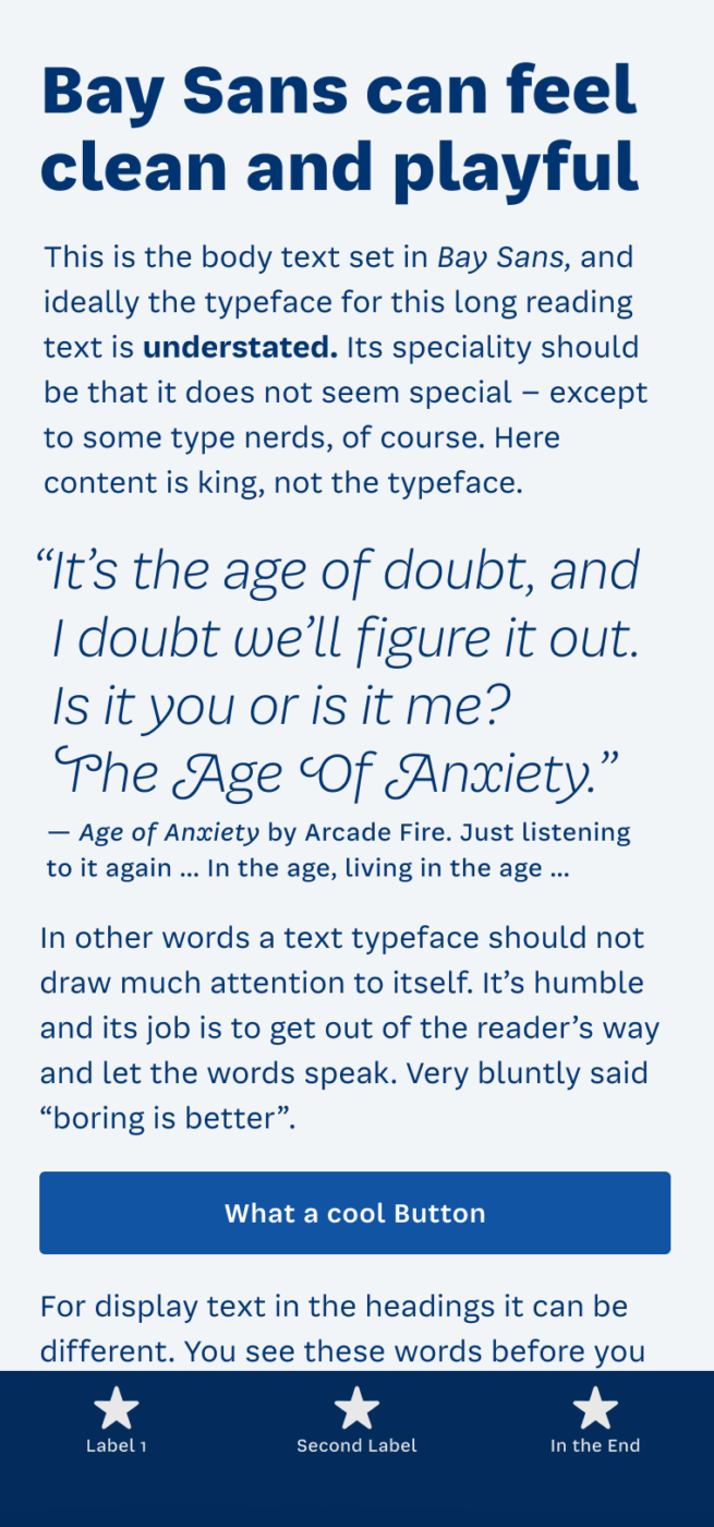
Examining Bay Sans’ details, so many delightful peculiarities stand out. Many already show in the lowercase “a”, which manages to be sober and friendly at the same time. Overall, this typeface is a wonderful balance between functional and interesting. And thanks to the option to tailor it to your needs by activating or deactivating certain features, you can make it ideal for large headings, copy, or small functional text.
Font Pairings with Bay Sans
Bay Sans is a rational, linear sans-serif typeface. Pair it with Thunder for bold headings or one of these suggestions.
- Headings
- Copy
- UI Text
Learn more about pairing typefaces using the Font Matrix.
Thanks to Lorcan, who spotted Bay Sans and recommended it to me. If you want me to review a typeface, tell me in the comments!


Thanks for the nod. Really lovely italics. I am using their calm and smooth Sharf for text for the moment (which has a very nice display companion).
What’s not to love about such a comprehensive typeface!? Bay Sans is looking cool, even, stable, confident, on the edge of the friendly but also professional. Little A and E are the letters with the most coolest vibes. They are simply indifferent 😅
Why there is no option to save/vote favorite font on your web and att he end of the year we see which 3 fo ta got the most votes, hmm Oliver?
What a great idea to do a vote! Let’s see if I get around to doing it 😉.