
My thoughts on Apfel Grotzek
Luigi Golero, the designer of this week’s pick, is co-founder of Collletttivo. A non-profit group of people sharing their interest in type design and distributing free Open-Source typefaces. I like their vision, and you immediately get the vibe of experimentation on their website with plenty of cool fonts, mostly made for display text.
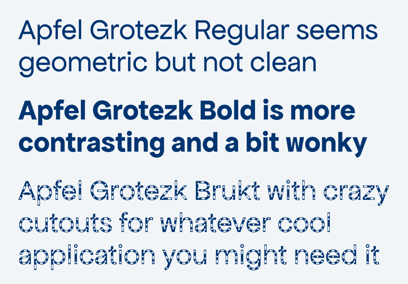
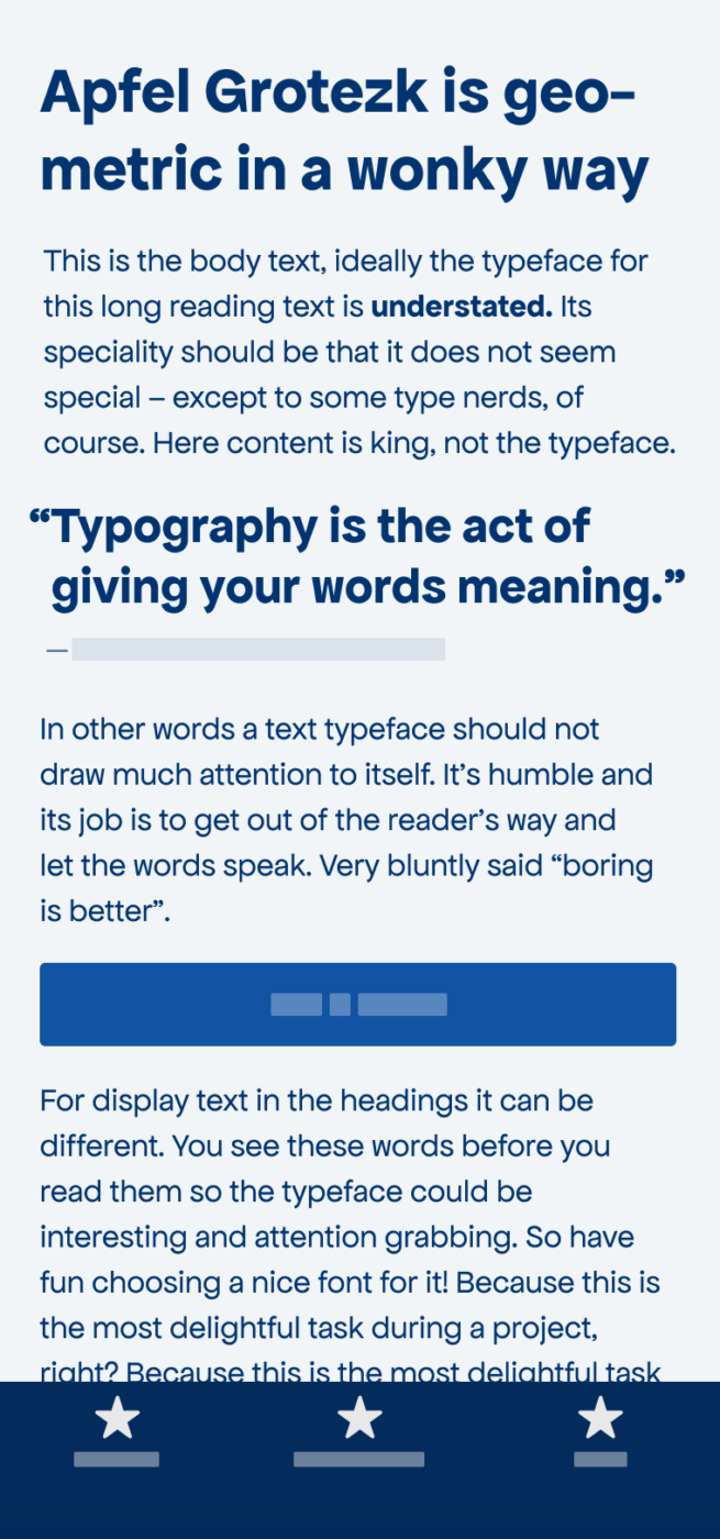
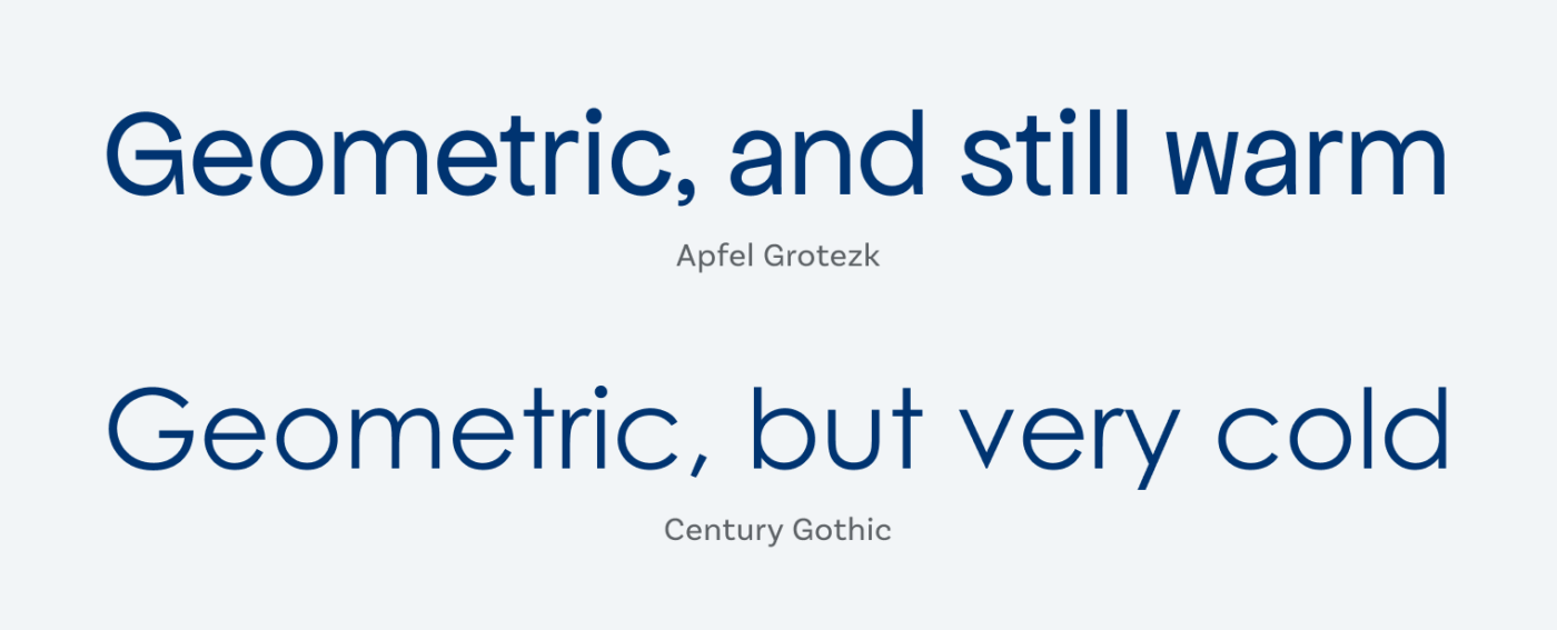
Apfel Grotezk is a rounded, geometric sans-serif with easy curves and a friendly attitude. But what does this type specimen bullshit bingo mean? Geometric? Easy curves? What? Let me show you by comparing it to popular Century Gothic from 1991. Century Gothic seems very mono-linear, exact, clean, and is also wider. Apfel Grotezk comes with better distinguishable letter shapes, like a serif on the t, or a double storey a. The curves are easier, less circular. In the bold weight, Apfel Grotezk is more contrasting (see the diagonal stroke of the z). These all are features that make it geometric, but not cold.
The Regular and Bold weight will work for a good amount of body text, although I would not use it on super text-heavy applications, since the typeface still needs plenty of space. The recently added punched Apfel Grotezk Brukt is marketed by Collletttivo as to reduce the amount of ink used in printing through the cut-outs. Yeah … I don’t really think that it has that much impact, but I like the style! Below 40 px font size, it definitely becomes too fuzzy, so only use Brukt for a cool short title or headline.
Recommended Font Pairing
Since Apfel Grotezk is best for headings or a little body text, a more versatile geometric sans-serif would be a great match for functional text. You could something like Figtree here. For long body text, a contrasting combination with Newsreader would work.

- Headings
- Copy


Learn more about pairing typefaces using the Font Matrix.
What do you think? Is Apfel Grotzek something for an upcoming project? Tell me in the comments below!
They are not only generous but their creativity shines bright! I’ve just visited Collletttivo’s site and Insta page. Seeing these fonts in unexpected action, animations and designs are a win-win to distinguish as a typo brand.
Apfel Grotezk isn’t my taste but I’ve found another in their palette. Despite, your comparison with Century gothic brought me closer to understand its specialty. Gorgeous!
Glad Collettivo inspires you as well. It’s always about how things are relative to each other, isn’t it 😉