This topic regularly pops up, and it was one of the most popular questions I got: Are fonts for dyslexia any good? Should we use Comic Sans or Open Dyslexic from now on in our designs? In my conversation with type designer Eleni Beveratou, we get to the bottom of things and bust some myths.
TL;DR: So-called dyslexia friendly fonts perform worse than other typefaces, while conveying an either broken or playful aesthetic that might not fit to your project. As a rule of thumb, prefer more common typefaces with a looser spacing, open shapes, and distinct letters.
What are dyslexia friendly fonts?
It is estimated that 1 out of 10 people have dyslexia, and 70 to 80% of people with poor reading skills, are likely dyslexic (source). So this is a huge topic. Dyslexia itself is not a disability, it is a learning disorder, affecting either reading or writing to different degrees. I myself have a mild form of dyslexia, which you can spot in my regular typos 😉, that especially occur when I’m typing.
There are plenty of typefaces out there that claim to be helpful for people with dyslexia. To give you a quick overview, I collected some of the most popular ones and put them in two groups:
1. The broken look
Dyslexie started the trend with this quite broken looking design, followed by a quite similar free font called Open Dyslexic. These typefaces contradicting almost everything we know about harmonious type design. And that is their point. The claim that mirrored letter shapes of b, d, p, q are most problematic, and so they make them very distinct, add a certain bottom-heaviness to all letters. They also add more space, so the text tend to be looser.
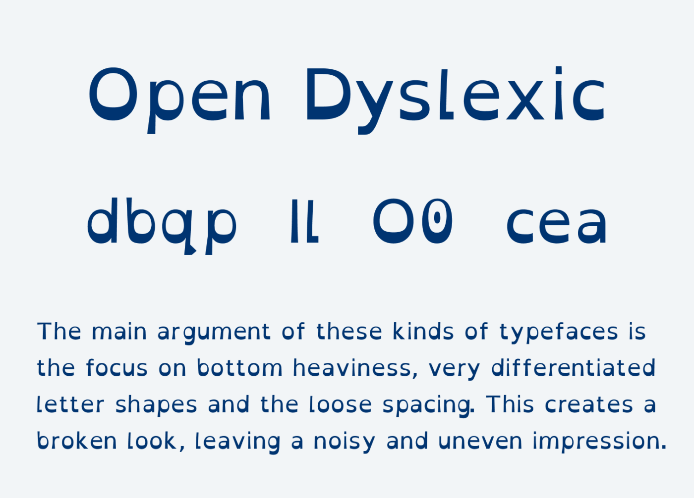
This all results in this grungy look. And this is where I have a problem. It seems to demand that this aesthetic is good for dyslexic readers. But it can be off-putting to everyone else.
2. The Comic Sans look
On the other hand, we have typefaces like Lexie Readable and first and foremost Comic Sans, which is often claimed to be more accessible for people with dyslexic traits.
“Research has shown that it [Comic Sans] reduces cognitive load and visual processing issues, which are common challenges for people with dyslexia.”
Comic Sans: The Dyslexia-Friendly Font, Dyslexichelp, March 2024
This is based on the looser spacing, the differentiated letter shapes. The well-made campaign from Dyslexia Scotland explains this in detail, by emphasizing Comic Sans’ features. But it also could be the friendly, playful aesthetics of the typeface that take the seriousness out of text.
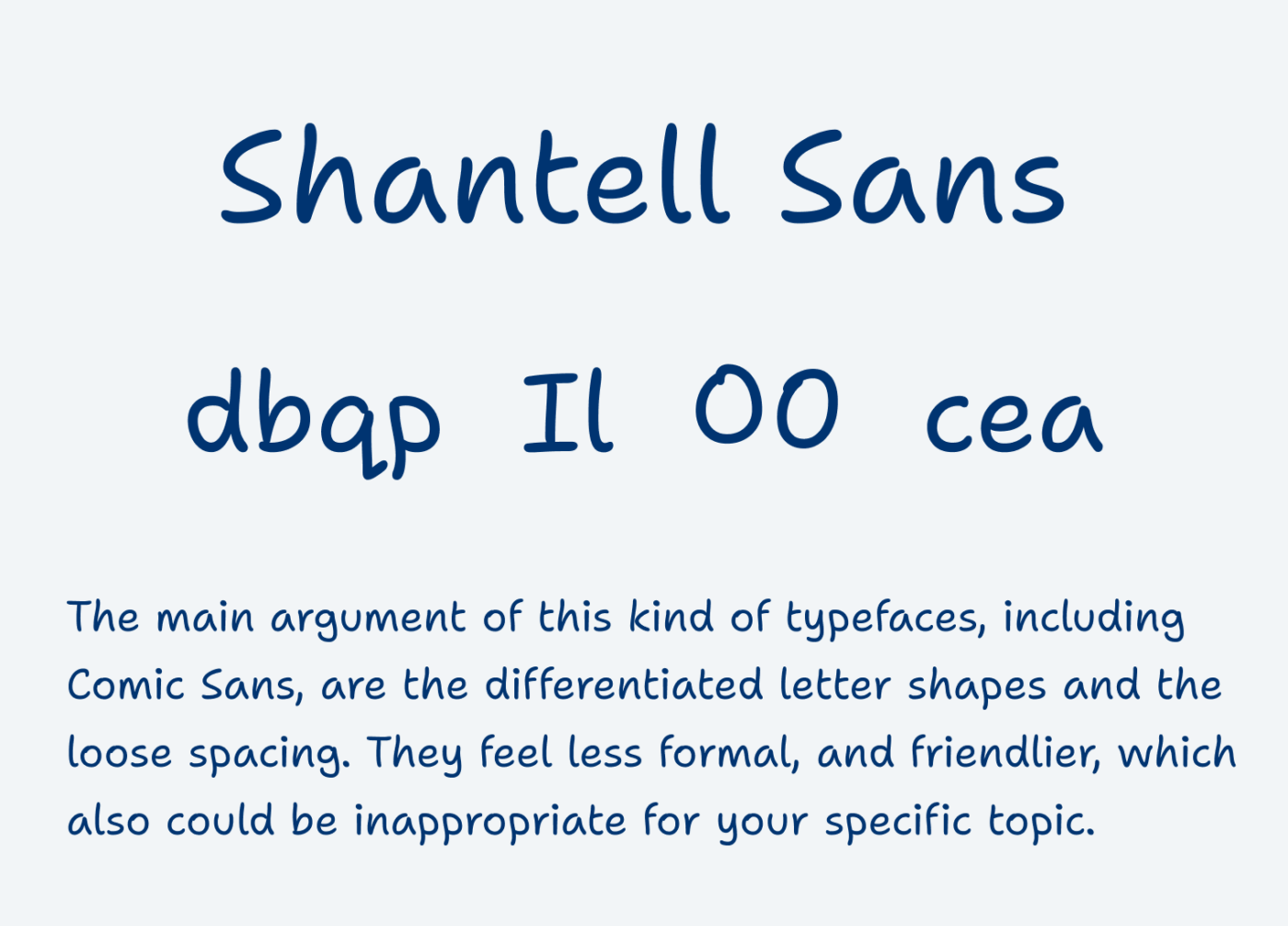
Shantell Sans, a handwritten style typeface by the artist Shatell Martin (read my font review) also follows that idea, but it is way better executed than its source of inspiration. But then again, this look might not always fit to your project. So what should you do?
Be skeptical
In our conversation, type designer Eleni Beveratout says she is always skeptical about typefaces that claim to “save the planet”. She says we want to do the right thing, and include as many people as possible. Then we tend to pick fonts that seem to be “approved” as suited for dyslexic people.
However, the research often compares a typeface with Arial, which is not hard to beat in terms of accessibility. Mostly because Arial’s spacing is horrible, and the letter shapes are quite closed (more on this in the complete talk with Eleni).
Dyslexia friendly font perform poorly
The Readability Group, conducted a survey with 2022 participants, of which 35% claimed to have dyslexic traits (from mild to strong).
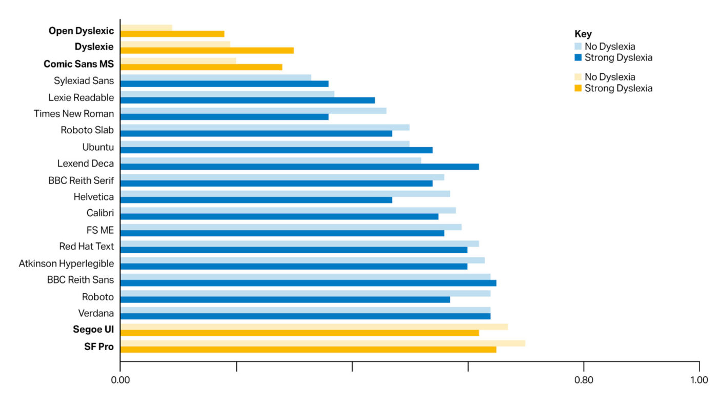
They found out that the typefaces Open Dyslexic, Dyslexie and Comic Sans MS were more popular for people that classified themselves with having strong dyslexia, compared to people with no dyslexia. However, these typefaces still were the least popular ones, even for dyslexic people, and especially for people with no dyslexia.
Many studies show dyslexia friendly fonts offer no advantage
The survey from the Readability group focused on preference and did not measure accuracy or reading speed. However, many studies have examined the actual reading benefits of different fonts.
The 2017 study “Dyslexie font does not benefit reading in children with or without dyslexia“ showed that children with dyslexia did not read text written in Dyslexie font faster or more accurately than in Arial.
The study “The effect of a specialized dyslexia font, OpenDyslexic, on reading rate and accuracy” from 2016 found that Open Dyslexic did not improve reading rate or accuracy for participants with dyslexia. The research found no evidence that the font had a positive effect on reading speed or accuracy than Arial or Times New Roman.
The results of the study “The Effect of Font Type on Screen Readability by People with Dyslexia” suggest that commonly available fonts are more effective than specialized dyslexia fonts like Open Dyslexic. It found that Open Dyslexic did not improve reading performance for people with dyslexia and was less preferred than standard fonts like Arial, Helvetica, and Verdana. Sans-serif, monospaced, and roman fonts were the most readable, whereas italic fonts – especially Open Dyslexic Italic – significantly reduced readability.
There are better typefaces out there
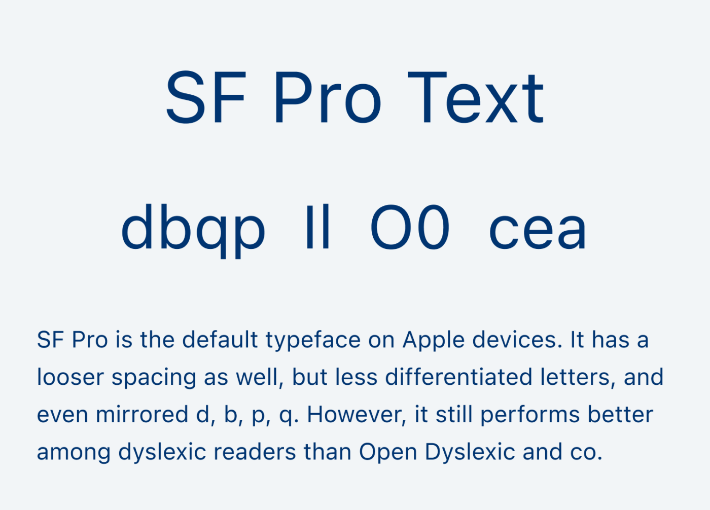
The survey also shows that there are much better typefaces out there that suit people with dyslexia. The top were SF Pro, BBC Reith Sans, Verdana and Segue UI. But there are a lot of different things to consider, and they all interplay. The Mirrored letter shapes of b, d, p, q might not be as crucial (SF Pro has them, but it performs best here).
What really matters
More relevant are these things:
- Good spacing: so that letters are not cramped
- Open shapes: open c, e, and a
- Differentiation between l or I, O or 0
Of course, so-called dyslexia friendly fonts can be helpful for some people on an individual basis. People are diverse in their preferences, and one solution can never satisfy all. But as a rule of thumb, don’t choose them over other legible typefaces, that also performed better by people without dyslexia.
This is why I recommend picking a more common looking typeface that works for the mood of your project and continue from there. Because if the dyslexia fonts repel more people, it works against the goals of accessibility. To make it better for everyone. And isn’t that what we want?
Also, a study from 2018 showed increase of inter-letter spacing may improve reading performance of dyslexic readers by reducing visual crowding. However, these results have been difficult to replicate.
If you want to learn more about this, check out my complete talk with Eleni Beveratou. Here is also a good summary by the A11Y Project about the myth of dyslexic fonts.
Given San Francisco’s (and Roboto’s) results, Inter should do very well.
And with disambiguation enabled (ss02), it should be even better.
But it’s easy to say that without real tests…
Absolutely, Nicolas. The disambiguation feature is one of the best things about it! Recently I posted a review on Inter 4.0, video will come up too 😉.
Sadly I am missing Atkinson Hyperlegible and ABeeZee in the survey – maybe they’re new. Otherwise I find the result of a comparison of ugly freefonts with widely used professional fonts quite predictable. But I think the warning about well-intentioned fonts is a good one.
Aktinson Hyperlegible is in that list, ABeeZee not. But it’s a great typeface too!
I highly recommend this talks, they helped me understand much more about the subject:
– Busting the Dislexia myth by Dalton Maag
– What Makes a Typeface Legible? Ask Science & Letterform Archive
I wonder how the font “Grace” by font foundry 2K/DENMARK does. It is designed to be readable for people with dyslexia and is actually used in print in some Bibles, but is way more subtle than OpenDyslexic or Dyslexie. Sadly, its license is purely commercial, which is why the only place you see it are 3 Bibles by two big publishers.
Interesting read, but some of the language issues made it harder for me to follow. Two smaller issues: you left the L out of dyslexia in one usage. Also, I believe you meant aesthetic (look) not acetic (acid)?
Thanks R! Yes all typos 😅. Fixed them.
I’m excited to try this! I am dyslexic so thought I could verify this!
All this important information is very helpful especially for people like me!!
Thank you for all you do!!