Why Quicksand is bad for UI Design

Don’t trust ChatGPT when it comes to typography. Besides all the save, overused, boring typefaces it suggests, it can clearly guide you in the wrong direction. This short video and article shows you what to focus on in your font choice, by comparing Quicksand with a much better free font.

Pick a font, ChatGPT!

I asked ChatGPT what font I should pick for UI design. After it recommended the familiar, overused typefaces like Roboto or Open Sans, I asked it to give me something more interesting for UI design. Its first suggestion was Quicksand 😳.

Something more interesting maybe for UI design?
Sure, here are a few less well-known, unique fonts that could add an interesting touch to your Ul design:
1. Quicksand: A sans-serif font with a playful, rounded look that can add a fun, friendly vibe to your design.
2. Nobile: A sans-serif font with a clean, modern look and a range of weights and styles, that offers a refined and sophisticated feel.
3. Museo Sans: A sans-serif font with a clean, neutral look and a range of weights and styles that can add a minimalist touch to your design.
4. Cantarell: A sans-serif font with a clean, modern look and a range of weights and styles, with a slight organic feel that can add warmth to your design.
5. Fira Sans: A sans-serif font with a clean, modern look and a range of weights and styles, that offers a distinctive touch with its slightly flared terminals.
Quicksand is interesting, but very inappropriate when it comes to UI design.

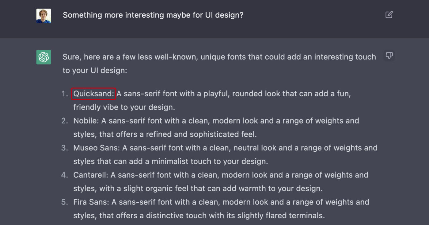
Sure, Quicksand is playful, fun and friendly. It might work well in a heading, but it is inappropriate for UI design.

Why Quicksand is a poor choice

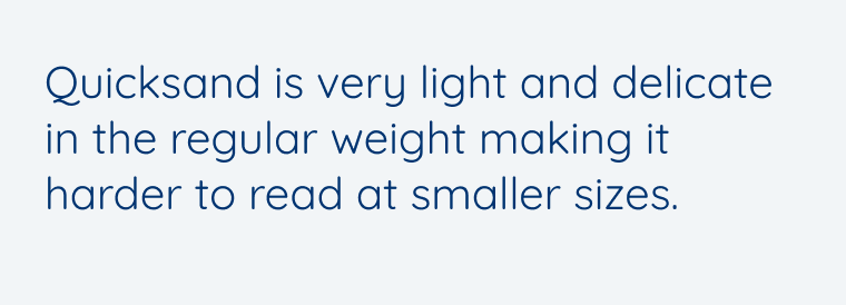
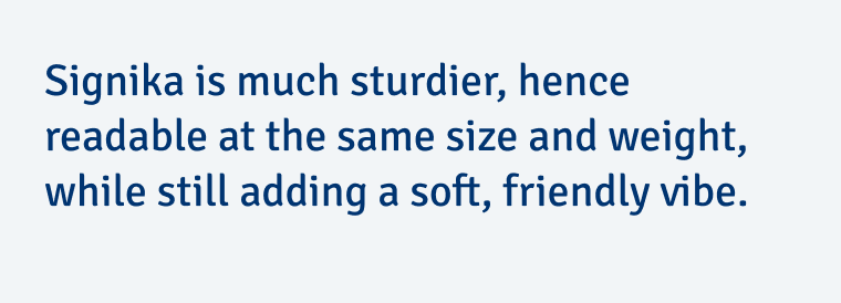
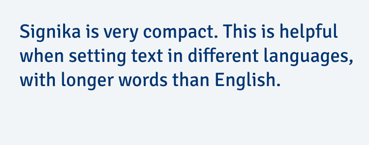
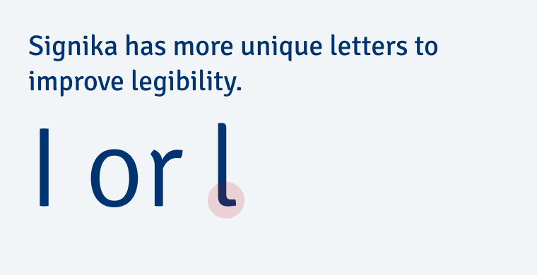
To make it clear, why Quicksand is not ideal for UI design, I compare it to Signika. This is another Google Font that is more suited for user interfaces, while also adding a friendly vibe to your design.

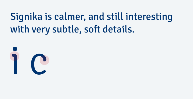
1. It’s too light and delicate

Quicksand is very light and delicate in the regular weight making it harder to read at smaller sizes.
😕 Quicksand is too light.
Signika is much sturdier, hence readable at the same size and weight, while still adding a soft, friendly vibe.
😃 Signika has better contrast.

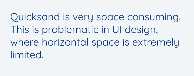
2. It’s too space consuming

Quicksand is very space consuming. This is problematic in UI design, where horizontal space is extremely limited.
😕 113 characters set in Quicksand.
Signika is very compact. This is helpful when setting text in different languages, with longer words than English.
😃 113 characters set in Signika.

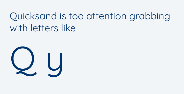
3. It’s too striking

Quicksand is too attention grabbing with letters like
Q y
😕 Quicksand has too striking letters.
Signika is calmer, and still interesting with very subtle, soft details.
😃 Signika shows interesting details.

4. It’s too geometric

Quicksand is very geometric, which is problematic for readability.
😕 All the top shapes look the same.
😃 Not all the top shapes are similar.

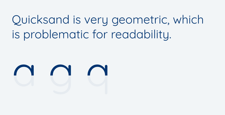
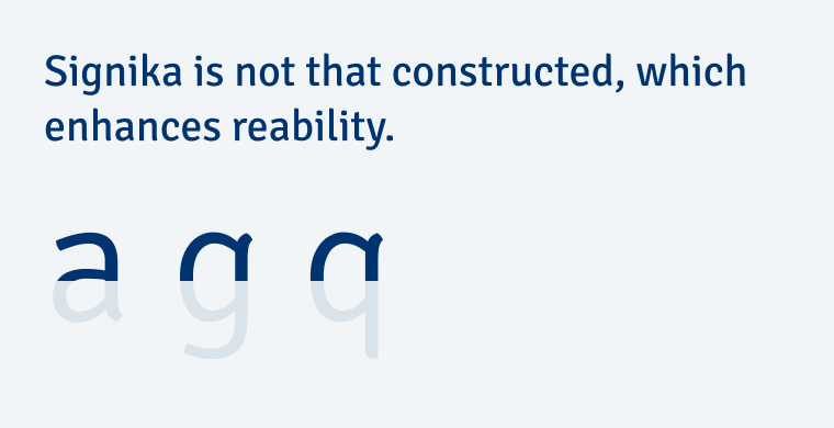
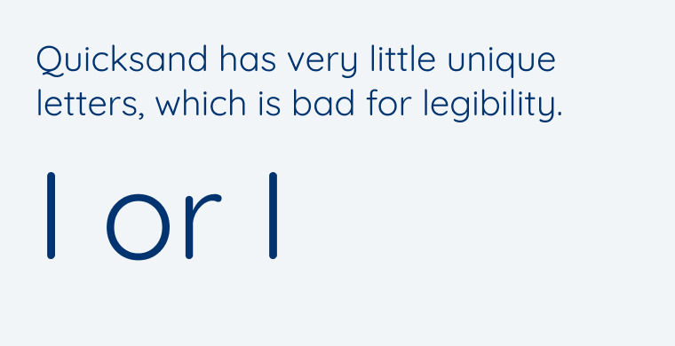
5. It has poor legibility

Quicksand has very little unique letters, which is bad for legibility. I or l
😕 Some characters are easy to distinguish.
Signika has more unique letters to improve legibility.
lorl
😃 Signika has more unique letter shapes.

What does this mean for your UI design?

When choosing a font for UI design, you should pick something that fits the mood of your project, is interesting, but not interesting in a way that it becomes distracting. Learning from Quicksand, I recommend a typeface that has the following features:

  • It is contrasting enough in Regular and has a linear stroke.
  • Is it rather narrow and space-saving.
  • The interesting parts lie in the details.
  • It has unique letter shapes.

Use AI tools as a source for inspiration, but you will have to decide if its suggestions make sense. And you can best do that by training your eye. One tool to do that is the UI Fonts Checklist or in the free UI Typography Webinar.


ChatCPT’s other font suggestions also have their flaws. If you’re interested in my assessment of them, tell me in the comments below!

Typographic power to your inbox

  • Font Friday: I recommend one typeface per week, free fonts included.
  • Type Tuesdays: articles & videos that up your design game.
  • Join 2500+ typography enthusiasts, unsubscribe anytime.

Leave a Reply

Your email address will not be published. Required fields are marked *