
My thoughts on Basteleur
Basteleur is a funny blend of influences and definitely very eccentric. I discovered it on VTF, which has cool stuff (and always is a challenge to endure navigate for me). You can feel, that the typeface was inspired by Tarot cards (you know these mystic cards fortune-tellers use), Cooper Black (a true classic) and medieval script. I lent Alanna Munro’s Avona to visualize this.
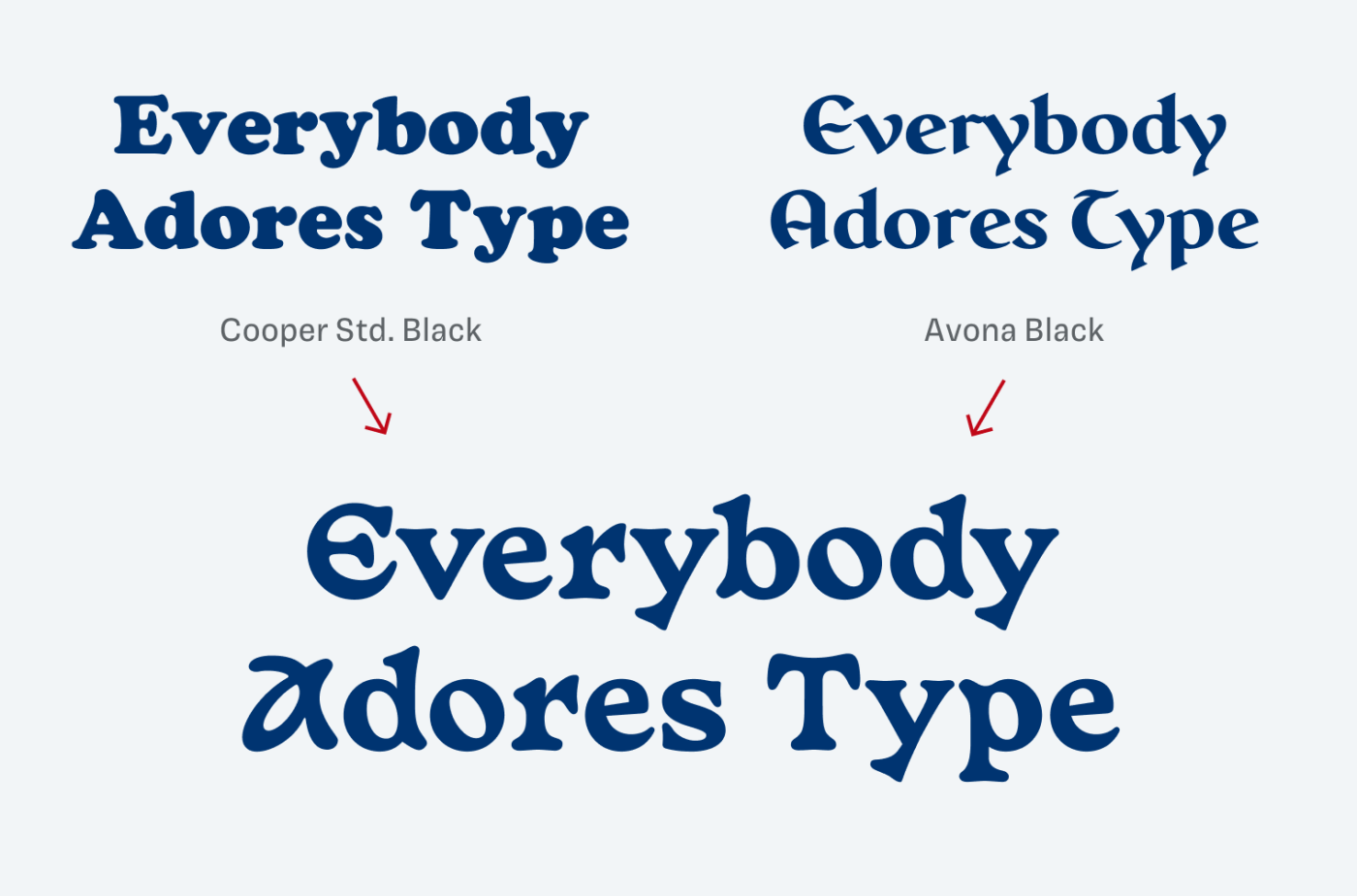
It comes in two weights, Moonlight and Black. I like how pointy the light style is and how blobby, soft, almost melting Basteleur Black seems. Look at the m, the Y or the R. Genius! Also, very cool in all caps.
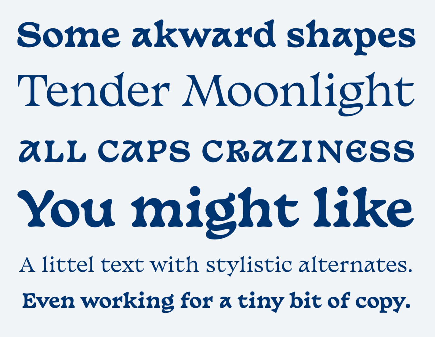
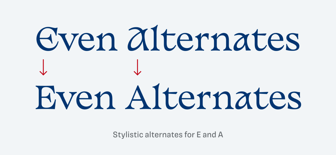
I could imagine Basteleur being used in a logotype, maybe for certain headings or a short intro text. The peculiar lower case “a” will make it too striking for longer text. At least there are some stylistic alternates for the E and A (in Moonlight only) that tames it a bit. Unfortunately, not for the lower case “a”, which would have made it a bit more versatile. But it’s always a balancing act – personality vs. utility – depending on the needs of your project.
What do you think? Is Basteleuer something for an upcoming project? Tell me in the comments below!
Where was this font when we all were crazy about three witches from “CHARMED”? 🔮Oliver, an impeccable eye. Com’ on, who would come up with Cooper Black and Avona as a true match for the star Basteleu? This type is crazy moody. A ton of character at first glance but then I zero in “a” and “s”, and they’re like two different families! The point with Basteleu is, I think, the proper match of some letters. When you pair characteristic once, it’s the moody crazy font but ordinary n, l, s, etc. strike the balance. This is the weirdest choice so far! But definitely, one to experiment with. 🧚🏻♂️
Yeah, very loud, very peculiar. You summarized it well with balance – some characters stand out too much and others fit in too much.
Free font Basteleur isn’t weird, Oliver. This font is the result of an heavvy accident with many form defects and severe fractures. Certainly the bold version is only usable as headings in promoting alternative medicine or psychic powers. With the regular version, especially the lower case ‘a’ and ‘g’ are quite disturbing as far as I’m concerned in terms of typeface rhythm and form.
“Certainly the bold version is only usable as headings in promoting alternative medicine or psychic powers.” 😂 Love that! And well, these applications definitely need typefaces as well 😉.
Love your post, but I was wondering where you got the alternatives for The E or A. Couldn’t find it anywhere