In this article and video, I want to share with you my approach in combining typefaces. It’s a beginner’s guide that will teach you some principles, show you two quick wins you can apply right away, and – if you want more – goes into the nerdy details. Ready to mix some fonts? Then let’s go!
TL;DR: Pairing typefaces doesn’t have to be a hard and complicated process. First, decide if you really need another typeface, have a reason for it. Decide on a base, then find something to combine it with. For a quick win, use type families that contain different styles (most sans-serif and serif), and are designed to fit together. Another quick win is going for a very diverse combination. The most advanced level is looking at a typeface’s construction and pair similar underlying designs. Most important: have fun while doing it! Don’t make yourself crazy, try things out and evolve your skills and taste.
Don’t be afraid of making a decision
In the welcome email of the Pimp my Type Newsletter I ask: What’s your biggest challenge when it comes to typography? The top answer is always related to pairing fonts. So if you struggle with this, you’re not alone. Beginners can find it overwhelming, intimidating, and cumbersome. I understand that, since it can be, if you don’t know what to look for. Combining typefaces is a bit like combining clothes. There are no absolute rules to it, a lot of it relates to fashion and trends, and of course to your taste or the mood your project should convey.
It’s neither black nor white. In the end it’s an artistic decision, and like everything in design there are guidelines, and no strict rules. So don’t make yourself crazy.
Before we dive into my best practices, let me encourage you to just go for it. Don’t be afraid of making a “mistake”, try things out. Nobody will release the typographers throwing 960 pt metal type squares at you for retaliation. Don’t think of your combination as being “bad”, it might be inappropriate, but dare to make a decision! You can and will improve your skills on your typographic journey. Try to do it as good as you can right now. The fact that you read about this stuff is awesome already! Motivated enough? Then let’s get started with some principles.
Basic principles for combining fonts
1. Do you really need more than one typeface?
I’m serious – ask yourself the question if you really need another typeface. You can achieve a lot with only one typeface by using a different style, like a bold heading or an italic, or a display style. For many projects one typeface with a Regular and a Bold weight, and maybe an Italic might be sufficient. Just know, that you don’t have to mix fonts.
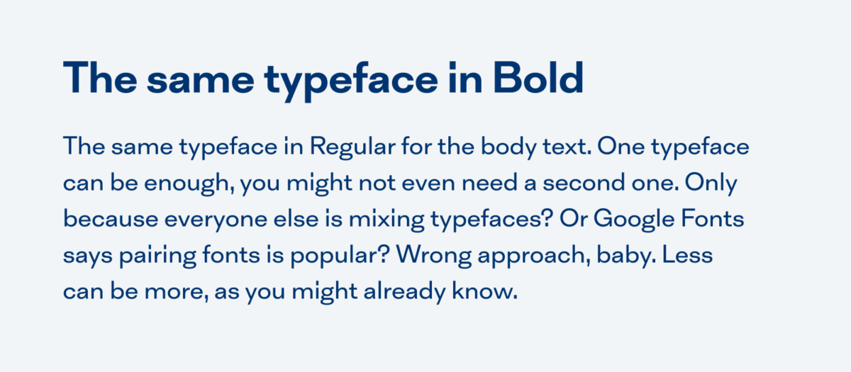
In this case, Inklination is used for the heading in bold and for the body text in Regular. This might be enough.
2. Have a reason for another typeface
Some common cases when you might need a second, or even a third typeface to your body text are:
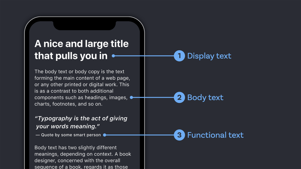
For titles, headings, or pull quotes – so for something larger and shorter than your regular text, a.k.a. display text. This is a great chance to use a striking, fancy, cool display font to quickly set the stage for your project.
For captions, marginalia, small print, navigation or other UI components – so for something smaller than your regular text, a.k.a. functional text. Here it’s important that the typeface is sturdier, the letter shapes are open to perform well.
For code on your site – when you show code snippets and naturally want to do this in a monospace font since it’s the familiar and easier way to read it.
For other markup in you body text sometimes, like highlighting the first line of text of a paragraph, or a lead-in text, although I’d recommend sticking to your body text typeface in this cases.
Where your base typeface does not perform well, you feel you’ve reached it’s limits.
3. Find your base first
Decide on the most important kind of text for your project first: is it body text, display text or functional text? If you have trouble with this step, I wrote a guide how to identify your main kind of text. Make a decision, stick to it, and then look for something to combine it with. Avoid reconsidering everything all them time, this will just make you crazy. So know your base, to know what you want to combine it with.
4. Use as few different styles as possible
In typography, like in any other design system, strive to introduce as many elements as necessary and as little as possible. Repeat your font choices as often as you can, and only when something does not work in a given situation, add a new style. This way you create consistency, which will make your design clearer, and help your audience understand what you mean by it. Don’t just use different styles for “fun” or to show off how many cool fonts you have. It will end up confusing people and leave a messy impression.

Now let’s go from easy to advanced in three levels. Pick your difficulty, and remember, you can achieve a lot in any level.
Level 1: Use superfamilies
When I first found out about type superfamilies in design school back in 2005, it was mind-blowing to me! Type families or super families are designed in different typographic styles with the aim to fit together. Popular examples are:
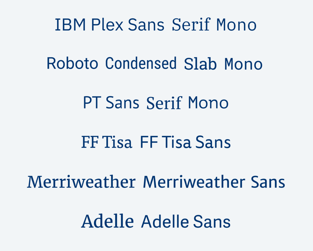
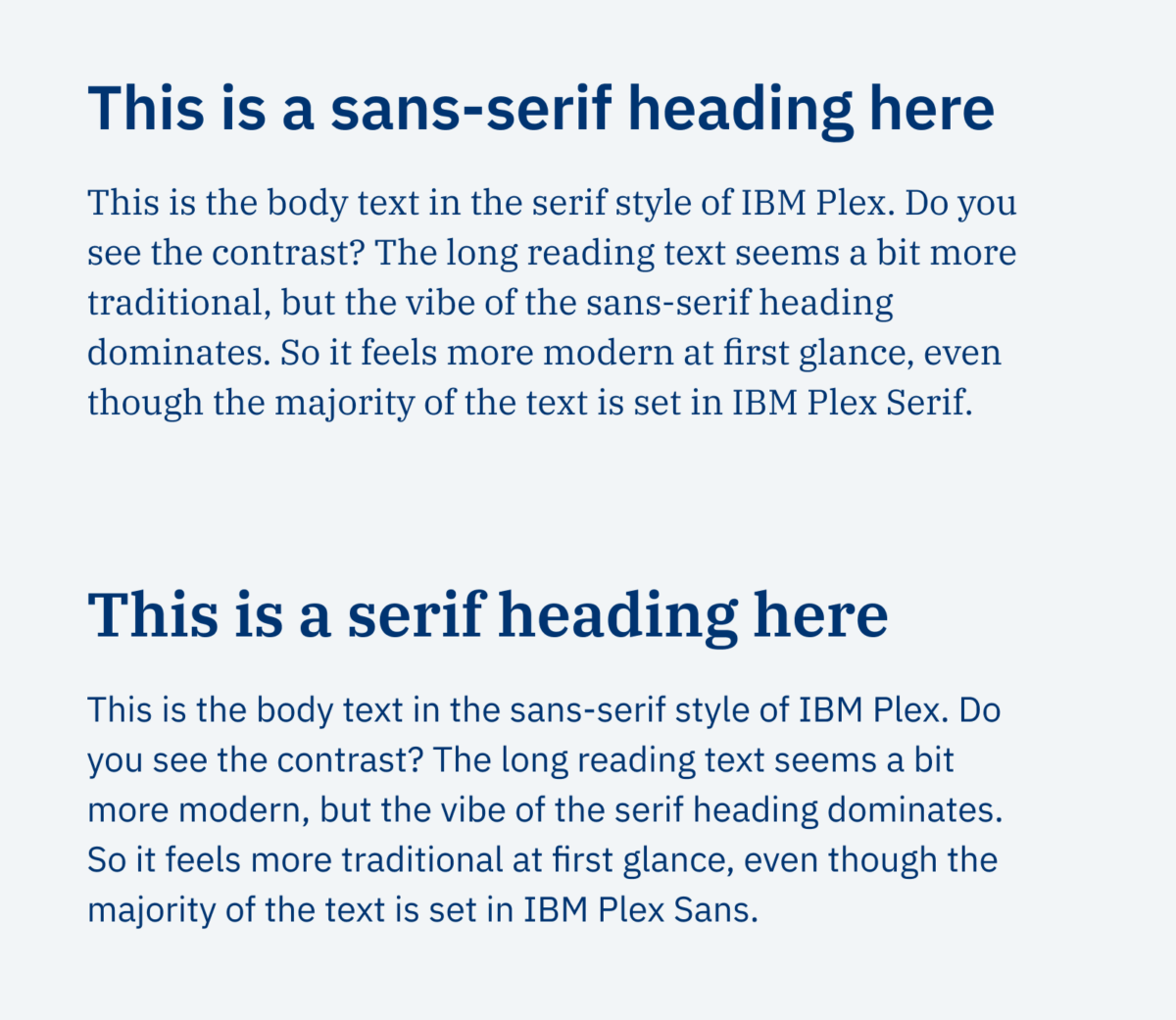
Type families are great, when you want to save time. You can use them, they will look good together right away. You can create a fascinating interplay of moods just by swapping out sans and serif for your titles and body text, like in the example below.
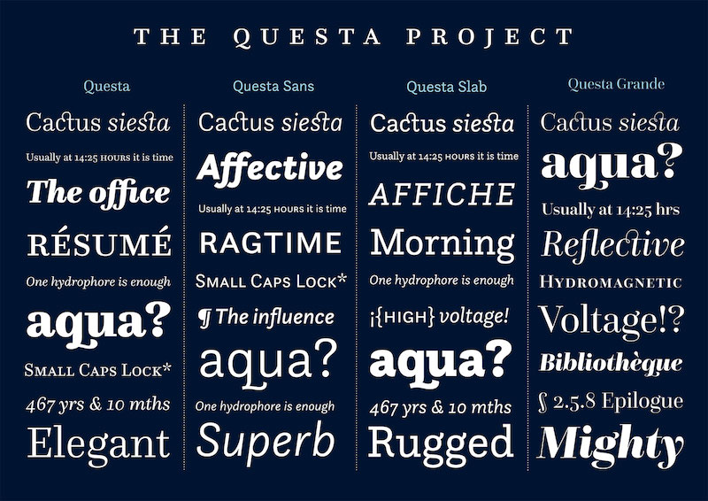
And there is even more, with super-duper families like the Questa Project by Marin Majoor and Jos Buivenga or Arizona by Dinamo, or Foreday by DSType you have plenty of possibilities to cover a wide range of typographic styles.
Level 2: Make it obviously different
The second quick win is to go for contrast. Pick a font for your titles, headings, lead-in paragraph, or pull quotes, that really stands out. Choose something that won’t get in the way of your regular body text, because it’s so different. Follow your taste or the feeling your project should convey. Have fun, and explore!
In the three example below, IBM Plex Sans is used for the body text. The headings are set in the Handwritten typeface Supermarker, the sans-serif display typeface Ancho and the script typeface Hello My Love. They all create a very different feeling, remember font follows feeling, even though the body text is always the same.
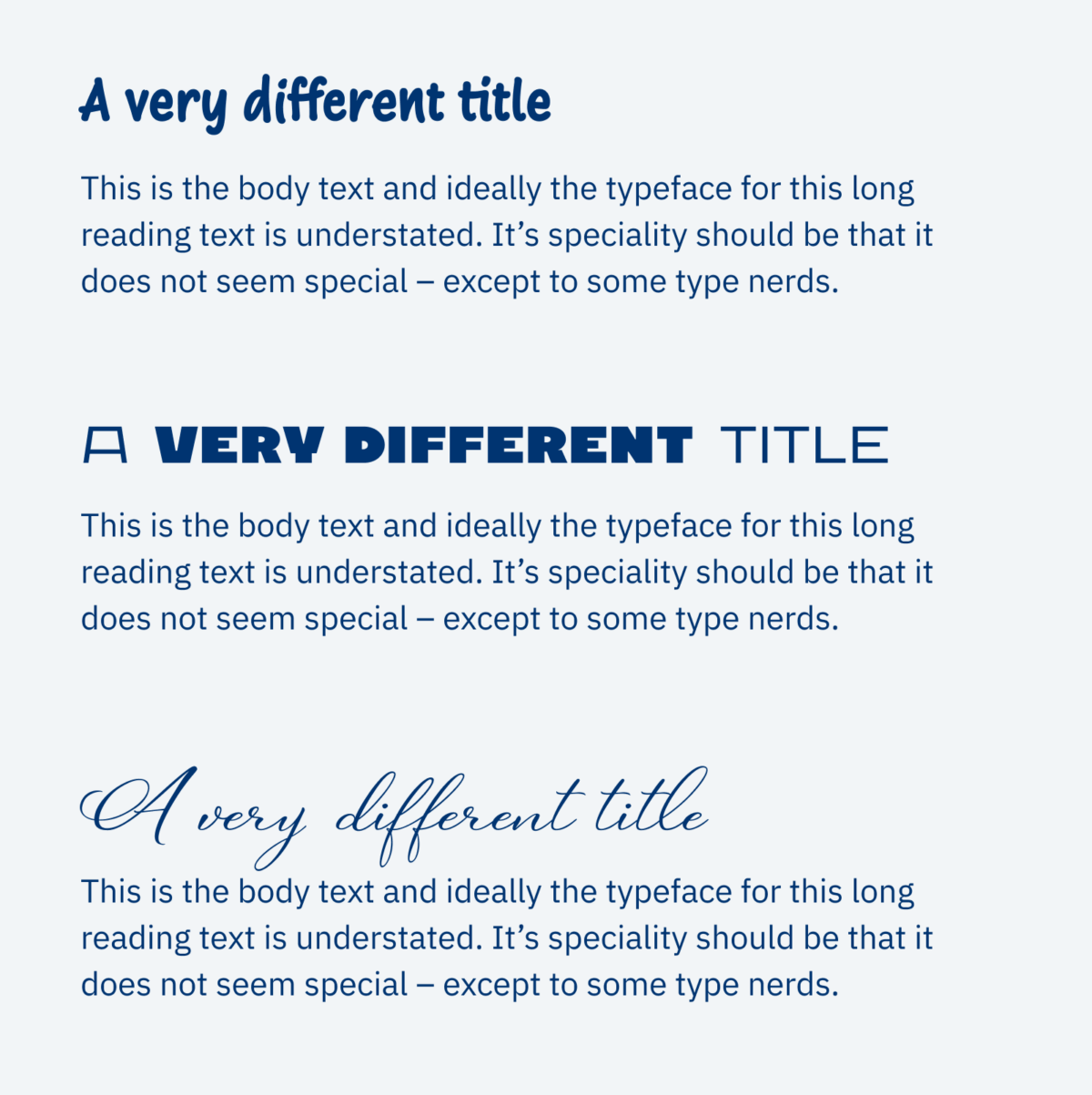
Try to avoid very similar combinations. Avoid to combine two fonts from the same category, a sans-serif with another sans-serif, or one script font for your <h1>, and another script font for your <h2> and <h3>. Make it the same or make it different.
Pimp my Type on Patreon
Get several benefits while supporting my content creation.
Join Patreon
Level 3: Look at the typeface’s construction
The most advanced way to pair fonts is taking a closer look at the typeface’s construction. Here the lines get blurry fast. Remember the first part of this article about no exact rules, just guidelines, and eventually it’s a design decision? But let me walk you through an example.
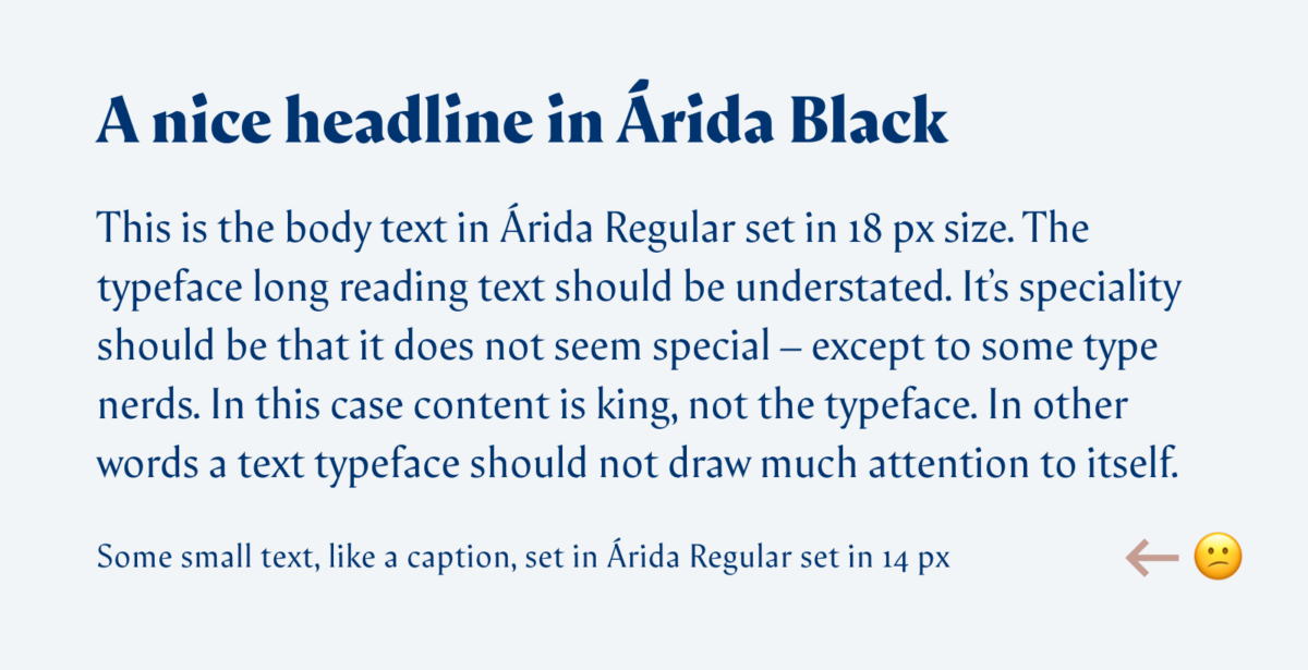
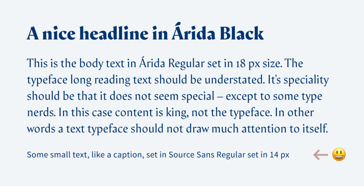
I picked the gorgeous Árida in Black for the headline and in Regular for the body text. In these applications it looks great, but for smaller text, like a caption or a navigational element, it does not perform that well. The contrasting strokes and relatively low x-height makes it pretty fuzzy. This is the reason why I need another typeface to combine it with. I’m thinking about a sans-serif that’s easier to read but still conveys the same atmosphere as Árida. To find one, I take a closer look at the letter’s construction.

I came up with the word “Megatypos”, because I’m mega passionate about typography, and my text always has a lot of typos 😉 (if you find one, please let me know, I’m the worst editor). And Megatypos also contains very different letter forms that will make it easier to compare typefaces at a glance. Don’t get blinded by the serifs, look at the following criterion:
- Letter forms – are the lower case a and g single-story or two-story?
- Apertures – is the inner space of the letter shapes more open or closed (see the e, a and s)?
- Angle – what’s the angle (look at the o to see this)?
- Contrast – are the strokes even or contrasting?
- x-height – How’s the relationship of the lower case letters to the upper case letters?
- Width – are the characters narrow, regular or wide?
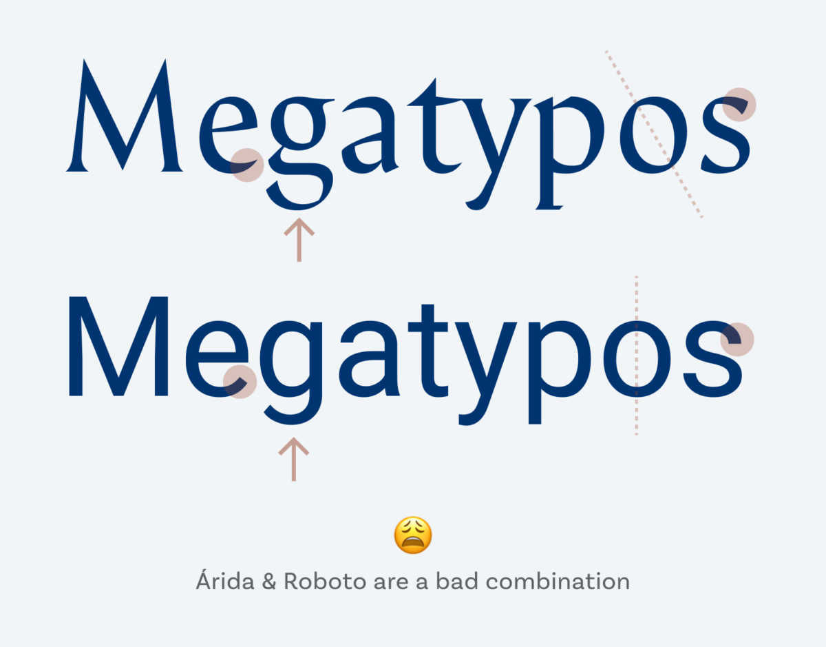
Not every criterion has to fit here, I find the apertures, letter shapes, and angle are the most important. Árida with its two-story a and g has opened apertures to the surrounding (look at the e and s), is pretty angled (see the thinnest parts of the o) and has contrasting strokes.
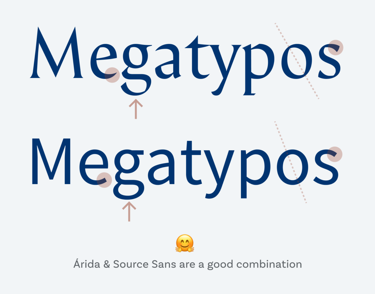
My pick, Source Sans Pro, has the same letter shapes, they are open, the strokes seem to be even, but they are slightly contrasting (look at the M). Comparing them in this situation looks good, but most importantly, Source Sans Pro performs well in overall design. At first glance, it seems as if it was Árida, just easier to read. Mission accomplished!
As a negative example, soulless Roboto comes with very different characteristics. The shapes are rather closed (see the e and s), the letter forms are different (one-story g) the angle shows a vertical stress. This is why it’s not a good fit.
Update – go even more advanced with the Font Matrix: Almost one year after this article, I found out about a great system that makes it clearer why certain typefaces fit together, and others don’t. Learn about the Font Matrix here in an in depth-article and video. Or jump right into my online course Pairing Typefaces like a Pro.
Closing thoughts
Don’t be afraid of pairing fonts. Pick the level and approach that suites best for your given situation, apply it in your design and see if it works out. This is not science, it’s an art, and you as a typography will develop your skills and taste. You will become better at this with practice. So don’t forget to have fun doing it. And if you need support, I’m here to help!
Was this helpful to you? What part most surprised you? Are there still open questions to you? I’m happy to read your thoughts in the comments below!

Thanks, Oliver
That’s a very helpful article!
I’m using free fonts for various voluntary print and graphic design things.
I’m ready for a change from using Fira Sans as my body text font for everything, with it in bold for headings etc. Last week I installed Inria Sans and Serif, as per your recommendation earlier, as my new workhorse.
I’d decided that font pairing was a black art, and your article has demystified it.
I’m happy to stay at level 1 for now, and take the level 2 approach when needed.
Thanks, and keep on rocking!
Tim
Thank you, Tim, for that super kind comment!
So happy to hear that! Inria is great and has a bit more personality than Fira Sans. If that fits your projects, great 😉
Thank you! Great article!
Thank you, Eva-Maria! 🙂
ich habe gelernt, dass man für eine Website normalerweise maximal zwei verschiedene Schriften verwenden sollte.
Für den Fließtext am besten eine serifenlosen, für die Überschriften kann man gerne eine mit Serifen verwenden.
Sie machen das genau andersherum.
Dabei wäre ihre Schrift für den Fließtext doch auch prima für die Überschriften. auf jeden Fall besser als die aktuelle, meine ich.
Die Schrift für den Fließtext macht sich auch gut, obwohl es eine Schrift mit serifen ist.
Gruß, Carsten
Danke für das Feedback, Carsten! Also, dass Serifenschriften vorwiegend für Überschriften genutzt werden sollten, kann ich so nicht bestätigen. Vielleicht war das im Web mal so, als die Auflösung der Monitor für Fließtext und Serifen noch nicht so optimal waren. Mittlerweile ist das aber kein Problem mehr, vor allem am Smartphone sind die Screens schon fast der Qualität von Papier nahe.
Warum ich die serifenlose Basic Sans für die Überschriften verwende ist, weil ich im ersten Moment doch einen mordernen Eindruck erwecken möchte, dann in zweiter Linie das klassische. Deshalb die Mischung.
Hello Oliver,
thank for the practical tips on how to pick the right pairings, especially if is worth to have more than one font style.
The best approach is to evaluate what are the needs, design direction and UX of a project so you know when to keep things simple and when you need to do something more complicated.
Well said, Andrea! I agree, you always should start with the need and resources for a project first.
Great article. Small typo in this sentence: “the letter shapes are open to performs well” (should be perform I think).
Megatypos! 😉 thanks, Jonathan, fixed it.