Type has a utilitarian purpose since it is there to be read. But shape and content melt together, which means at the same time your font choice evokes emotions. So besides Font Follows Function, Font Follows Feeling as well. This article and video will give you a broad overview of how to categorize typefaces to figure out what kind of moods they can evoke and for what sorts of text they are suited.
TL;DR: Categorizing type is hard and only helpful to a certain degree. Sans-serif, serif and slab serif typeface can work for all sorts of text. Sans is perceived more modern, serif more traditional, slab serif can be both. Script, handwritten and display fonts mostly work for short and large applications, and are more striking and thematic. Eventually you have to find your own typographic vocabulary.
An approach in categorizing fonts
Knowing what broad categories of typefaces exist and what feelings they evoke, can be a handy tool to dig through the tons of available fonts out there. To make this as related to practice as possible, I oriented on a very rough classification that popular font catalogs use as well. With some adoptions MyFonts, Adobe Fonts, or Google Fonts divide their fonts in the following categories (click on them, to jump to the section directly):
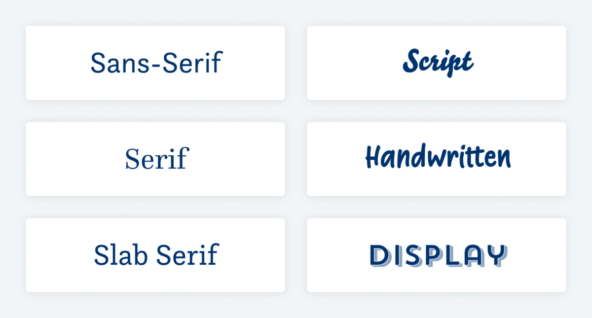
This categorization is an orientation point. Lines get blurry very soon. While the first three (sans-serif, serif, and slab serif) are pretty straight forward, easier to distinguish, and might be suitable for all kinds of text, the latter three (script, handwritten, and display fonts) get fuzzy and should only be applied for display text.
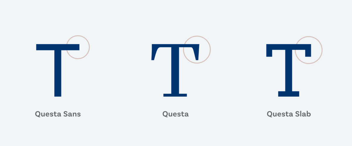
Don’t waste time overthinking if a font belongs to this or that category. In today’s digital world, type designers mix and blend influences from all over the place. Things are not linear and a rigid categorization will not work (if it ever has). Better think about what mood a font creates and for what sort of text it fits best.
Find your own language, and take the attributes I connect with these categories with a grain of salt. Typefaces all have their own appeal in a given situation, and you will have to decide if it truly fits the project and circumstances, or not.
1. Sans-Serif fonts
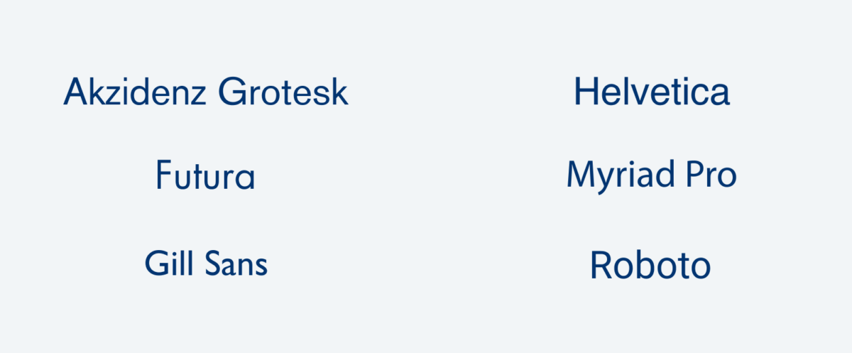
Sans-Serif typefaces have letterforms without the tiny tails or lines at the end or beginning of a letter’s steam. They started to gain popularity at the beginning of the 20th century with Akzidenz Grotesk in 1896 and Futura in 1927. Many sans-serif typefaces have a monoline structure, meaning all the strokes of a letter optically have the same width. It provides them with a sense of simplicity and clarity. This and the historic connotation might be the reason why they are associated as modern typefaces.
Besides Futura, other popular typefaces in this category are Gill Sans, Arial or Helvetica, Myriad, Open Sans, or Roboto.
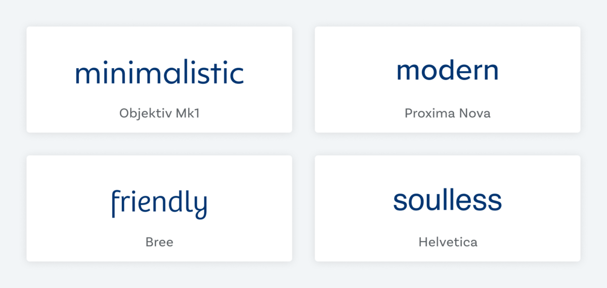
Feelings sans-serif fonts evoke:
- modern
- clean
- minimalistic
- dry
- technical
- restrained
Sans-serif fonts work for:
- Headings (display text)
- Long reading text (body text)
- User Interfaces (functional text)
When using sans-serif fonts think about not using a too geometric typeface for long reading text. Also bear in mind, that sans-serif typeface in digital design are the more popular choice, and sometimes it’s a good idea to swim against the stream to make your project stand out.
Here are my #fontfriday sans-serif font recommendations.
2. Serif fonts
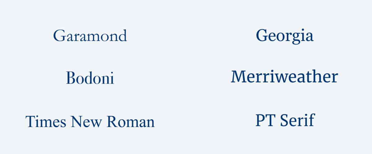
Serif fonts have these tiny decorative tails or taper and are used in print since the 15th century. This background makes them appear more institutional, gives them a certain weight of history or even authority.
Popular serif typefaces are Garamond, Times New Roman, Bodoni, PT Serif, Merriweather or Georgia.
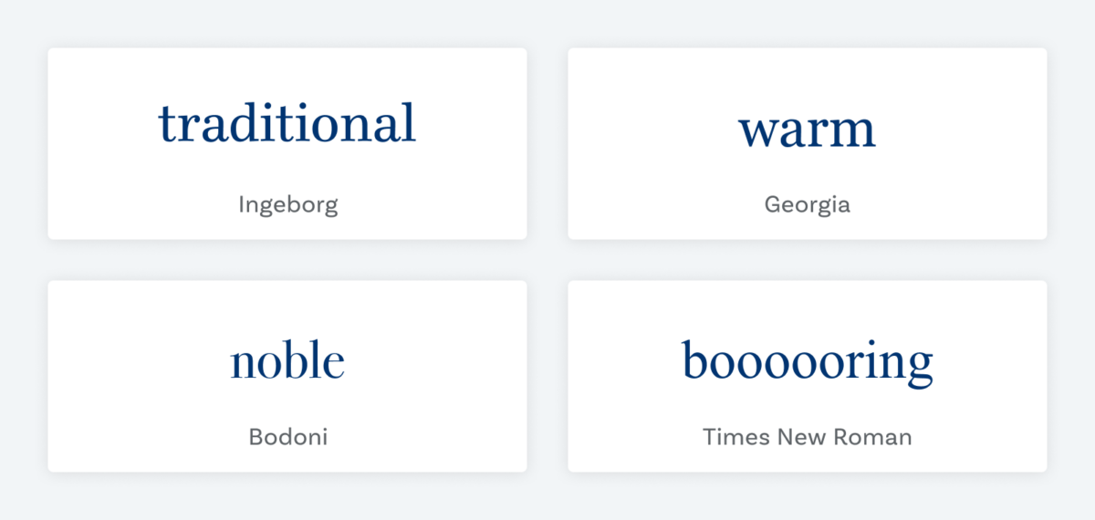
Feelings Serif fonts evoke:
- traditional
- classic
- established
- trustworthy
- warm
- noble
Serif fonts work for:
- Headings (display text)
- Long reading text (body text)
- User Interfaces (functional text)
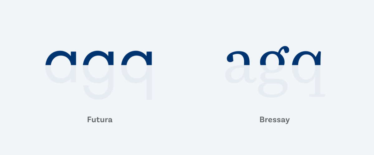
Notice that serifs are not only decorative, they also give letters with more distinctness which is beneficial for readability, especially in body text. In app or web design they are not that common for functional text and in smaller sizes they could be too dense or noisy for our visual conventions.
Here are my #fontfriday serif font recommendations.
3. Slab Serif fonts
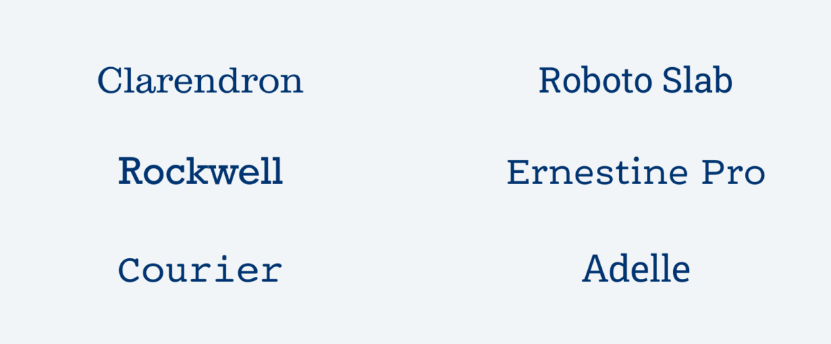
These typefaces can have thick, sometimes exaggerated, block-like serifs. They came up in the 19th century when they were most popular. This is also the reason why the might be associated with the wild west, especially in display sizes with very striking or even decorated serifs.
Popular slab serif fonts are Clarendon, Roboto Slab, Rockwell, Adelle or Courier as one monospace typewriter like typeface.
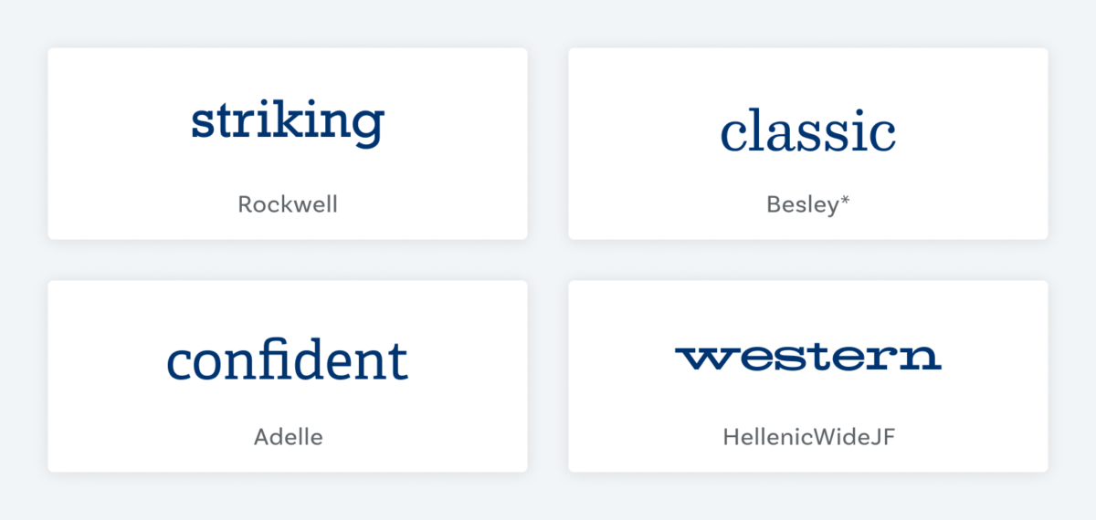
Feelings slab fonts evoke:
- confident
- stable
- striking
- solid
- clunky
- wild-west
Slab serif fonts work for:
- Headings (display text)
- Long reading text (body text)
- User Interfaces (functional text)
I see slab serif fonts as the upcoming stars for UI design. They combine the best of both worlds – distinct letter shapes and a mostly monoline structure. They can be very modern (see Adelle) or more tradtional (see Clarendron).
Here are my #fontfriday slab serif font recommendations.
4. Script fonts
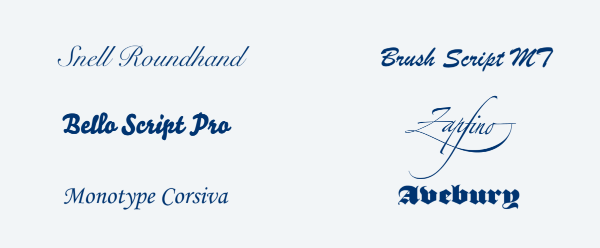
When the first three categories were pretty straight forward and somehow historically clearer, with this category the lines start to blur. Script typefaces represent calligraphy, writing tradition and penmanship. This is a very broad category, and it can go from something you would see on a wedding invitation (round hand script) to a Surfer’s Bar (brush script) or a beer label (blackletter).
Some popular and wide-spread examples for this category are Snell Roundhand, Zapfino, Monotype Corsiva, Brush Script MT, or Bello Script Pro.
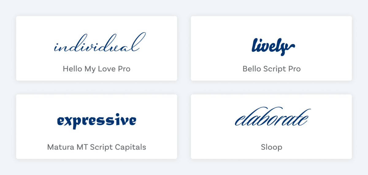
Feelings script fonts evoke:
- skillful
- elaborate
- lively
- individual
- playful
- expressive
Script fonts work for:
- Headings (display text)
- Long reading text (body text)
- User Interfaces (functional text)
For your digital project script fonts might only work for display text. That’s what they are made for. So set them in larger sizes and only use them for a headline, a drop cap or a very short leader.
5. Handwritten fonts
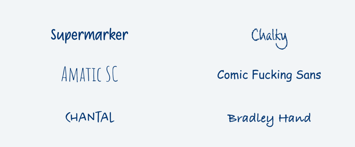
When script fonts were about skillfulness and the craft of writing, handwritten fonts are about creating the illusion of being handwritten by anyone. They should seem approachable and relatable, not necessarily fancy, artistic, or written by a penman.
Popular examples are Amatic SC (I see this everywhere) or Comic Sans – we could argue now if this is a good typeface, but it definitely creates an approachable mood.
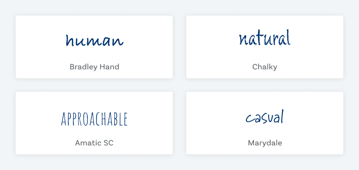
Feelings Handwritten fonts evoke:
- human
- approachable
- natural
- friendly
- authentic
- down-to-earth
Handwritten fonts work for:
- Headings (display text)
- Long reading text (body text)
- User Interfaces (functional text)
A big caveat for this category – good handwritten fonts are rare. Pick a font that has plenty of alternate characters, so not every repeating letter within a word looks the same. This might seem like a subtle thing, but our brains get that something is off. Because the whole point of using these fonts is to make it seem authentic, and then you destroy it by making it obvious that it not.
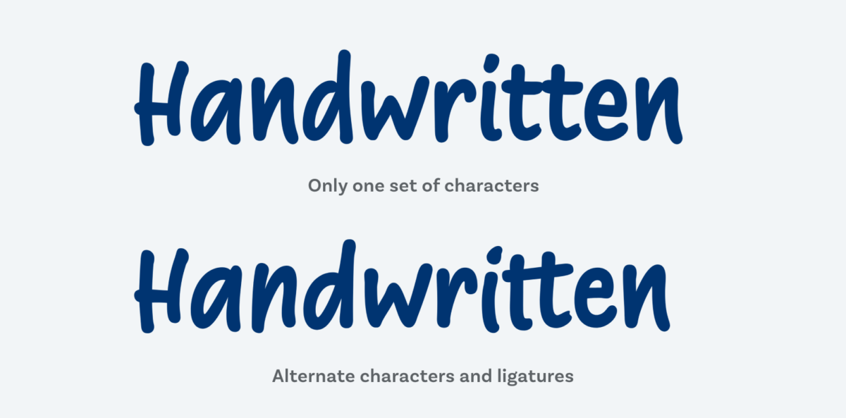
I recommend the fonts by Liebe Fonts for this handwritten touch, like Liebe Heide or Supermarker (used in the example above). And by the way, the caveat also applies to Script fonts. But with them it’s more forgiving if they don’t show so much visual variety since they are more aimed towards “perfect” writing.
6. Display fonts
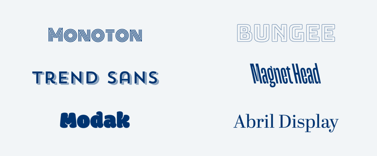
If lines started to blur for you with the script and handwritten fonts, now it really gets fuzzy. Display fonts are basically everything what did not fit anywhere else. It’s a very broad category, that contains fonts that are designed for short-form and often large-format applications. They can get very thematic or atmospheric, and create all kinds of moods. That’s also the reason why I added very, very generic feelings to the following list.
Display fonts often only have a single style, and can work great for a logo, a short heading or maybe only a nicely featured drop cap. But they don’t always have to look that striking. For some typeface there can also be special display styles, a version of the same design that is made for lager sizes with adapted spacing and finer details. Like Abril Display for Abril Text or at the Roslindale font family Roslindale Display and Roslindale Text.
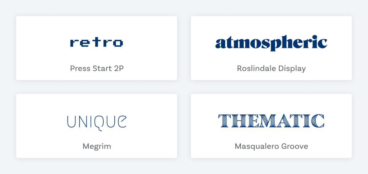
Feelings Display fonts evoke:
- retro
- unique
- thematic
- atmospheric
- interesting
- expressive
Display fonts work for:
- Headings (display text)
- Long reading text (body text)
- User Interfaces (functional text)
My advice here is to pick something you like and that fits your project. Taste is absolutely okay, go for your gut feeling, have fun and don’t be too dogmatic about it. More about display text here.
Remeber to follow your feeling
The categories and associations I listed were examples, aimed to give you a broad overview and guide you towards defining your own vocabulary. How it appears eventually depends on your project, circumstances, culture and of course the specific font you choose. You are the typographer, you decide what fits best.
What characteristics or feelings are related to your favorite category? If you feel – pun intended – like sharing, I’d love to add them to my list to make it broader and more diverse! Leave them in the comments below or write me a line on Twitter!

Amazing article, thanks!
One question related to sans-serif fonts: I’ve been a bit surprised by the recommendation of sans-serif fonts for long-reading texts (body). I guess that in the end, it may depend on the actual font, but could you please provide a few examples of which sans-serif fonts may be ok for body text? thx!
Hey David, thank you, happy you liked it! You’re right, when it comes to sans or serif, it depends on the font, specifically on the distinctiveness of its letter shapes. Let me point you to this part of a video about sans vs. serif in body text. Good sans-serif fonts for running text are for example Pangea, Darkmode or Inria Sans. Hope this helps you!
re: serif fonts for body text.
Many printed novels are using serif fonts, so if that’s a ‘feeling’ the page is going for, then use a serif. Fonts like Georgia are designed for the screen. Some older typefaces were obviously not designed with pixels in mind, i.e. low x-heights are stylish but hard to read.
Here is an interview with Mathew Carter who made Georgia, I love this whole podcast a lot: https://www.designmattersmedia.com/podcast/2018/Design-Matters-Live%3A-Matthew-Carter
Super, werde ich meinen Schülern bei Pratt in NY zeigen, vielleicht denken die Du wärst mein Bruder.
hier ist mein video, etwas ähnlich; sorry, audio ist holperig, must fix.
Ich habe hier vor ein paar Jahren mit Thomas Jockin eine Typegruppe aufgebaut die wir http://www.TypeThursday.org nennen, auch in Berlin gibt’s das, wo bist Du?,
Anyways, greetings, fun video, hope to meet you someday.
Hey, Bruder 😉 super Video – da ist voll viel Content drin, sehr schöne Beispiele und voll viele Themen, die du da aufgreifst. Wow! TypeThirsday. Wo bin ich? Wo ist der Newsletter Signup, dann bin ich beim nächsten Online Event dabei! 😉
TypeThursday.org: some ‘chapters’, aka cities, are more organized than others, but you can follow them on Instagram, fb, or Eventbrite that’s where the free tickets are posted. The concept is to present unfinished work so that it can be critiqued. 3 presenters sign up (we never know who, so it stays completely democratic), 10 mins present, 10 mins critique each, x3 = one hour total, plus wine
Hello, I would like to thank you for this amazing information. I was really confused about the script font that I wanted to choose for a branding project. Your article really helped me to find the right one. It was like puzzle pieces set together.
Hey m, thanks for sharing that with me, really appreciate it! I’m happy you found the article helpful! Curious how your design turned out and what it was before and what you changed after reading the article. If you want to share, send me a mail, I’m always looking for personal typographic success stories!
By the way, really enjoyed your Baskerville Kinetic! Didn’t know anything about him besides the typeface 😅.
Thanks for your information it’s very helpfull for me thanks
Happy to hear that!