

My Strichpunkt Sans Font Review
Strichpunkt Sans is a genuinely interesting mix of personality and functionality. It covers a wide range of expression, if you know how to use it right. At first sight, this free sans-serif creates a sober, technical impression. Arcs on letters like the ‘t’ and ‘l’ contribute to that – unique characteristics that also keep it legible. The numerals do their part too: a ‘1’ with a serif, a slanted zero, making these details matter. Strichpunkt Sans also runs fairly large at default sizes, which makes it a solid choice for UI components at smaller sizes.

Speaking of versatility, Strichpunkt Sans is available in six weights and three widths. This makes the typeface a candidate for uses in headings at larger sizes too. The bolder and the wider it gets, the more interesting the contrast becomes. Look at letters like the lowercase ‘a’ and ‘g’ – I just love that contrast!

But Strichpunkt Sans comes with a few things to consider. That uppercase ‘R’, for instance – its vertical leg creates a tension between interesting and distracting. There are no stylistic alternates, so you either love it or you leave it. No italics either, which makes me reluctant to recommend it for long reading text.
But if you can make peace with those quirks, Strichpunkt Sans is an interesting, well-rounded option for your next digital project. Think of it as a wonkier, more playful sibling of IBM Plex Sans.
Font Pairings with Strichpunkt Sans
Strichpunkt Sans is a rational, linear sans-serif typeface. It is very clean and restrained. For interesting body text pair it with a warmer serif typeface. To give it more personality and balance out its technical aspects, pair it with a striking heading font, like the ones below.

- Headings
- Copy
- UI Text


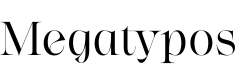
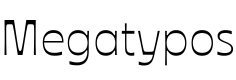


Learn more about pairing typefaces using the Font Matrix.
Thanks for 200 Font Fridays – for your comments, your feedback, and for following along. If you fancy it, post in the comments below which was the first edition you read. Also what you think about this week’s review 😉.
Oliver, I can’t recall which post it was exactly unless I dig down the memory lane but I’m certain it was one of your five first posts. So, I’m an OG here. Thankfully!
Looking forward to the next 200 font reviews. Type is my love within the whole branding stratosphere, fav ingredient.
And don’t you dare to compare my IBM Plex with this guy. Bold extended R is blurry, it plays with my vision-distortion.
I didn’t vote for this font review, go back to the votes 😆
Oh Jana, what would Font Fridays be without you! You are definitely the most engaged person in the comments, thanks for that! And I found your first one on edition #18 in May 2021. Thanks for sticking along all that time!