

My Ancizar Serif Font Review
I’m happy to show you a font that I only discovered recently. Ancizar Serif conveys warmth, confidence, and classy vibes. Its sturdy strokes make it feel very robust for both screen and print, while its wedge-shaped serifs give it confidence and a contemporary touch. Two things really stand out to me. First, Ancizar Serif’s italics. They are almost upright, very narrow, and tightly spaced, which makes them integrate nicely in running text.
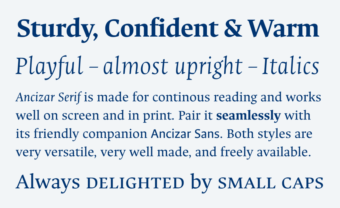
Second, I’m always excited when I see a typeface with small caps, because they blend in so elegantly, especially when using all-caps abbreviations. I love that there is also a sans-serif companion available (which I used quite a lot in the graphic on top), and that both are variable fonts. This makes Ancizar Serif a solid and versatile choice for any text-heavy use case. So try it out and make something beautiful with it!
Font Pairings with Ancizar Serif
Ancizar Serif is a dynamic, contrasting, serif typeface. Primarily pair it with Ancizar Sans, however here are some other interesting pairings mainly for headings.

- Headings
- Copy
- UI Text


Learn more about pairing typefaces using the Font Matrix.
Is your UI waiting for Uai? Tell me your thoughts in the comments below!
So compact, so well done 👌🏼 Favorite letters w, m and t.
Oliver, stan up whaaat!? You’re constantly on stage man 🎤 😅
I love the “w” as well! 😊 Need to be more on stage, but stand-up comedy is very different to doing a presentation, then again, not really. 😂.