
My Push Font Review
Push is pushing it to the limit! This sans-serif type family stood out to me because of its vast design space, providing you with plenty of options to express yourself. It is aimed towards large text or logotypes. And since it’s a variable font, you can really fine-tune how it works. And this is what we will do in a little example below.

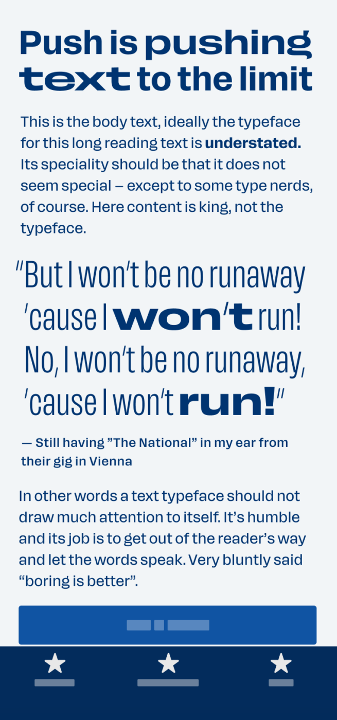
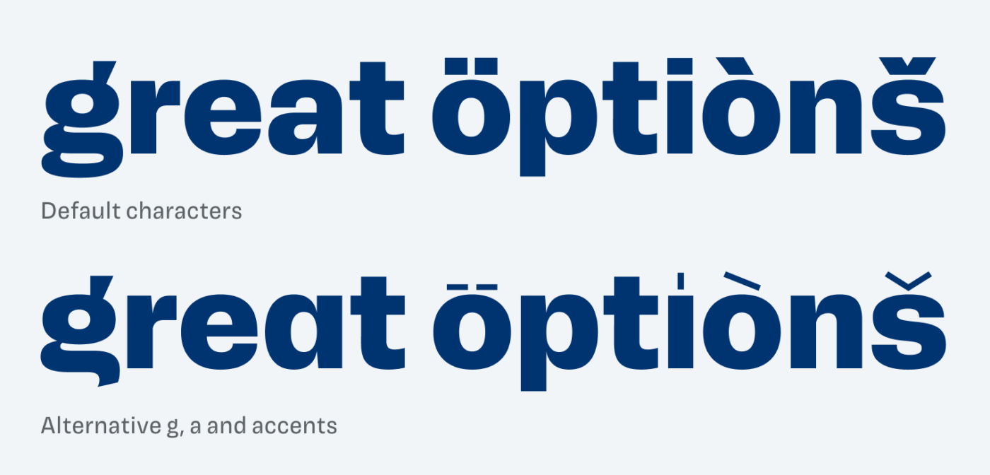
But first I want to tell you about its appearance. Push is a contemporary American Grotesque typeface. These typefaces, like Franklin Gothic, feel very strict and sober. Push however, manages to still convey something quirky and playful. Also because of its stylistic alternates, of which I love the light accents and punctuations.
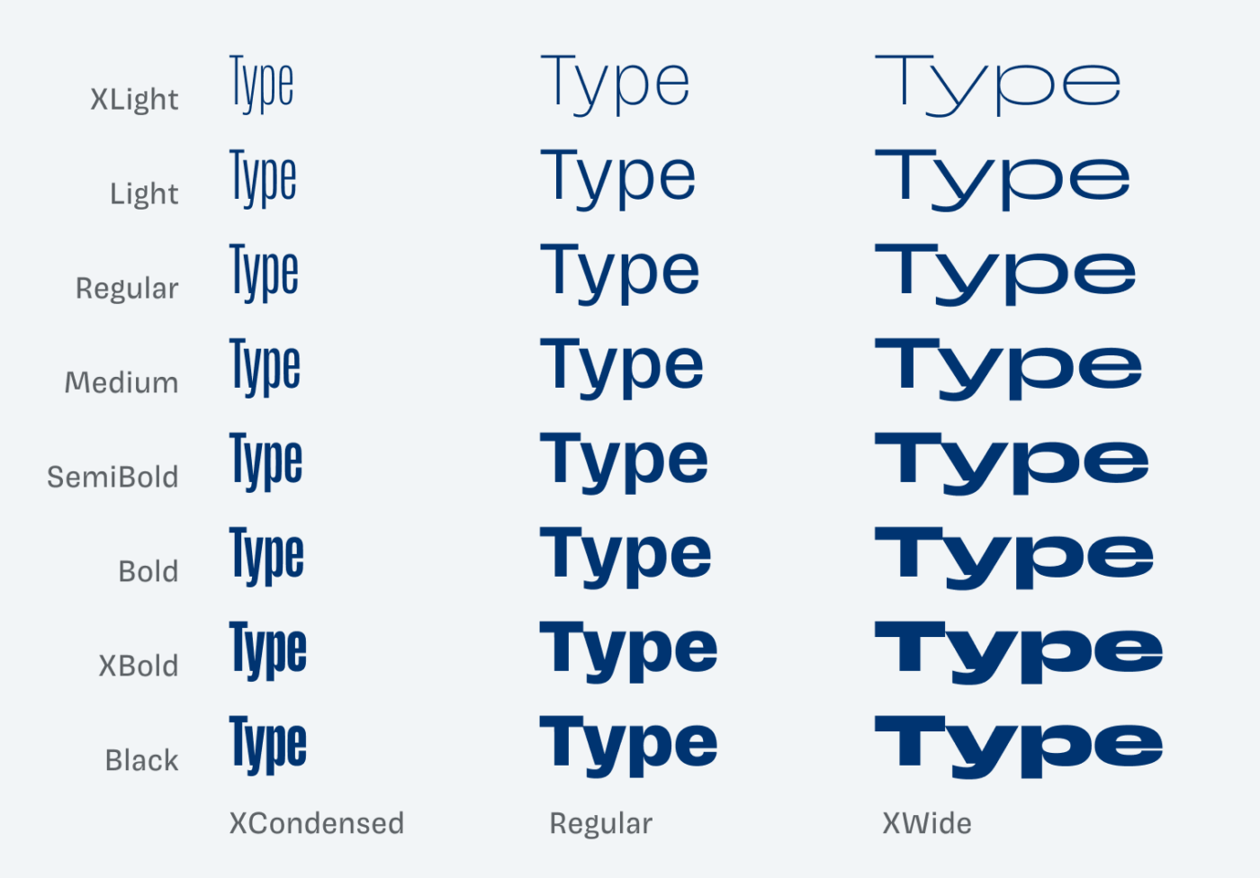
But its biggest advantages are the 56 styles, covering seven widths and eight weights. Below I only show you three widths, the extremes and the regular one. But it’s not so much about the styles, it’s what you can make with them. So let’s make use of this flexibility for a podcast title design.
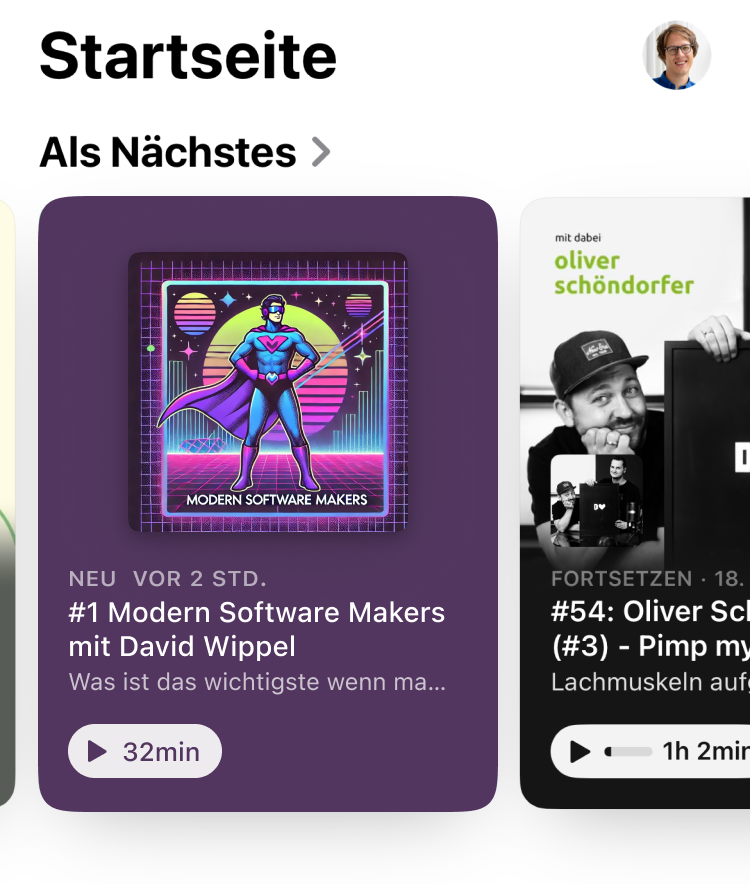
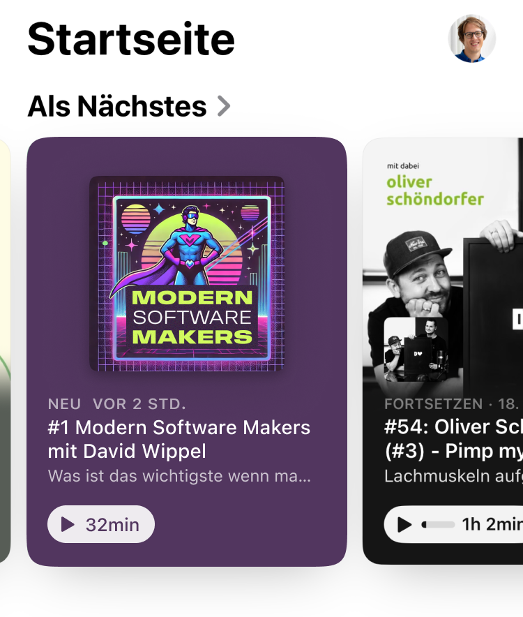
In an upcoming article and video, I will show you how to use the variable font to adjust the logotype of a podcast cover. See for yourself in this little preview what difference the right typeface can make. Inside the podcast app, which one of these titles stand out more?
Font Pairings with Push
Push is a linear rational sans-serif typeface, made for larger text or branding projects. Pair it with one of my suggestions for body text or UI text.

- Headings
- Copy


Learn more about pairing typefaces using the Font Matrix.
Is this typeface pushing it to the limit? Tell me in the comments what you think of Push and if you would use it in an upcoming project!