
My Borel Font Review
Recently I stumbled across the charming script font Borel. I was so drawn away by its somehow cheerful, simple but still in a way sophisticated look. What makes this French school cursive so intriguing? In my opinion, several factors come into play.
Borel is an upright cursive. This gives it a certain simplicity, emphasized by the design decision to go with plain capitals, and not complicated cursive shapes there. The caps are also not linked to the other lower case letters, that show an easy and rhythmical flow of connections.
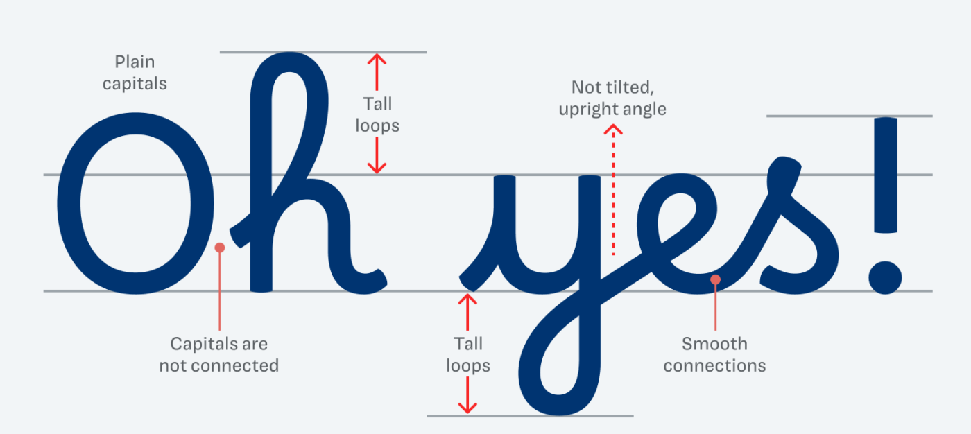
Another thing that stands out are the tall loops. They connect ascenders and descenders and add a certain finesse to it all, just look at that delightful “f”, “l” or “y”. Also, the lower case letters are fairly high in relation to the capitals. But it does not always seem that way because of the large loops.
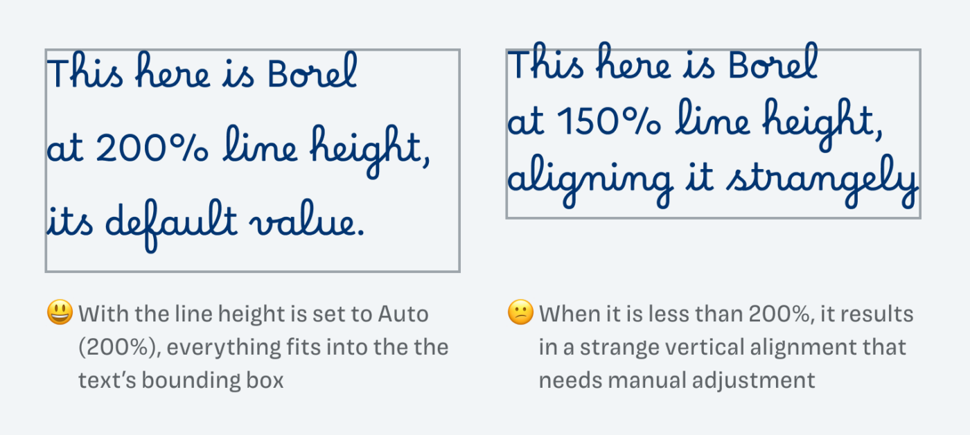
Since this typeface is mainly made for learning cursive handwriting, it has generous vertical metrics too. The default line height is at 200%, which might be a bit too much for screen display. However, if you reduce it, it results in some issues with the vertical alignment that you can see above. Better balance it by manually adding some space before it.
It is planned to extend the typeface in the future, but for now Borel is only available in one weight. I recommend it for medium large display text, maybe for a short in intro paragraph. For everything else, pair it with one of my suggestions.
Font Pairings with Borel
Borel is a linear cursive script font. I recommend pairing it with something that also conveys a soft touch, like Netto, or with something quite very different, like NaN Holo.


Learn more about pairing typefaces using the Font Matrix.
What do you think of Borel? Does it give you too many PTSD flashbacks to school? Or do you feel its charm as well? Tell me in the comments!
I embrase its imperfection. It’s naively charming. The only thing that bothers me is the capital letters aren’t connected to the small ones. It’s like they’re not together so it breaks the script flow.
I wonder about the name behind this font 🤔
It was a tough decision which one to vote for a review because all were interesting and good for a deeper investigation!
Maybe in the future there will be a connected version for the capitals …
About the name, it named in tribute to Suzanne Borel-Maisonny (a pioneer in speech therapy).
I voted a little late for this font and what a pleasant surprise to see that it’s the one that’s been reviewed! Thanks for the discovery Oliver, I’m charmed by this font which takes me back to childhood in a way that no cursive font ever has. The project behind it is brilliant, and the dedicated page on Git Hub is well worth a read. Fingers crossed that cursive capitals will be introduced in a future update.
“… takes me back to childhood in a way that no cursive font ever has.” – Could not read a more wonderful comment ☺️! Thanks, Elle!
The lc “p” is a deal-breaker.