

My thoughts on Sansita
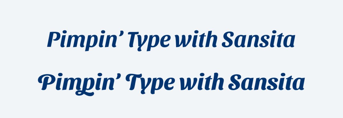
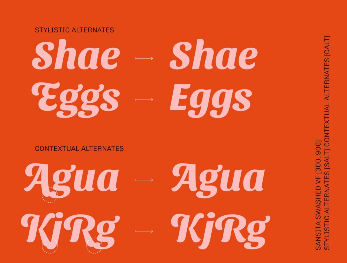
Sansita explores the borders between typography, calligraphy and lettering. Sounds super fancy, but it basically says that it comes from a handwritten, lively direction and as a display typeface is suited for short and larger text. The normal, upright style of Sansita is pretty calm compared to the matching italics, just take a look at the heading and the quote in my sample. It also develops to a typeface family with the matching Sansita Swashed that provides you with more curvy letters and cool optional swashes. Unfortunately only Sansita Swashed is available as variable font for now.
Sansita or Sansita Swashed might be just right for a short title, logo-type or pull quote, while brining Latino street vibe to your app or web design.
Recommended Font Pairing
A great, soft companion for Sansita could is New Zen or Rebrand, which also have a smooth and soft appearance.


Learn more about pairing typefaces using the Font Matrix.
Thanks Oliver for your kind comments!
Greetings from sunny Buenos Aires 🙂
Thank you for this gorgeous font!
Guten Tag,
bin kürzlich auf ihrem Blog gestoßen und ihre Artikel interessieren mich sehr.
Mich interessiert auch, welche Schrift sie im Block für den normalen Fließtext verwenden.
Also beispielsweise die Schrift, die in diesem Artikel beim Satz
My thoughts on Sansita
Sansita explores the borders between typography, calligraphy and lettering.
Verwendet wird und auch die Schriftgröße.
Würden Sie mir dies bitte mitteilen?
Beste Grüße, Lena
Liebe Lena, freut mich, dass dich meine Inhalte auf dein Interesse stoßen! Die Schrift für den Fließtext ist Bressay von Dalton Maag und wird am Desktop in ~22 px gerendert. Für die Überschriften verwende ich Basic Sans von Latino Type, die ist etwa 37 px am Desktop groß. Hoffe das hilft dir weiter!
Lieber Oliver,
vielen Dank für deine Antwort!
Ja, deine Inhalte interessieren mich sehr. Wünschte, ich wäre schon früher auf deinen Blog gestoßen.
Die Schriften, die du hier verwendest, finde ich sehr sehr schön. Und schade, dass die verschiedenen Betriebssysteme keine solchen schönen Schriften beinhalten. Bei Windows beispielsweise gibt es sehr sehr viele Schriftarten, aber leider wenige schöne.
Liebe Lena, sag das nicht, es gibt schon auch sehr gut Schriften die schon bei Windows dabei sind. Ein paar meiner Favoriten (die von der Atmosphäre auch etwas meinen auf der Website ähneln) sind:
Lieber Oliver,
Danke für deine Hinweise.
Werde mir die erwähnten Schriftarten mal anschauen.