Goodbye Quicksand: Free Font Alternatives
Quicksand might be unique, but it’s not suited for body text. In this article and short video, I’ll share with you three Google Fonts that are a great alternative to make your documents more appealing and readable, shown at a real-life example.
“Why do you hate Quicksand?”
After my brutal rant against Quicksand, showing that it’s too light, too geometric, and too striking for UI design, Taylor wrote:
“You don’t like Quicksand very much, do you? At least tell me it’s advantages because I love it. Don’t get me wrong, I think you’re right about your assessment but I failed to find a better typeface for middle school worksheets.”
Taylor via Email
I don’t hate it, but it’s often used in the wrong places. For very short copy or a title it’s okay, but it’s simply overused and most of the time in the wrong places. But there are some advantages, obviously. Quicksand feels friendly approachable, and quite unique. But in order to find a few alternatives, we have to determine what makes Quicksand distinct.
What makes Quicksand unique?
Distinct to Quicksand are the geometric construction, the simplified letter shapes, and the rounded terminals. This makes the typeface playful and friendly.
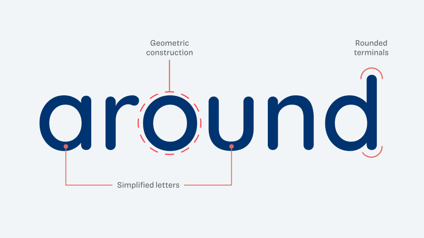
But there also are some disadvantage, when used for the worksheets, because it uses a lot of space. Additionally, the regular weight is a bit too light, so it’s necessary to use SemiBold for sufficient text contrast.
1. Asap
One alternative could be Asap, which is also freely available on Google Fonts. It is narrower than Quicksand, even a bit squarish. The letter shapes are common, following a dynamic construction – more about this in my Font Matrix article. Its terminals are not rounded, but softened.
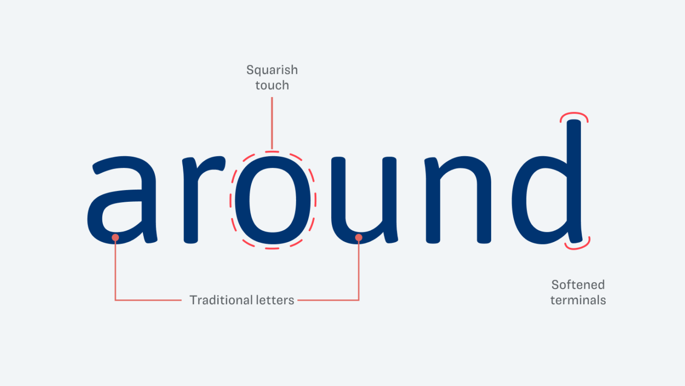
When used for body text, Asap is very readable and due to its narrow proportions space-saving. Also, the Regular weight is sufficiently contrasting. Learn more about it in my Asap font review.
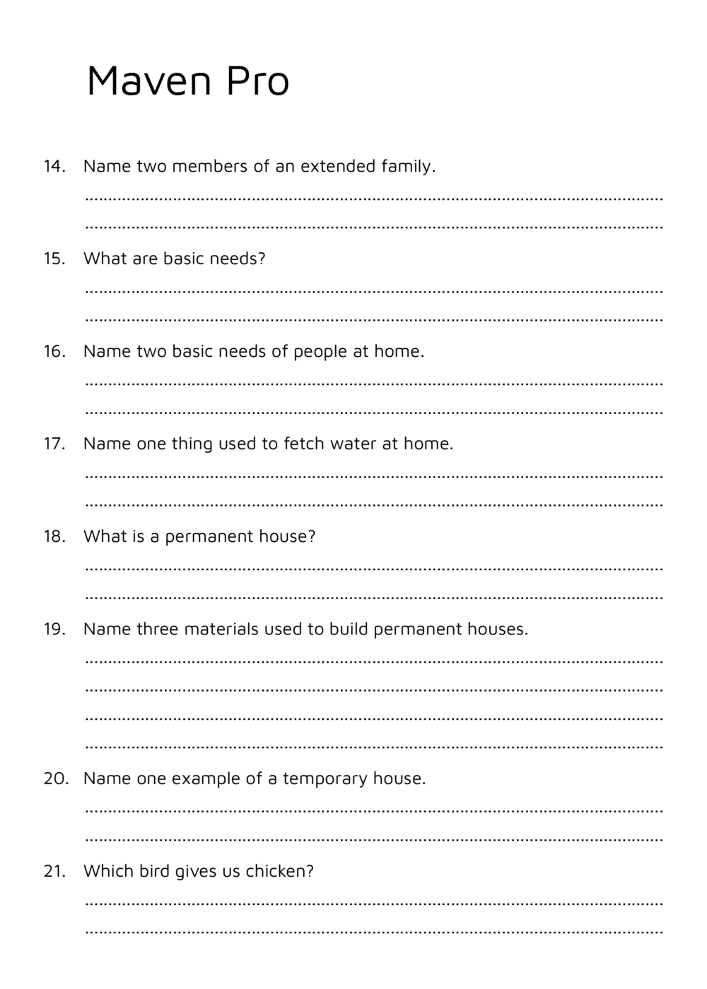
2. Maven Pro
If you want to keep a more distinct look, I recommend the Google Font Maven Pro. It has some simplified letter shapes as well, like the lower case “u”, but also the missing terminals at “a” and “d” are pretty unique. This also adds a soft and gentle touch to it.
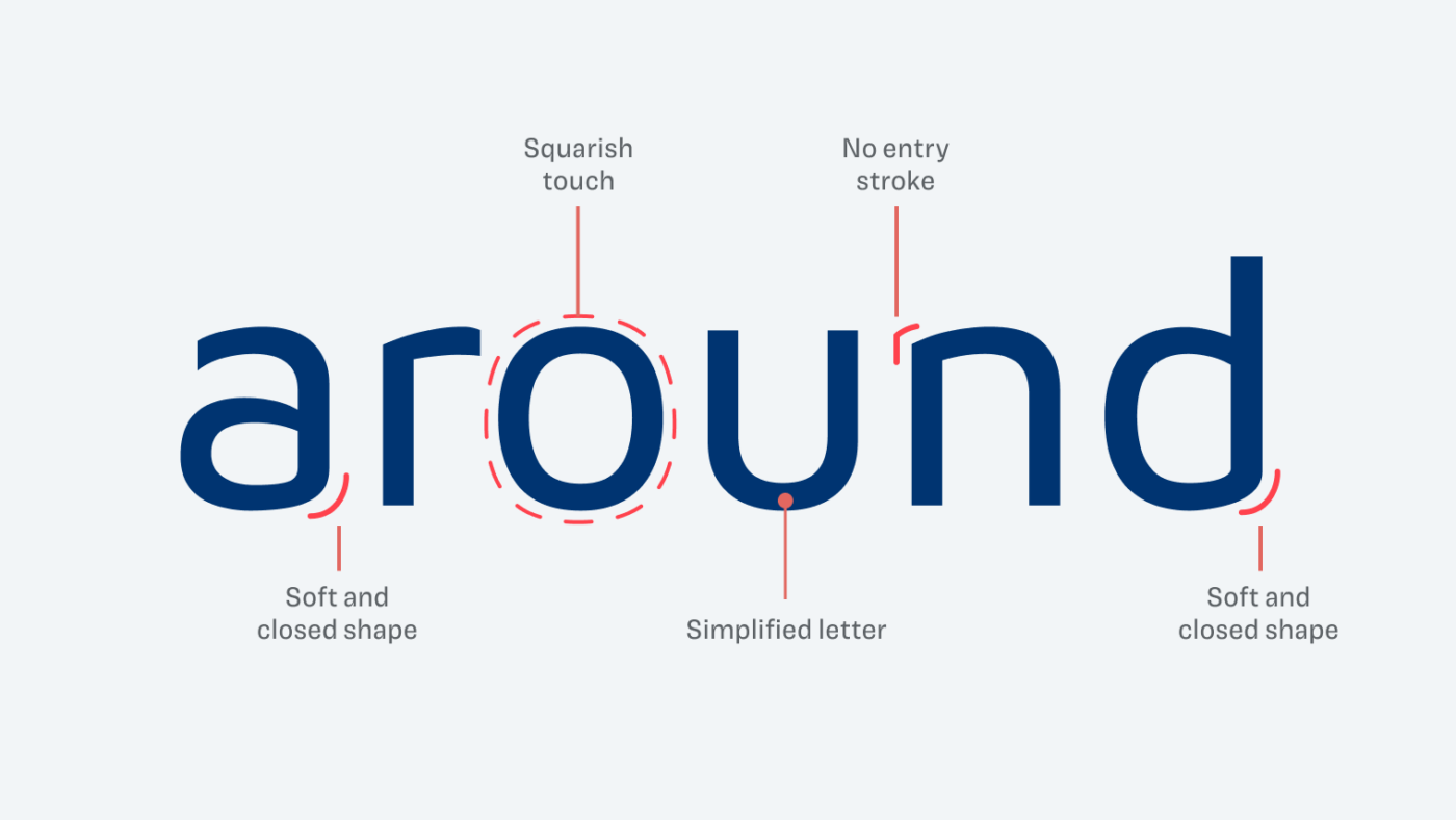
When used for the worksheet, it becomes obvious that Maven Pro might be a bit too light as well. So maybe the Medium weight would be better in smaller sizes. But due to the squarish touch and narrow width, it is a very economic type choice.
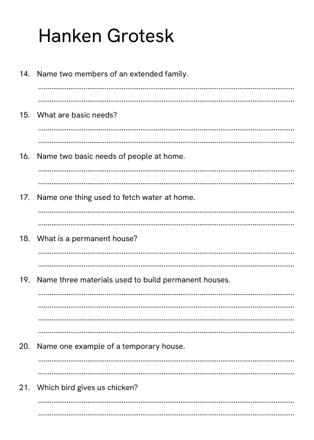
3. Hanken Grotesk
Depending on the vibe the worksheets should convey, this is the strictest and soberest choice. Hanken Grotesk is close to typefaces like Helvetica or Inter, but with wider proportions and a little geometric touch. Its terminals are straight and overall the typeface seems very plain.
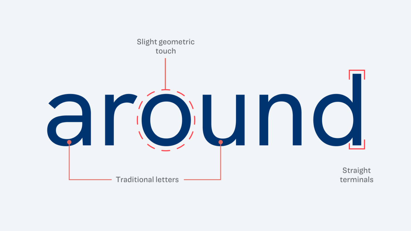
When used for copy, it almost disappears, it does its job without much fuzz. The most exciting thing about it might be the double-storey ”g“ that stills gives it a little personality. Use this typeface if you want to emphasize functionality.
What’s the best Quicksand alternative?
All three suggested fonts have their advantages and disadvantage. The unique choice is Maven Pro, the friendliest is Asap, and Hanken Grotesk is the quietest.
Now it’s up to you, Taylor! Choose the font which suits you most and let me know what you make of it.
If you have a typographic question, submit it here, or consider a private coaching call.
Nicely done.
Thank you, Norman! 🤩
Great article. Always liked Hanken!
Oh yes, Carl! Hanken is a great type family!
You should cite the actual artist/foundry, Google just curates a list of free fonts, a few fonts like Noto are their own making, but the majority are from independent artists who still hold the copyright.