
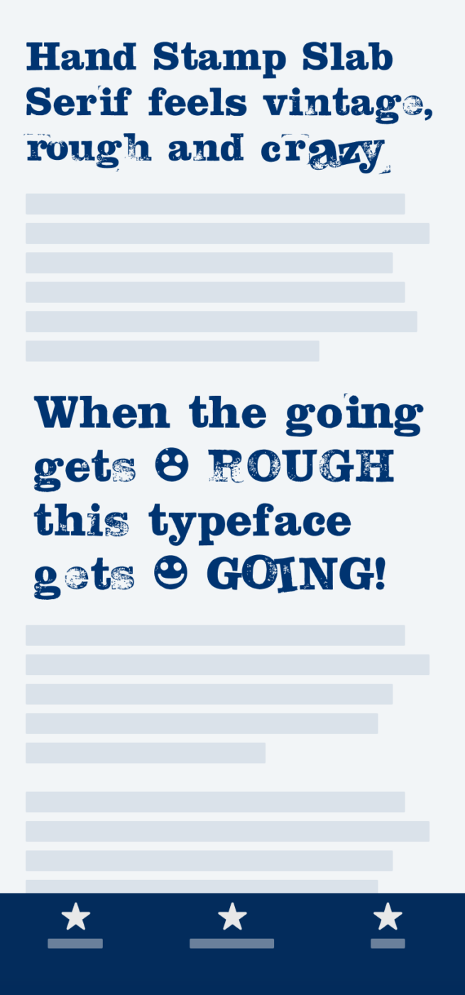
My thoughts on Hand Stamp Slab Serif
Hand Stamp Slab Serif is a very different approach to a handmade typeface. To keep the natural impression and texture of hand-stamped letters, Manuel Viergutz started out with actually stamping each character. He scanned and digitized the result, turning it into a font and advancing it with clever OpenType features.
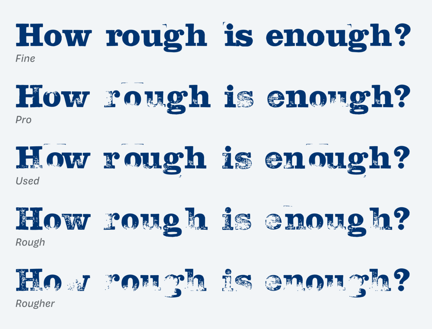
What came out is a type family that shows various degrees of roughness in its texture. Depending on how vintage you want something to look, choose what fits best. Fine looks more or less like a poorly spaced Clarendron, but the rougher it gets, the less legible and more interesting it becomes. Hand Stamp Slab Serif Mix and Mix Used push the concept further. These styles are strikingly wild and playful, with characters that change their size, position and angle. These styles live somewhere between a ransom note and the album cover of a punk band.
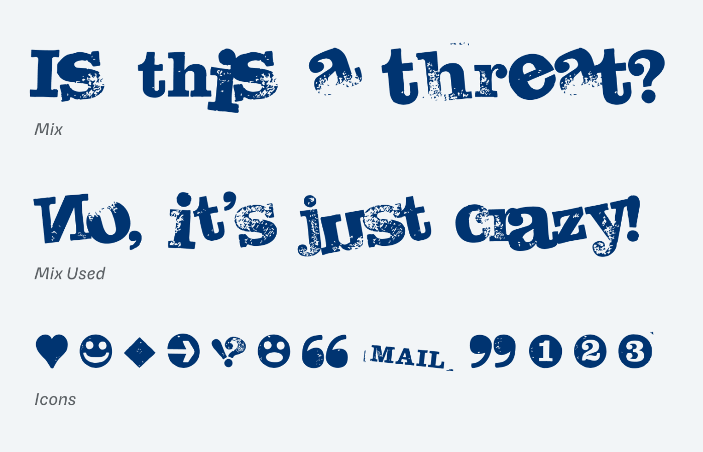
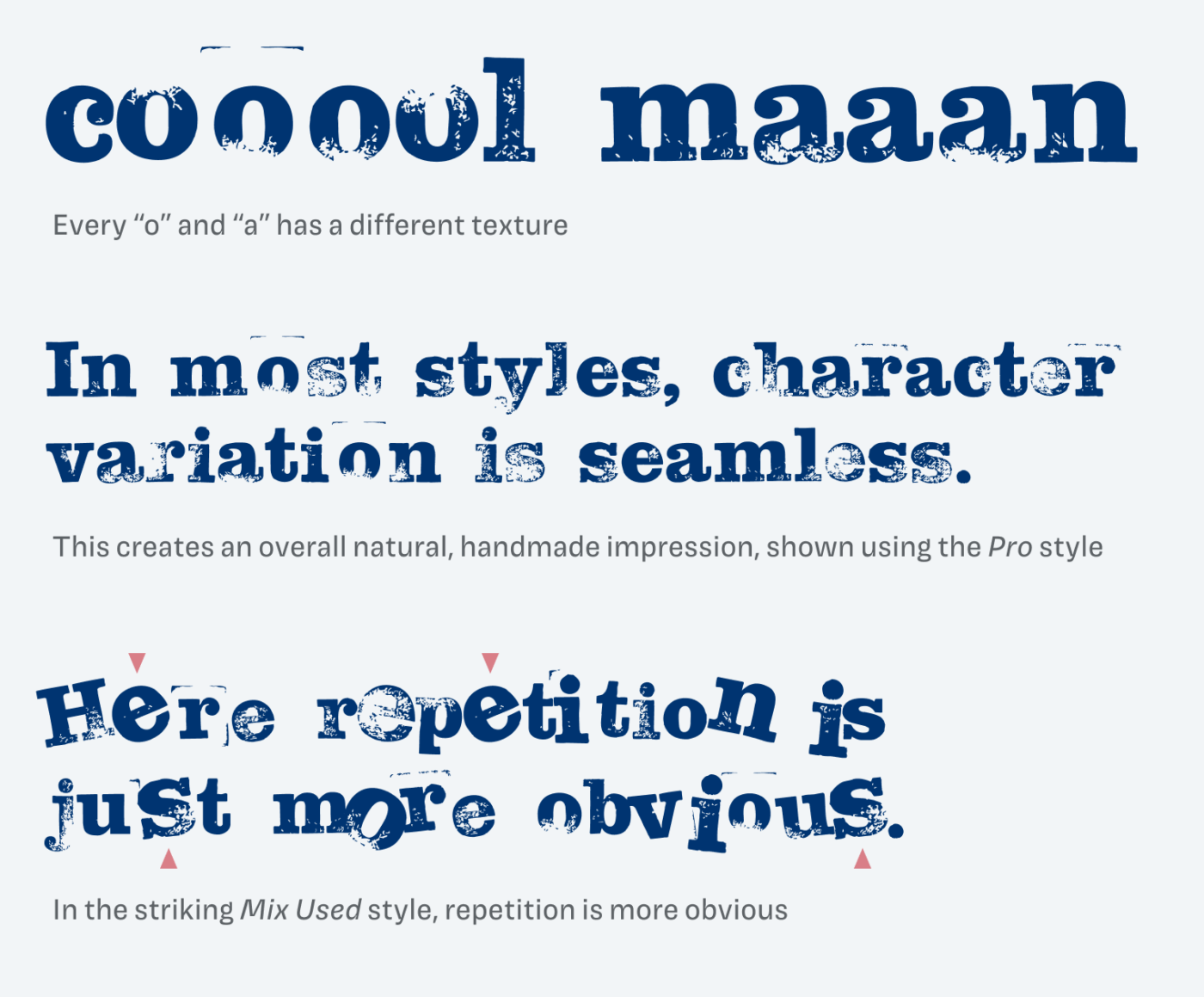
One feature I particularly like, are the contextual alternates. Every character has several variations, so the impression of an authentic hand-stamped piece of text is created. While character repetition is little obvious in the rough styles, this reaches its limits with the wild Mix styles. There the individual characters are more striking, which lets them stand out. This makes them easy to compare and destroys the illusion of being hand made. I would not recommend using Mix for more than one or two words. But if your project strives for total anarchy ✊, you could still hand-pick the characters.
Overall Hand Stamp Slab Serif is an outstanding typeface if you want to represent something hand made, vintage or even rebellious. Ideal for posters, headings or other large, sort display text. On the web, I recommend using the Pro style since it is most legible while still remaining an interesting texture and patina.
Font Pairings for Hand Stamp Slab Serif
Since this typeface is quite rational and based on Clarendron, it matches perfectly with Besley for body text or one of the more sober suggestions.

- Headings


Learn more about pairing typefaces using the Font Matrix.
What do you think of this week’s typeface? Write it in the comments! Also, if you have a suggestion for an upcoming Font Friday 😉.
As you suggest leaving suggestions here. Here are two. They are somewhat classic, rather than more quirky/expressive. I know that you have a lot of options and suggestions so I have no expectations about seeing them feature in these pages. But FWIW ..
Dalton Maag .. Objektiv
https://www.daltonmaag.com/library/objektiv
I like how the base is a nice geometric geometric sans, and then there are two sets of stylistic variants which soften it for text etc.
Lucas Bihan .. Self Modern
https://fonderiebretagne.fr/
Becomes more expressive in bigger sizes and simply lovely italic.