My thoughts on Sharpie
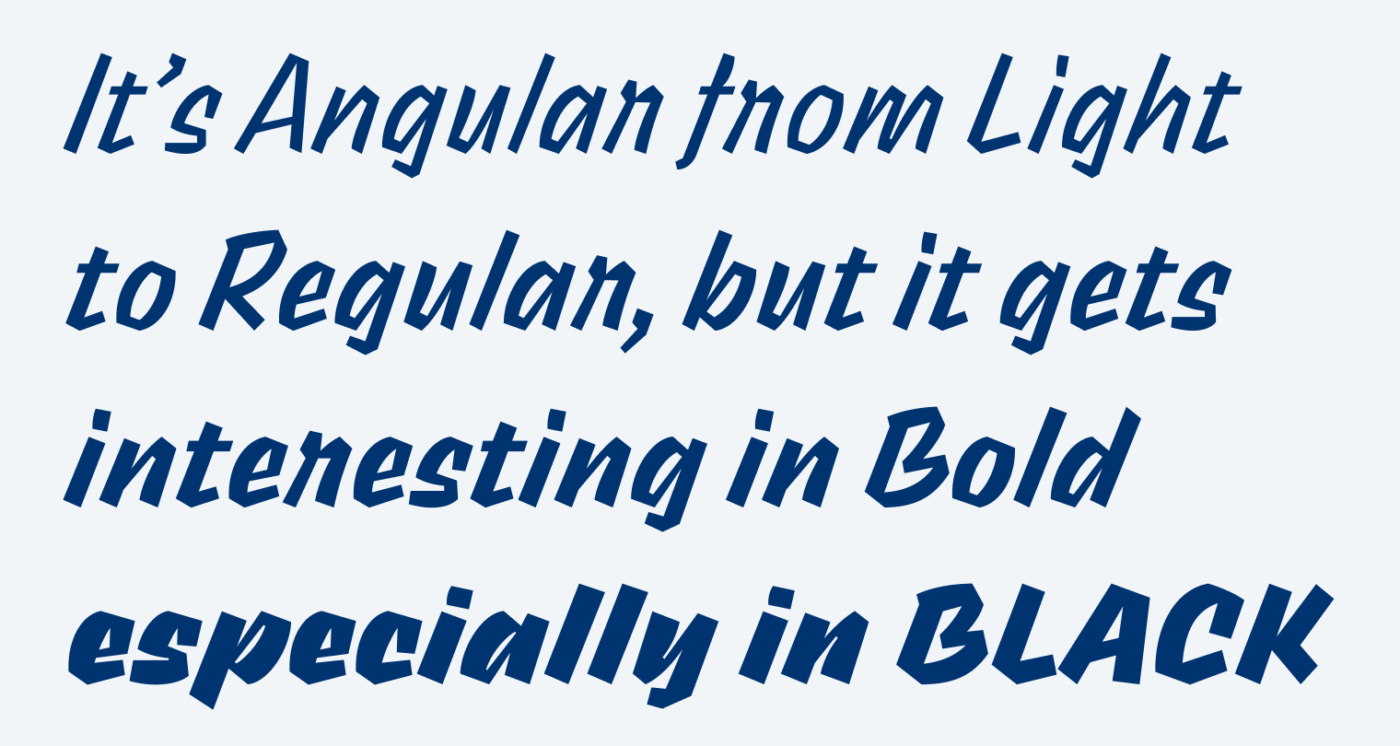
Sharpie, designed by Théo Guillard, is named after the popular kind of marker with a broad and a narrow side. It’s more a display typeface that shows some calligraphic vibes, which make it seem approachable, casual and friendly. But friendly in an angular, edgy way. It shows some speed, contrast, and rhythm. Except for using it in a title or some headings, Sharpie also works for very short paragraphs or marginalia and the Regular weight is still legible in sizes around 16 px.

Sharpie is available on Fontshare, a free fonts service launched by the Indian Type Foundry with the mission is to make high-quality fonts accessible to everyone. When I discovered a fault in the kerning of the typeface, they immediately fixed it. So obviously they stand by their word 😉.
Recommended Font Pairing
All right, now you want to use energetic Sharpie for a cool heading, but what pairs well with it? For your body text, you gould pick something edgy like Comma Base, or totally different, very calm and soft Golos.
- Headings
Learn more about pairing typefaces using the Font Matrix.
What do you think? Is Sharpie something for an upcoming project? Tell me in the comments below!


Among the fonts that look like they were written with sharpie this one is very good one. However I would expect the letter -s- to have something similar to -B- and what is going on with -r-? It looks like upside down -u- .
I thought the same thing about the lowercase -r-. Looks like it is was written in script but is the only letter like that.
I agree, these shapes are rather peculiar for it being a handwritten kind of typeface. Alternative characters would be interesting or helpful there. P.S. Love your name, Dr. Zoidberg. Love Futurerama.
Sharpie, how serious the name is😆 behaves like a generation alpha when entering the disco club😎 And yet, there is so much to experience. Unfinished project, with potentials. Sharpie, Sharpie, inconsistency in letter style will cost you some lectures and practice.