My Sentient Font Review
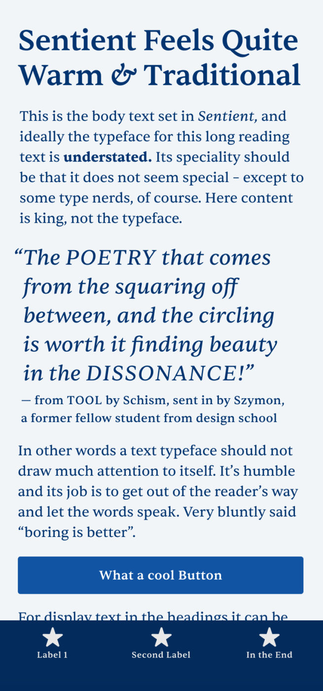
You are looking for a modern, free, serif typeface for extended body text? Then I got a wonderful treat for you: Sentient is a robust, clean free font and with its five weights plus matching italics just made for text heavy use cases.
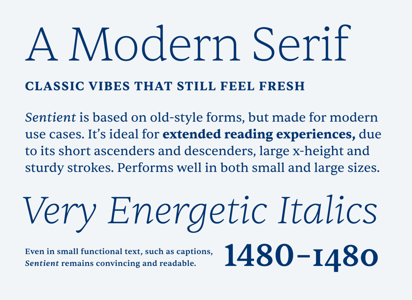
You may wonder: what exactly is a modern serif font? “Don’t all serif fonts look the same?” I dare you to say that again after looking at the examples below. When comparing Sentient with EB Garamond, you will feel and see what I mean.
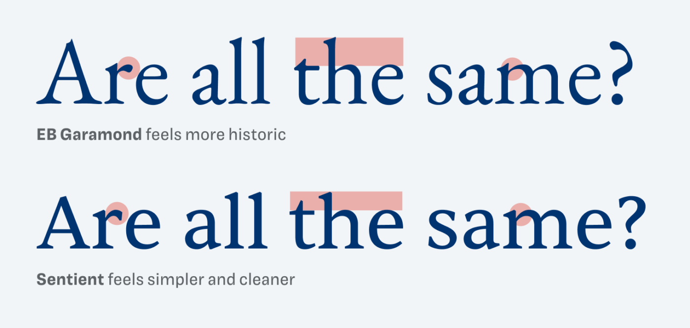
The biggest differentiators are the stroke contrast, the length of the ascenders and descenders, and even the exact look of the serifs. As always, these details add up and create a very distinct picture. Which of the two samples feels more contemporary to you?
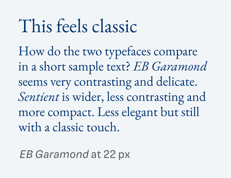
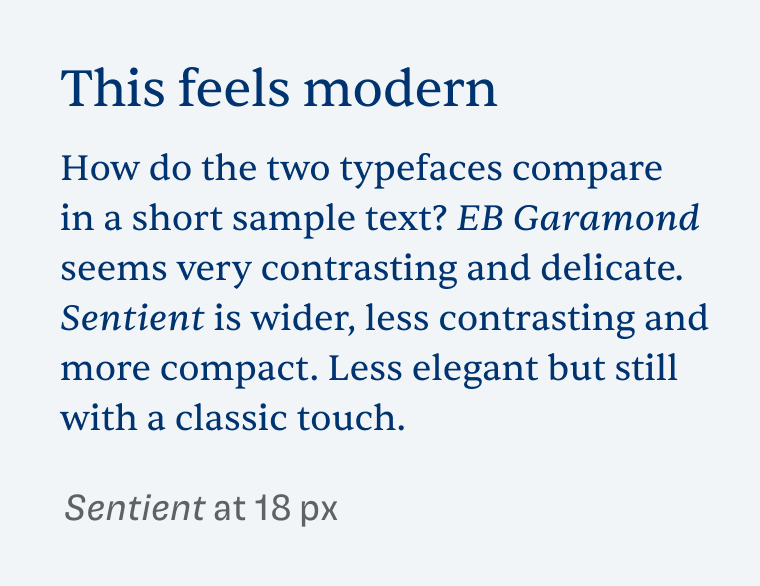
Even though Sentient is best for body text, it still convinces at larger sizes, especially in the Light or Extra Light weight. I recommend activating the rare ligatures to make your headings and big pull quotes more charming. Also remember to reduce the letter spacing, like I did in the right column below.
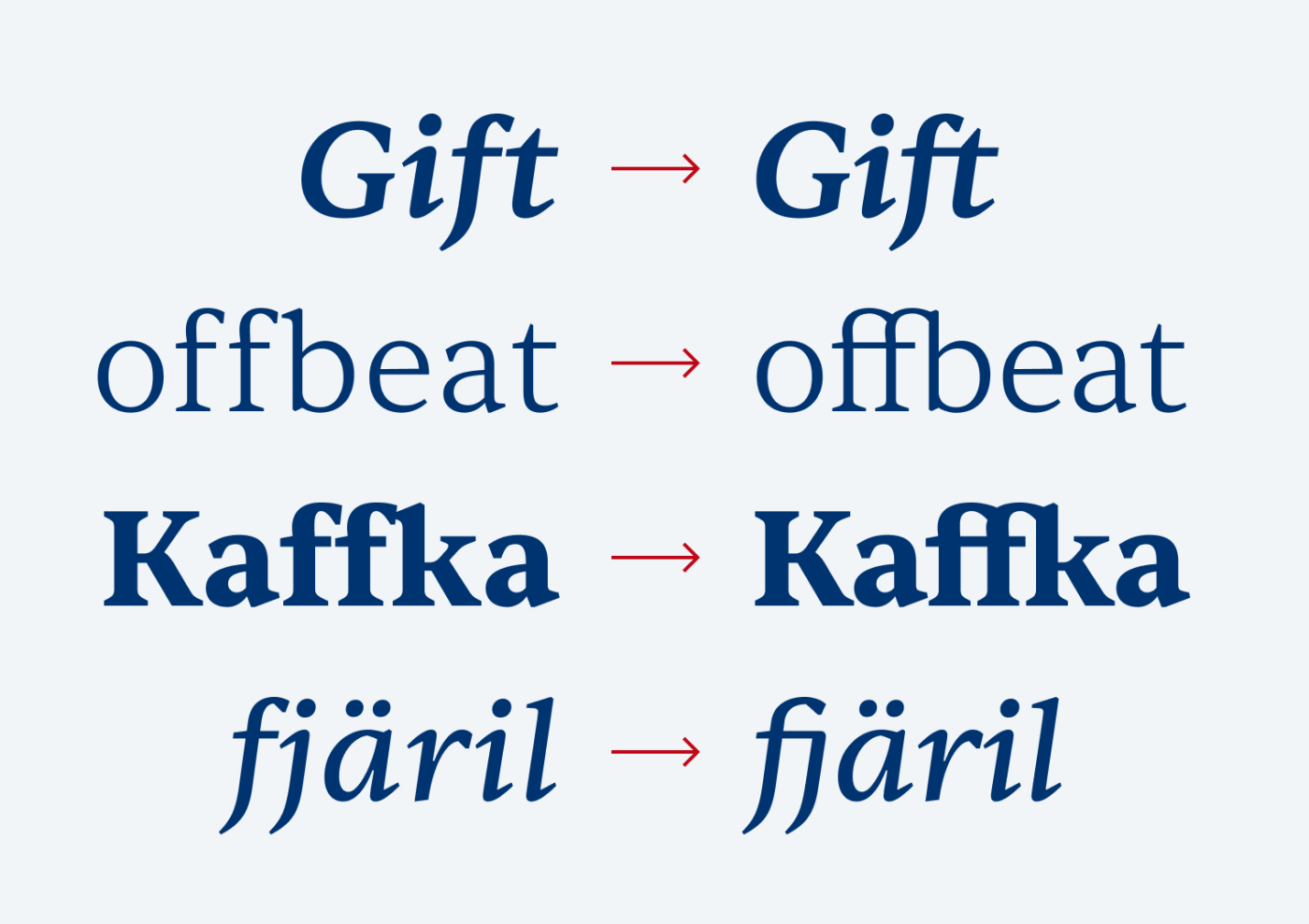
Exploring Sentient’s possibilities makes me eager to use it in an upcoming project, perhaps for a blog design? Its modern yet classic touch, paired with smooth readability, makes it a versatile choice for both body text and elegant headings. It’s definitely worth a closer look!
Font Pairings with Sentient
Sentient is a dynamic, slightly contrasting serif typeface. Pair it with one of my suggestions for exciting headings or UI text.
- Headings
- Copy
- UI Text
Learn more about pairing typefaces using the Font Matrix.
How do you like Sentient? Tell me in the comments, also what cool typeface I should review next!

Great find, thanks! I really like the cleanliness of Sentient, while the italics and especially the ligatures give it a distinctive look. This puts Sentient in a preferable position compared to other contenders in the “modern serif” field, such as PT Serif – which might have been a better comparison? 😉
Yes, PT Serif would have been a good comparison. Next time 😉.
A wonderful font, thank you for the find! Love this website.
Very happy to hear that, Andrew. Sentient is really a gem 😊.