
My Name Sans Font Review
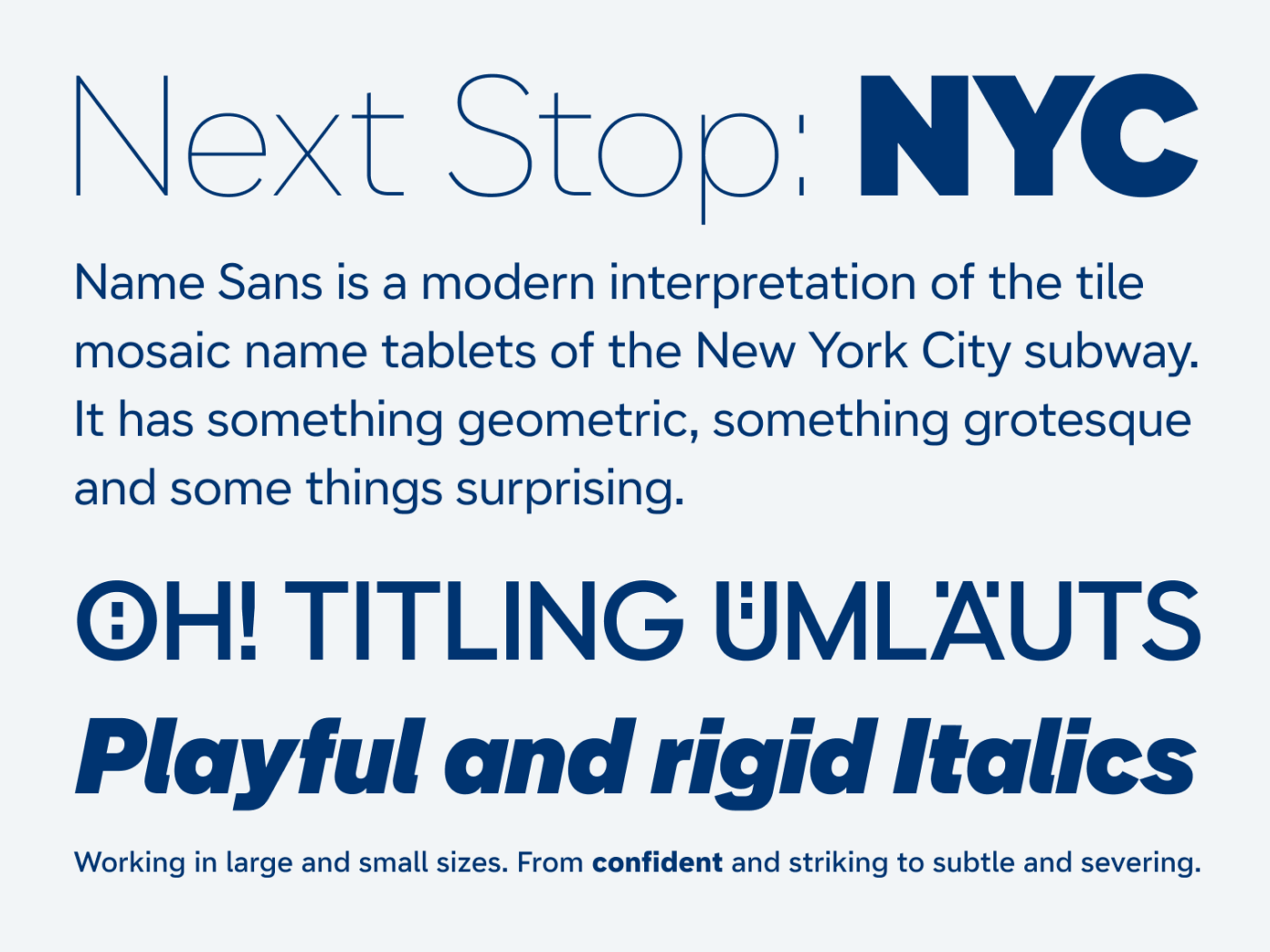
When you take a ride with the New York subway, you will observe that some stations have mosaic name tablets on the wall. They might appear similar, but when closely looked at, you will discover some interesting variation and details. Like Stephen Nixon did, when he turned that tile mosaics into modern and versatile Name Sans.
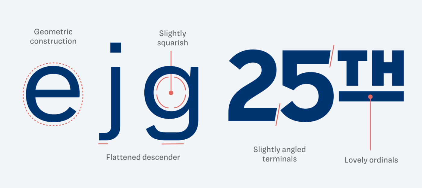
What’s very particular about Name Sans is the geometric construction that you can see at the circular lower case “e” or “g” below. However, this round shapes often turn slightly squarish or get flattened, like with the descenders, reminding you of the mosaic tiles again.
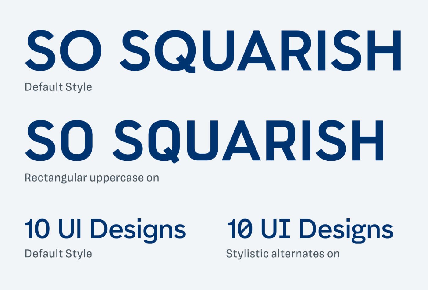
Name Sans is equipped with twelve weights and a vast number of ordinals and stylistic alternates. These let you fine-tune the appearance of the typeface, like from rounded to squarish capitals, giving it an extra vintage touch. Legibility was also considered, thanks to certain stylistic sets, that let you make certain characters clearly recognizable.
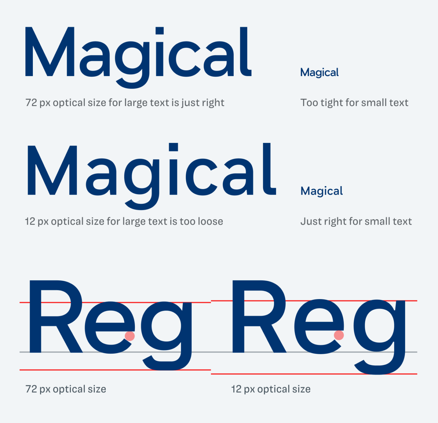
But what makes it truly sophisticated is the optical sizing, ensuring this typeface works from tiny UI text to big posters. The smaller Name Sans gets, the looser it is spaced and the more open letter shapes become. See it in the sample below.
Besides all the practical advantage and the versatility of Name Sans, I particularly appreciate how well the lovely details from the mosaics were kept and systematized for this typeface. It makes me eager to use it and try it out. Learn more about the process in the making of story.
And as Lorcan pointed out, there is currently monospaced Name Mono in the making, available on Future Fonts.
Font Pairings with Name Sans
Name Sans is a quite geometric, linear sans-serif typeface with grotesque influences. For a diverse pairing pick unusual Antipol or soft Borsok.


Learn more about pairing typefaces using the Font Matrix.
How do you it? And do you have another font recommendation I should share? Tell me in the comments!
Very nice. Might be worth noting that it has an interesting and distinctive Mono companion.
Thanks for pointing me to it, Lorcan! I added the link in the article.
Sorry Oliver, can’t stand that belly on little p and large shoe on little t, pardon, the flattened descender.
BUT, Name Sans is a labor of work, and I can only imagine what I would have discovered yet about this font. It seems like it’s full of crafts surprises. The beauty of optical sizing is that it can shift your design 180!
I love reading about the cultural references and this one possesses the US vibe. My favorite detail is angled terminals. It makes this font more serious and I have more respect for it.
P.S. Please share the link to your speech!
All good, Jana, tastes are different. In one project where I suggested Name Sans, the flattened descender of the g was also too striking. Luckily Stephen included a stylistic set where the g and the t are more simplified, so you can switch.
Once that talk is out, I’ll post it in the newsletter ☺️.