
My Metropolis Font Review
When I discovered Metropolis, I was immediately pulled in by its elegant and stable numerals and capitals. Inspired by geometric sans-serif classics like the wonderful Gotham, it conveys something clean, solid, and durable. This makes it especially suited for larger text – which is where I think its biggest strength lies.
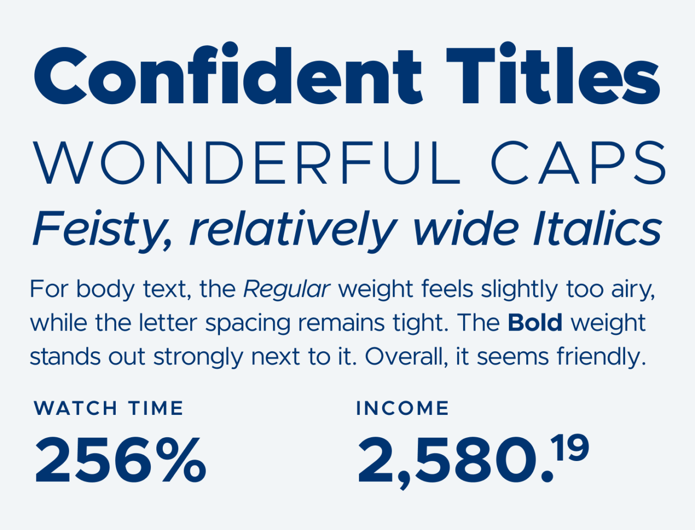
Fairly interesting are the italics. They add something playful and organic, especially in letters like the lowercase single-storey ‘a’ and, most of all, the ‘e’. What I’m not so convinced of is Metropolis’s performance in body text or smaller UI text. It seems fairly light and tightly spaced, so it’s better to compensate for that.
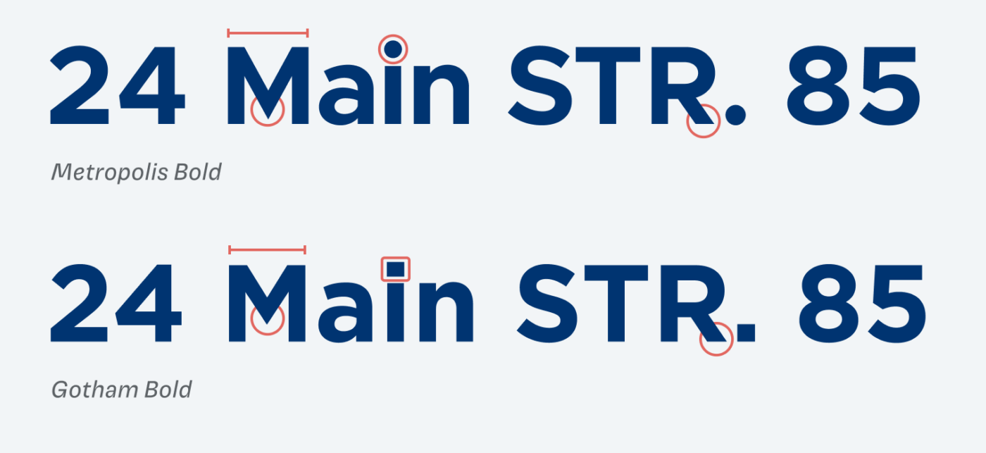
When comparing it to Gotham, you can see how similar Metropolis feels. Some letters are a bit wider, like the capital ‘M’, and I also have an issue with the ‘R’, which seems slightly unstable to me. For my taste, its leg sits a tiny bit too far to the left – but maybe that’s just me being picky 😂. You can also see how much impact the rounded punctuation has, giving Metropolis a softer and more approachable touch.
Font Pairings with Metropolis
Metropolis is a geometric, linear sans-serif typeface. Use it for lager text and pair it with something more contrasting for your body text or something narrower for functional text.

- Headings
- Copy
- UI Text


Learn more about pairing typefaces using the Font Matrix.
What do think? What do you like or dislike about Metropolis? Tell me it in the comments!
I like the font. A theatre in my home town used Metropolis. But I believe there were copyright issues with Hoefler & Co. in the past. Maybe handle with care. 🙂
Nice! Which theater is it?
• db and qp are mirror images
• uc I and lc l indistinguishable from each other
• A condensed version would be nice
• I agree about R; looks top heavy. Don’t shake the page or it will fall over.
• Calling Regular “airy” is a polite way of saying it’s too thin
• I could not find a way to download all 18 fonts at once from github. Downloaded elsewhere.
On a different note, most sans fonts need to find a way to differentiate uc I and lc l and number one:
• M16: M-16 or MI-6: is this a rifle or an intelligence service
• A1: artificial intelligence or steak sauce
• You can call me Al: man’s name or artificial intelligence
Yes – in this context it can be horrible and so easy to mix up. I’m always reading “AL” instead of Ai. 😂
Metrópolis is an obvious clone down to its name which is reference to DC Comics’ other major franchise Superman.
I would add that Jonathan Hoefler famously DMCA’d the GitHub repo, but VMware forked the font. As demonstrated with the success of Monserrat, a lot of people want a Gotham-style font without the cost.
On a side note, I want the Gotham Slab font that was used for the Obama campaign.
Oh, Gotham Slab is a good one! ❤️
“R-For my taste, its leg sits a tiny bit too far to the left” R is humble, shy, and a hesitant guy.
I’m taking little e with me.
Metropolis was one of my previous choices as a brand font, back in the day when I didn’t know my company very well. But there is something barbaric in it that I can’t qgrasp. It’s weak and, at the same time, neanderthal!?
I really like the medium italics and I love free fonts.. but this is almost exactly a clone of Gotham from 2000. So the original creator is likely still alive and would potentially losing income from it. I am fine with taking inspiration but even an AI wouldn’t have copied it this much.
In your recommended section you list both Charis and Clear Sans. I actually think those two fonts work even better with each other than Metropolis. Currently Charis page lacks any recommendations, so maybe you can add Clear Sans. I am going to try them together for myself (with Charis Sil in place of Charis for the better Unicode coverage)