My thoughts on FR Kraken Slab
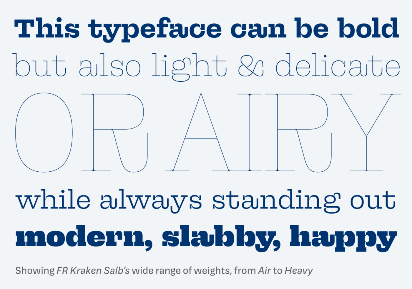
Love is in the air … the sturdy serifs of FR Kraken Slab grabbed my heart and hold it tight. This typeface designed by Béla Frank is confident, playful and shows strong personality. In the bold weights it is loud and strong, in the light weights, it can be gentle. But it never loses its uniqueness.

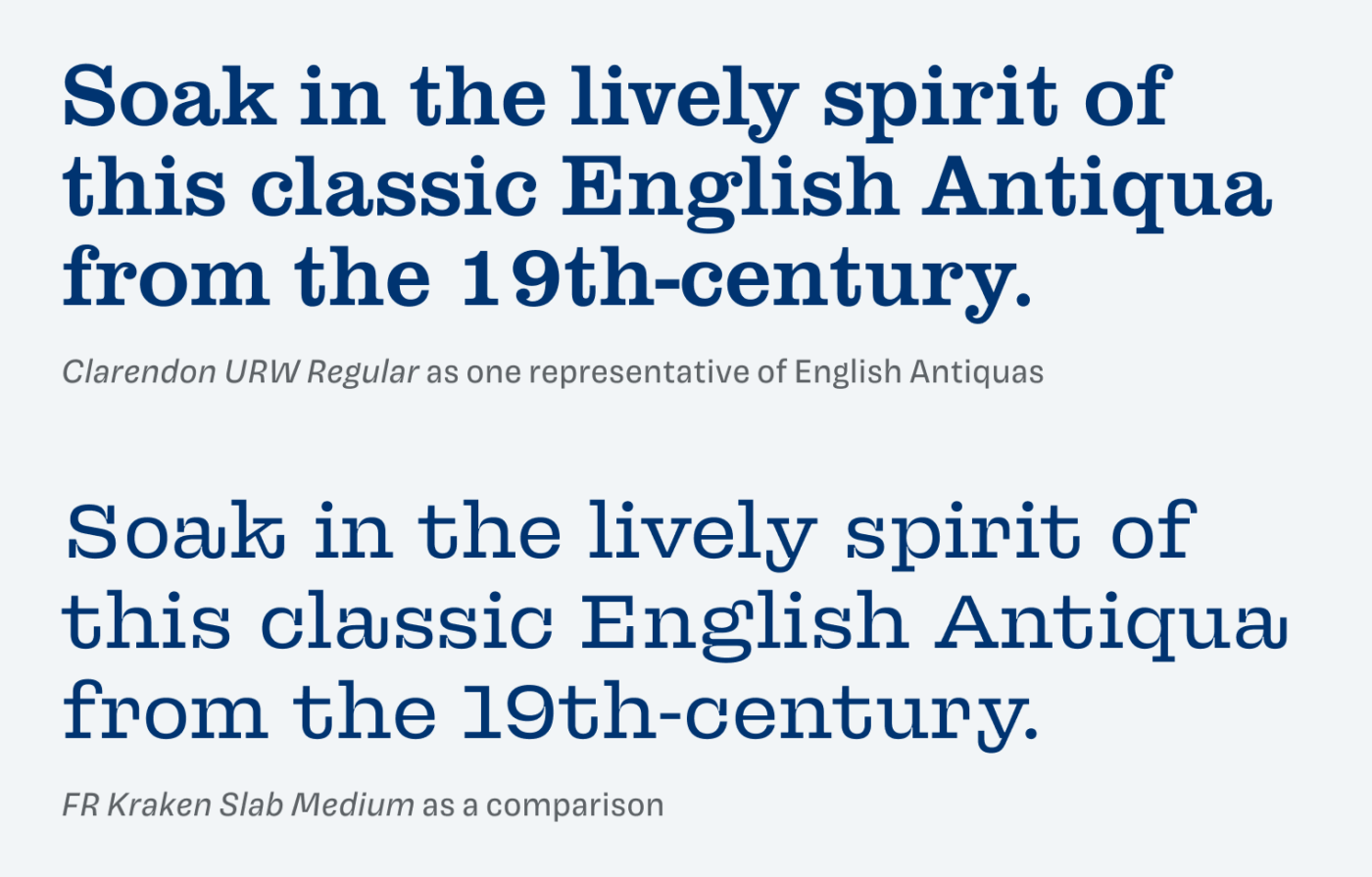
At first sight, you might say it does not look that modern, probably reminding you of the wild west or retro bulletins. That’s no coincident. The typeface was inspired by the lively and raw 19th-century English Antiquas, like Clarendron. What FR Kraken Slab does extremely well is captivating that spirit, while moving it to contemporary design with less contrast, and more characteristic features.

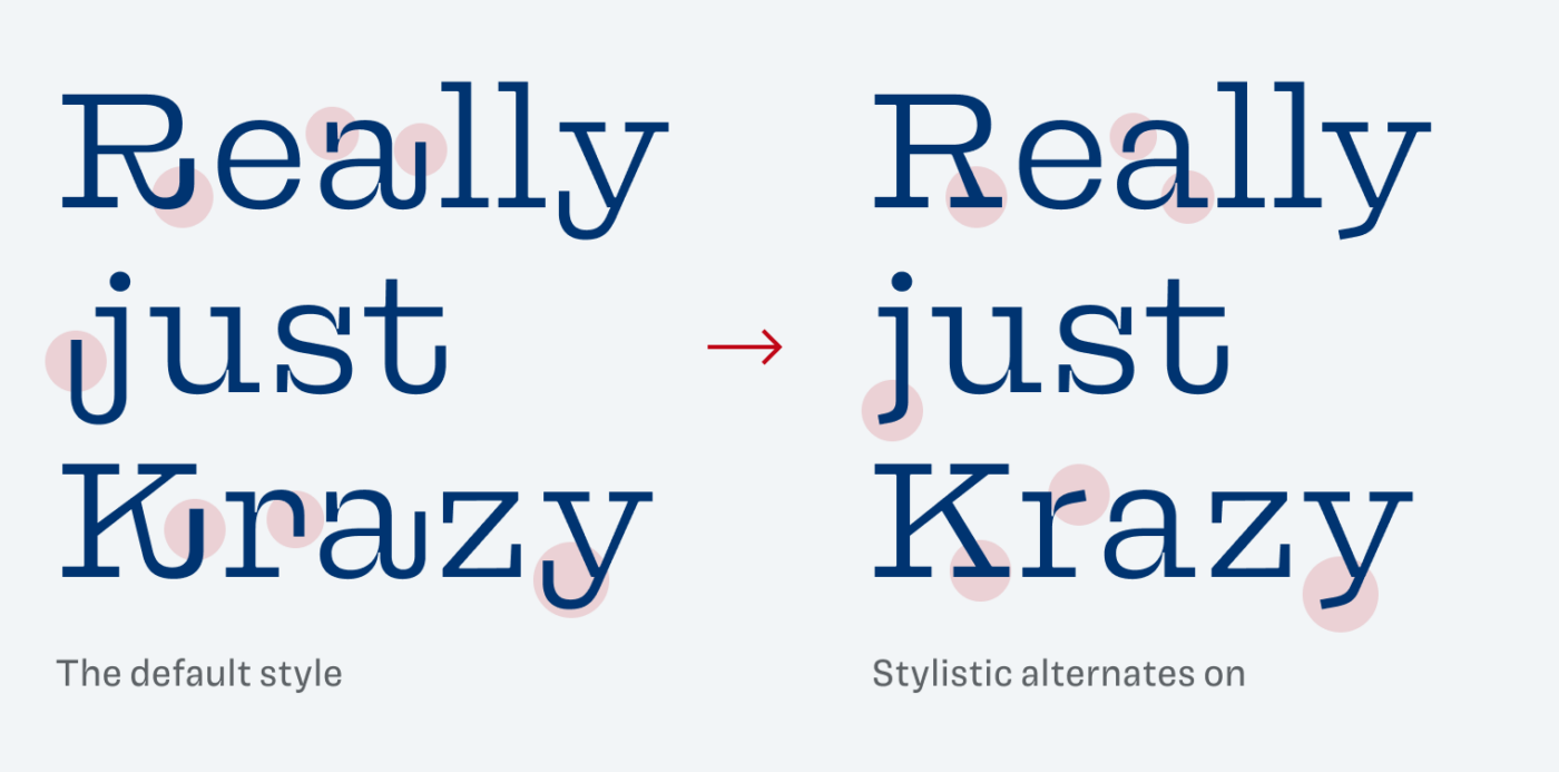
The most striking features are the bent and extended strokes at the end of many letters, like the R, K, a, j, k, r, or t. They add to the playfulness, wildness and loudness of this typeface. Brilliant for headings, while it also can become distracting in body text. Luckily, there is a way how you can tame that typeface.

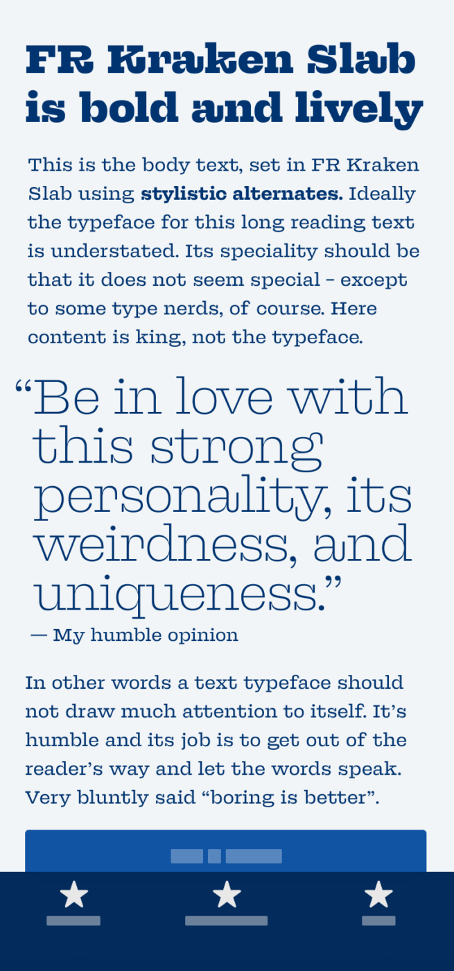
It is called stylistic alternates and makes FR Kraken Slab simpler and narrower. I activated this OpenType feature for the body text in the phone image on top. See for yourself what impact this has, in the comparison below.
Overall, FR Kraken Slab is a great choice for branding, a playful editorial design (maybe using the free Air weight), or an attention grabbing web design for titles and shorter paragraphs. The power of stylistic alternates makes it more versatile, so make use of them, when it makes sense.
Font Pairings for FR Kraken Slab
FR Kraken Slab is a rational, contrasting serif typeface. Pair it with Domine for classy and friendly serif copy. Or use rational Besley that is more like a simpler version of it.
- Headings
- Copy
Learn more about pairing typefaces using the Font Matrix.
What do you think? Is FR Kraken Slab something for an upcoming project, or do you have a font recommendation? Tell me in the comments below!


This one is worth buying even though I don’t currently have the concrete project for it. My favorite letter is little ‘a’.
Looking at the picture that you so nicely designed, do I see ‘s’ being jealous on ‘t’ and ‘y’ being in love?
Are ‘c’ and ‘a’ fighting in ‘can’?
(sentence: This typeface can be bold)
R is a lazy guy, other favorable letters: g, q, r.
Fantastic choice, both, FR Kraken and your lovely wife, your support! Cheers to 9 years 🥂 Make it x10 more Oliver!
It’s somehow like buying jewelry you don’t have an occasion for. But there will be on, for sure 😉. Thanks for the good wishes, Jana ❤️!