My thoughts on Fig Grotesk
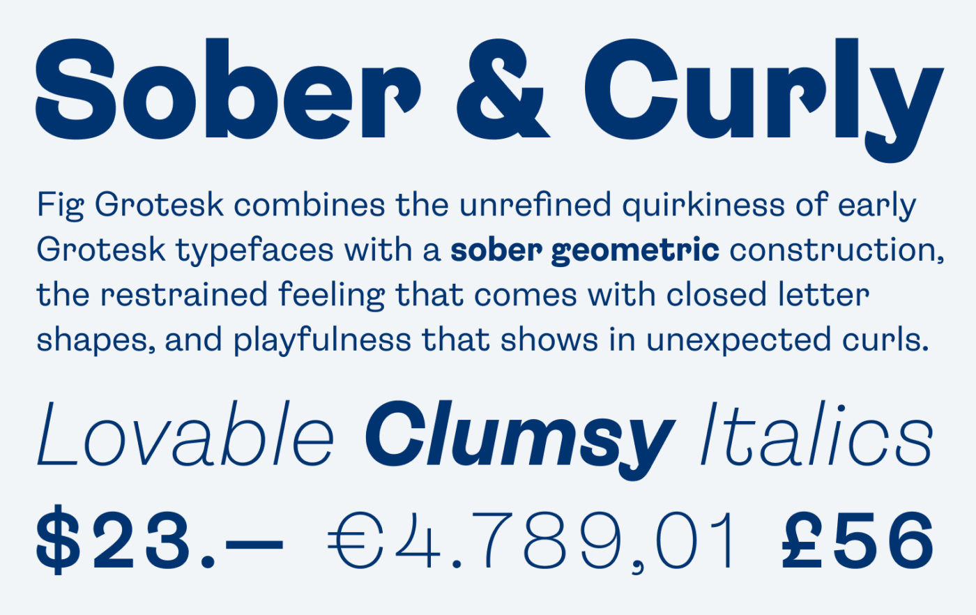
You might say: “Come on, another Grotesk?” Well, Fig Grotesk is not. It’s a true eye-catcher, not as polished and “neutral” as the Inters and Robotos of the world. This one has personality, is playful and quirky, conserving the interesting vibes of Grotesk typefaces from the early 1900s. But why is that?

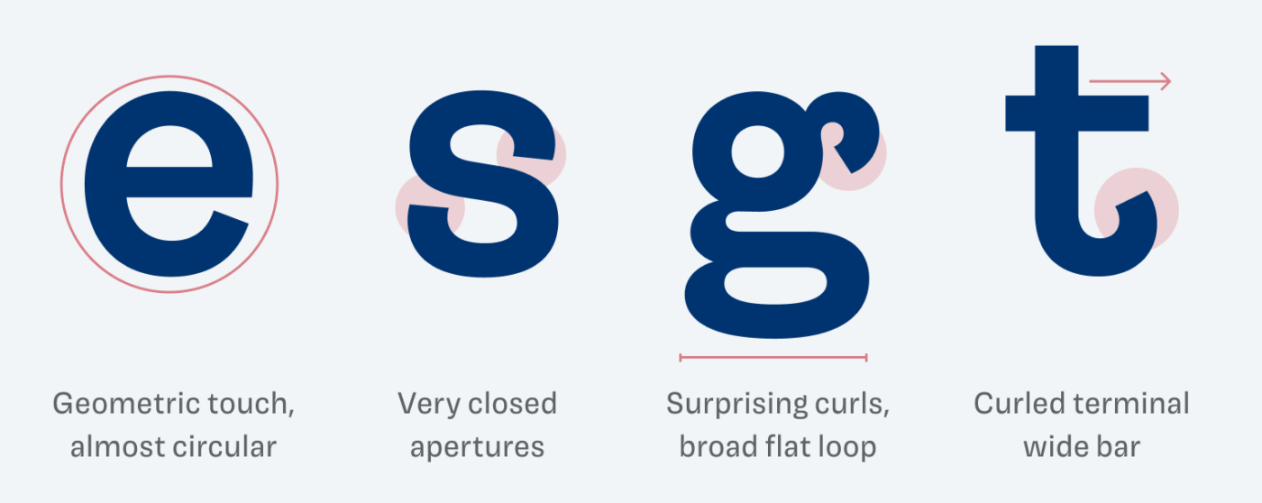
Let’s take a look at the details. Based on a geometric construction, Fig Grotesk combines many influences. The closed letter shapes (look at e, s, a) give it a restrained, sober touch. At the same time, the curled terminals add this certain playfulness and personality to it.

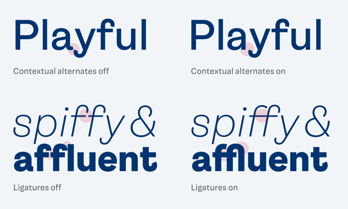
But with all that curls, they might get into each other’s way. This is why there is one contextual alternate, as you can see below. Also, the thoughtful ligatures assure that a word will look smooth and connected, which can be especially important in logotypes.

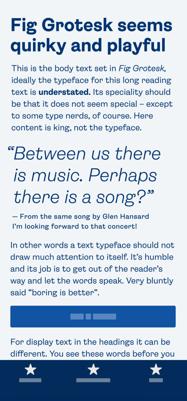
All these traits that make Fig Grotesk ideal for logos, posters, headlines, or even a little copy. For anything more, it will become too striking. This typeface, is still a work in progress and available on Future Fonts, but already in a quite refined stage.
Recommended Font Pairing
For body text or UI text, any other more functional Grotesk typeface will work, like bashed Roboto or Inter, but also Golos. For a more contrasting pairing, Fraunces would be very interesting for body text.
- Headings
- Copy
Learn more about pairing typefaces using the Font Matrix.
How do you feel about Fig Grotesk? Tell me in the comments!


I feel that Fig Grotesk might be a winner of the Font Friday 2023. year!
⭐⭐⭐⭐⭐
Who could resist that lovely “y” or “r”?
Fir Grotesk has firm curls, firmer than any black lady’s hairstyle. 👩🏾
Interestingly, no matter how good the font is, I won’t love the “s”. Hm.
Much of the potential in lowercase “e”, a circular base for the logo symbol.
What a nice font to close the October!
Absolutely, Jana, the y and r, r rockstars! Haha, love the hairstyle analogy.