
My thoughts on Faune
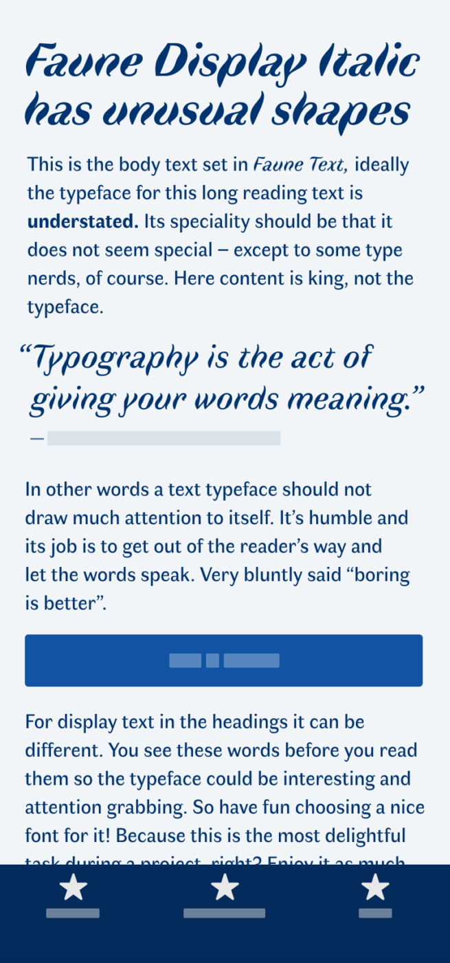
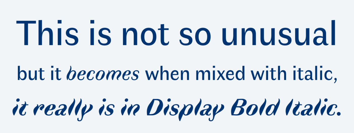
What a cool sans-serif typeface! Faune by Alice Savoie was commissioned by the French Centre National des Arts Plastiques. I don’t really get the back story, but theses wired, unusual, almost melting shapes of the italics fill my heart with joy! The typeface is available as a free font in two styles, Display and Text. The text style is sturdy enough for longer body text, but it’s the italics and combining them with the body text, that make it so interesting.
Recommended Font Pairing
If you need a more robust typeface for body text, pair Faune quite similar Garino or Foreday.


Learn more about pairing typefaces using the Font Matrix.
What do you think? Is Faune something for an upcoming project? Tell me in the comments below!
Being a regular feedback-er of your Newsletters shows how much interesting I find them. And appreciate the value you share each week with a proper dose of meaningfully structured content. I’m happily subscribed for a few months now which is not at all a usual case for me. I’m a subscriber to only 4-5 Newsletters! Take it proudly!👏🏻
Now on Fauna… Again, professional distortion. Yes, MELTING, you proposed better traits of it. Naming isn’t proper for this artistic gem. I’m a fan of all things artistic design so this one fills my eyes with pleasure. It should be kept as a one-of-a-kind because of opposing combination regular + italic. The melting walk is just… marvelous!
We’re heading to September, I’ve expected something more practical but you always surprise🔮
Thank you, Jana, your comment is highly appreciated! Made my day 🤩!
For free download, I’ve found Faune here: https://www.1001fonts.com/faune-font.html
Great that you added the link, on the site itself it’s a bit hidden and only the download link on the French site works.
Thanks!
I enjoy your weekly posts and the links to new or largely unknown fonts. I like to see new-to-me fonts, although with so many already, I am not really in the market to buy/download unless I see something really compelling. Keep up the good work, Oliver. Your “down to earth” advice on font use is valuable to users and, I’m sure, works as a good vehicle for your consulting practice.
Thank you, Philip! This is super kind of you and really motivates me to keep going! 🤩
It would be great if you would only introduce free fonts in my opinion.
Thanks for your feedback, Simone! But besides quality free fonts, I find it important to also promote paid quality fonts to encourage people to invest in their typographic voice.