My thoughts on the Climate Crisis Font
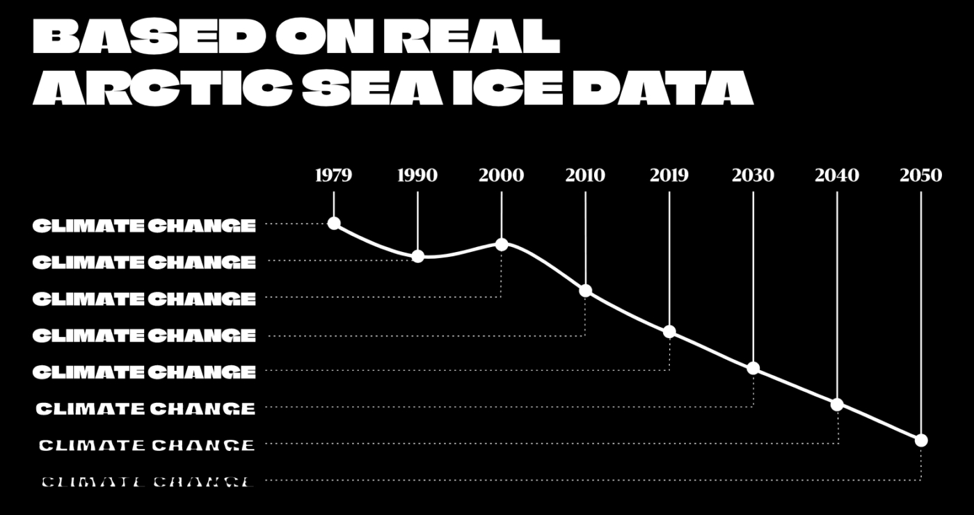
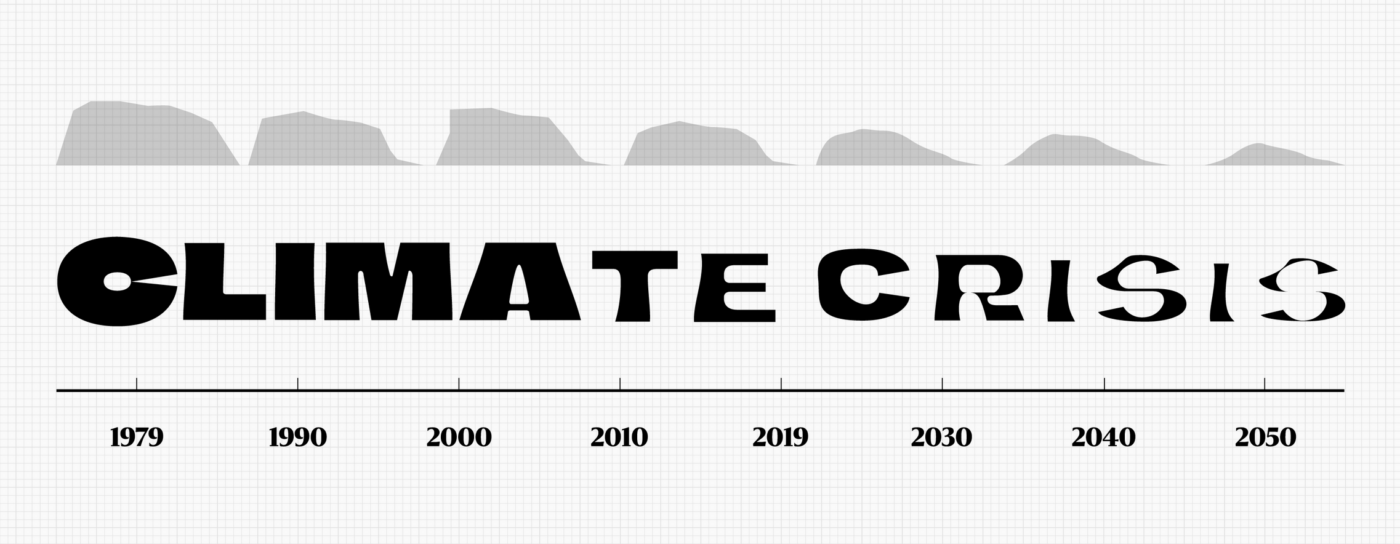
Today on September 24, 2021, it’s not only Font Friday, it’s Global Climate Strike as well. While I’m joining my local Parents For Future group to demand political action, I want to share this great and yet shocking free font I came across. The Climate Crisis Font is a variable font that helps people see the urgency of climate change in a more tangible form. The font’s weight responds to real arctic sea ice data from 1979 until 2019, and a forecast until 2050.


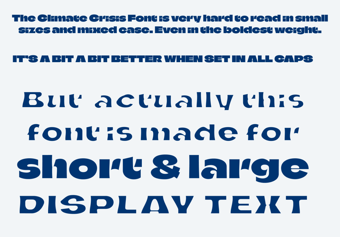
While the subject itself makes me angry and uneasy, the concept of this free font is brilliant. It shows the urgency and what already happened in such a visual way. The Climate Crisis Font is clearly a good choice for striking headlines and bold campaigns. For everything longer or smaller, even in the boldest weight (1979) is hard to read. The stencil like shapes in some lower case letters can easily be confused, so be aware of that.

Thanks to Veronica, one of the now over 700 awesome subscribers to the newsletter, that pointed me to this gem!
Font Pairings with Climate Crisis
Climate Crisis is a geometric, contrasting, sans-serif display typeface. If you look for something similar, choose Beatrice or pair it with something else from my recommendations for body text.
- Headings
Learn more about pairing typefaces using the Font Matrix.
What do you think? Is the Climate Crisis Font something for an upcoming project? Tell me in the comments below!


I love when design gets more culturally and humanistically involved. The idea is beautiful so is the execution. I already know to whom to propose this font for campaigns, it’s a newly opened place in Germany, run by millennials (architects & designers). Their topic and acquisition is the climate crisis.
Climate Crisis font speaks emotions to me. This gradual artistry from bold to melting is stunning.
Not to divert attention but, as I said a few times before, your content would be exposed to so much more audience on Linked In, a professional network, where I’ll share this post of yours.
And congratulations on 759 subscribers! 😲That’s for celebration🤗
Cool! Hope this will demand action faster! Thanks for the congratulations! Yeah, LinkedIn, I found my peace with only publishing on one social network, which is Twitter, but even there I recently withdrew a bit to keep me sane 😂.