
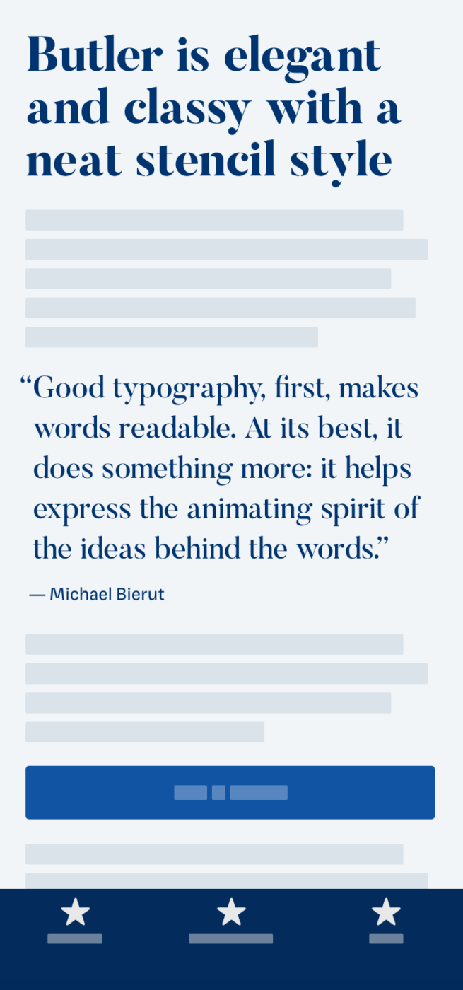
My thoughts on Butler
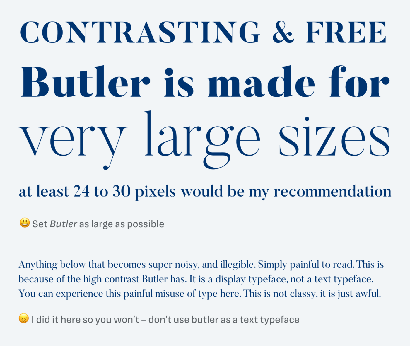
Butler is designed by Fabian De Smet and freely available. It is inspired by the elegant, restrained and precise typeface Bodoni. Butler is a bit more modern and less strict, while still having this beautiful contrast, that’s so striking about these kinds of typefaces. It obviously is something that works well for fashion, branding, or poster design. But it should be set at very large sizes. Below a type size of 24 px, Butler seems uneasy, as you can see in the example below.
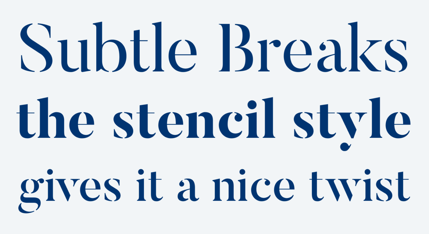
One thing that made it stand out for me, is the beautiful stencil style. The cutouts are very subtle, and almost seamless. They emphasize the typeface’s strong contrast even more, and almost make it feel like the letter shapes appear out of thin air. Wow, I get very poetic here 😅. As if the regular style would not require larger sizes, Butler Stencil demands it even more. Many thanks to Carsten who pointed me to this gem!
Font Pairings with Butler
Butler is a quite rational, contrasting, serif typeface. If you look for something calm for your body text, combine it with or one of my other suggestions.


Learn more about pairing typefaces using the Font Matrix.
What do you think? Is Butler something for an upcoming project? Tell me in the comments below!
Butler is a remarkably good free offering and I have it already. I just wonder if it risks being too popular, because I seem to see it everywhere just like Playfair Display.
I appreciate that you take this into consideration, since it kinda limits it’s uniqueness. Yes, it seems to be widely popular. However, less than Open Sans 😉.
Eine wirklich sehr schöne Schrift für große Überschriften. Danke für den Tipp.
Immer gerne, Lena!