Q&A time: Maciej wants to know:
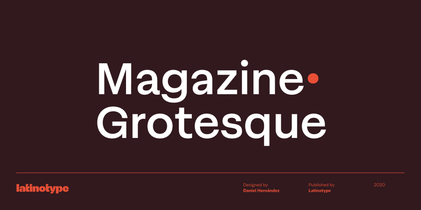
“Do you think there is a world, where a font made for branding can be used for product or app design with a quite heavy amount of data? I’m referring to Magazine Grotesque.“
Short answer: No. I made a super short video, explaining it.
Longer answer
Don’t use such a typeface for functional, small text that needs to be clear and legible. That outstroke extending (look at the a, e or g) that make Magazine Grotesque special are too much. Do the Il1 test, letter shapes are not distinct enough.
You can definitely use it for headings or kind of large and short text inside the app, but for a heavy amount of data, it is too noisy.

Two tips
- Combine it with something simpler for your functional text, Roboto, SF Pro or Inter would work, since they fall into the same style, but less attention grabbing.
- Take a look at the foundry’s examples and description of the typeface. They make it quite clear, that it is used for editorial design and headings.
If you have a question as well, happy to read in the comments below or just shoot me an email!
