Immanuel sent in a question:
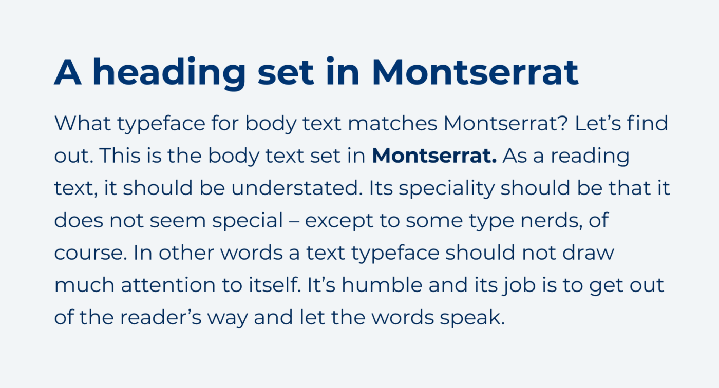
“I’m looking for a fitting font for body text. The headings are in Montserrat (that’s required).”
In this short video, I answer his question. And here are the examples I show.
Look at the typeface’s construction
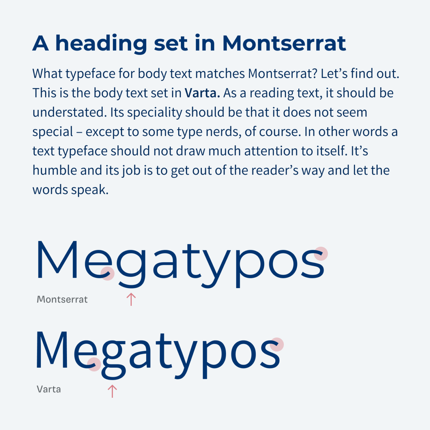
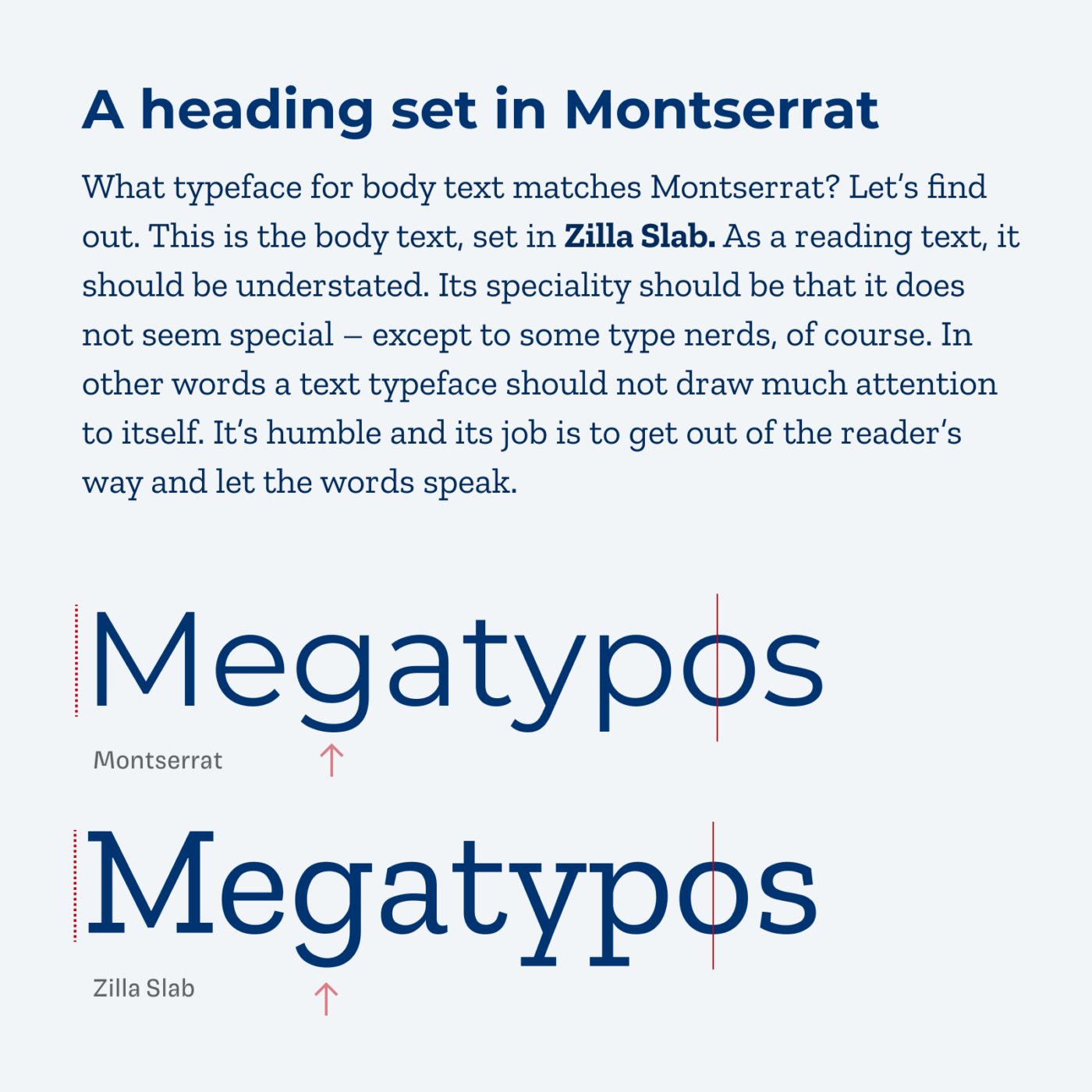
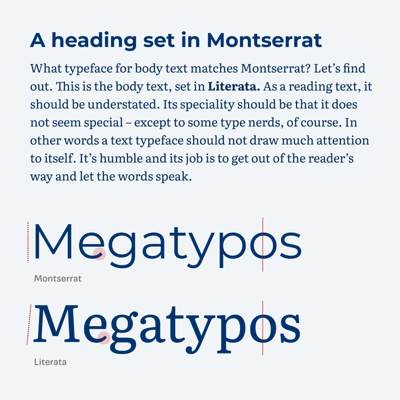
It always depends on what mood you want to create. How should your combination feel? Looking at Montserrat, it is a very geometric typeface. There is no contrast in its lines, the proportions are rather wide. And Montserrat is horribly overused 😉. When I look for a fitting font to pair it with, I always spell out the word “Megatypos”, then I look for similarities or differences in the construction of the typefaces. I describe the process in this article.
I’ll show you three possible combinations, that create different moods. All of them are available on Google Fonts for free.
Pimp my Type on Patreon
Get several benefits while supporting my content creation.
Join Patreon
1. Varta
Varta looks more or less like Montserrat, only narrower. A good typeface for body text, that save horizontal space, and overall stands for a very subtle combination. The only downside here is, that the bold weight of Varta is rather light.
2. Zilla Slab
Zilla Slab is a slab serif typeface that is very striking and confident. It is very similar to Motserrat, the construction is almost equal, just with serifs added on top. For text heavy applications, though, it might be too much.
3. Literata
This creates a very classical or traditional vibe. Literata is a typeface crafted for screen display. It still has a vertical angle (look at the o), and for long reading text, it’s a good choice.
If you have a question as well, happy to read in the comments below or just shoot me an email!
There’s a typo in the typo of this article. It should say “Montserrat” not “Motserrat”.
I meant to write “title of this article”, not “typo of this article”, obviously.
Megatypos all the way 🤪! I am truly blind to the most obvious. Thanks, Chris!