My thoughts on Borsok
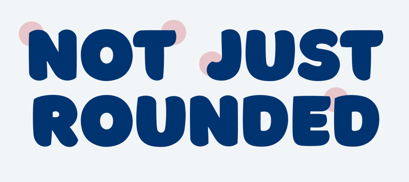
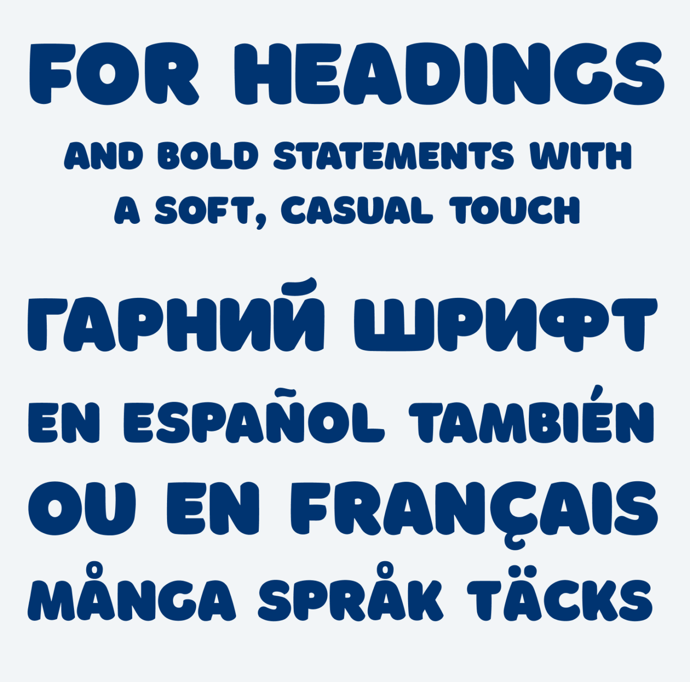
Borsok is a bold all-caps display font, available for free for personal and commercial use! I like the vibe it creates. The bold weight makes it seem confident, while it still feels friendly and approachable due to the rounded endings. Interestingly, these that are not rounded completely. Most characters have at least one pike. This creates a more organic, almost calligraphic appearance, reminding me of brush script fonts. Borsoc becomes something in between being constructed and hand drawn.

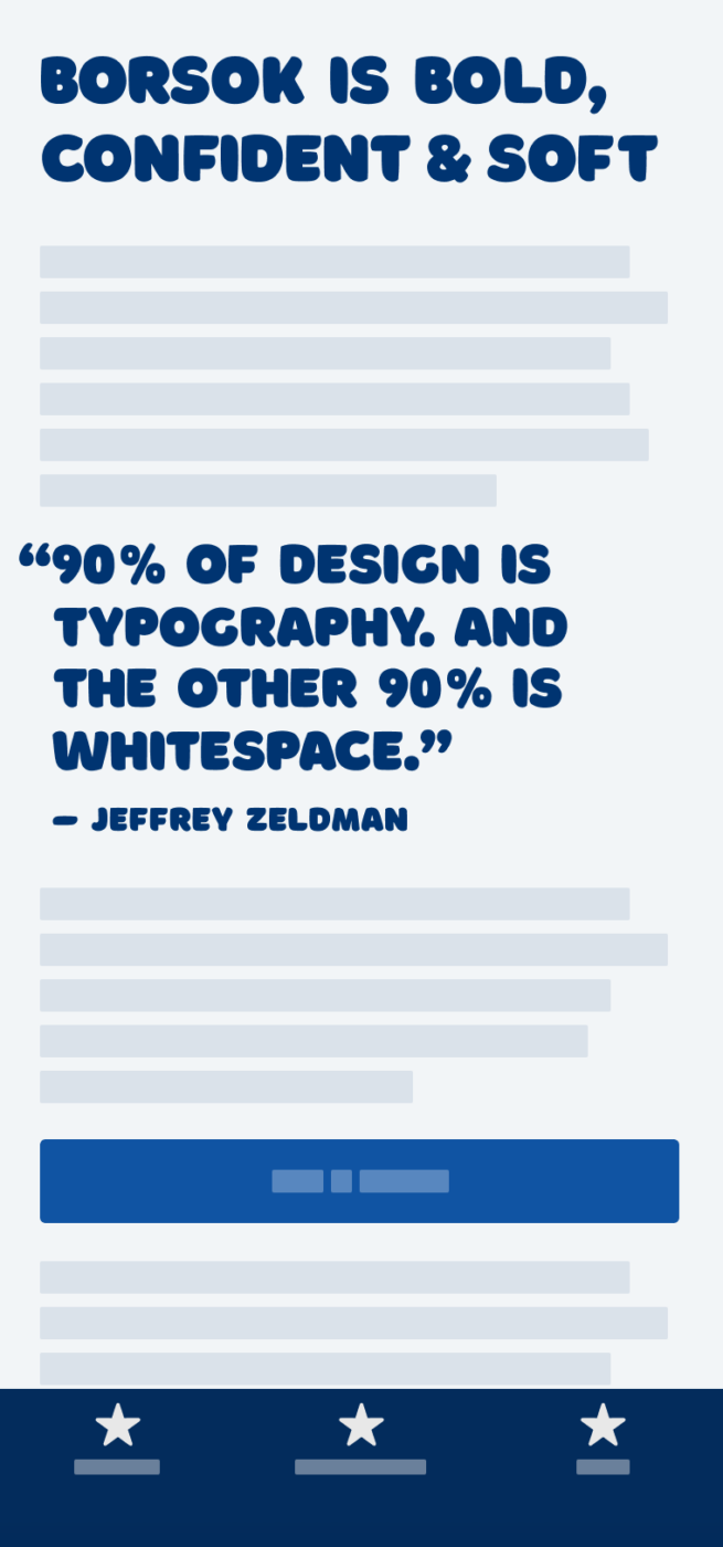
I really appreciate the multilingual support. The typeface works best in large headings, and for a little small text around 20 px, it still is legible enough. I also could imagine Borosk being used in logos, on packaging or in editorial design. For something attention grabbing that does not take itself too serious. Bear in mind, that here and there the kerining, and word spacing needs a little attention and adjustment.

What do you think? Is Borsok something for an upcoming project? Tell me in the comments below!


Borsok is hilarious! The attention-grabbing definitely works, especially for the packaging goods – food industry or editorial digital zines.
While it has a funny and relaxing vibe, Borsok also has that one but important pike, as you said, in each letter that makes it grounded, stable, and grown-up enough to act as a headline-er guy.
Love your recent choices Oliver, all are in the mood for the spring’s ease. No brainer, yet useful and interesting.😊
Thank you, Jana! 😍 Always looking forward to your comments, each week – headline-er guy – very cool 😂