
My thoughts on Belarius
Hooray, Figma finally supports Variable Fonts! This gives me the opportunity to showcase the cool abilities of this week’s pick, Belarius, by the wonderful people of TypeTogether. There are a lot of things I find really cool about this extended type family. It has very narrow proportions, a rational, square feel to it, is compact even in the regular width, and can shift from Sans to Serif to Poster (which has very long serifs).
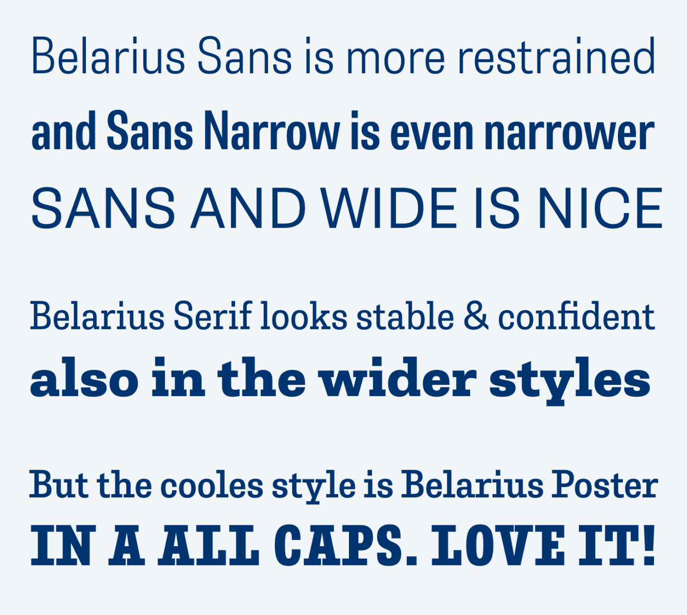
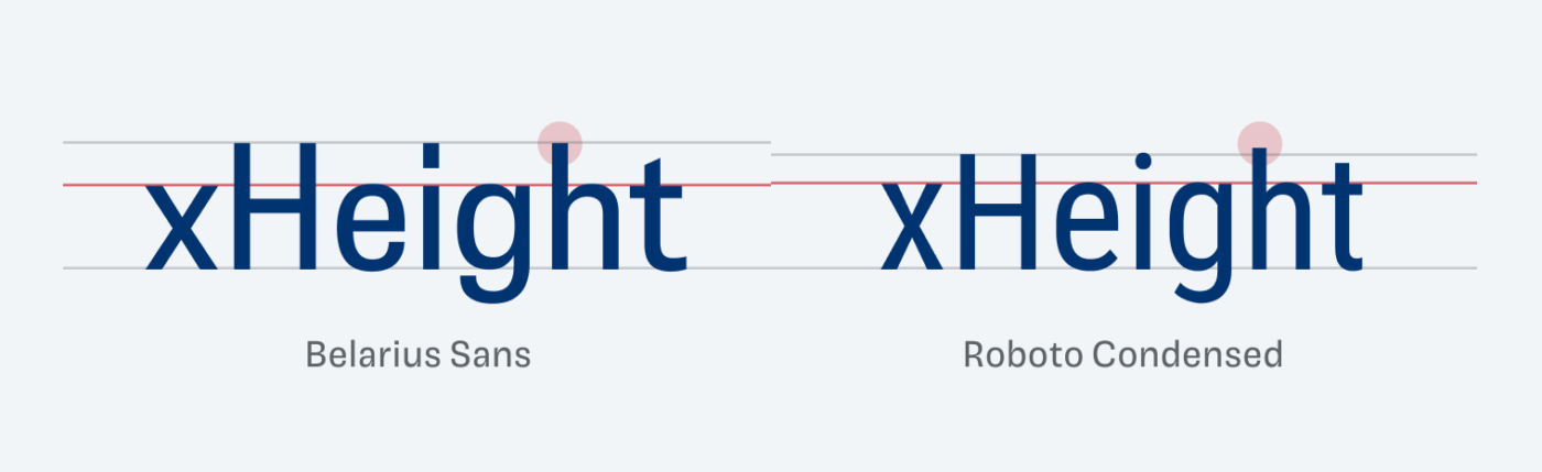
Belarius is so simple, linear and almost goofy with its square serifs, but it has a lot of character. The small x-height ex-heights me, too 😜. Actually, it’s the cap-height, that makes the x-height seem relatively small. Ascenders and capital letters have the same length, which gives the typefaces an even narrower look. And I love the simplicity of the long rectangular dot on the i.
Digging into the possibilities that Belarius provides as a variable font, is simply a joy! The seamless adjustment of the serif axis is something I could vividly imagine in a heading or maybe for some subtle text emphasis. Also, the narrow styles can be super handy for a mobile design, especially for longer titles.
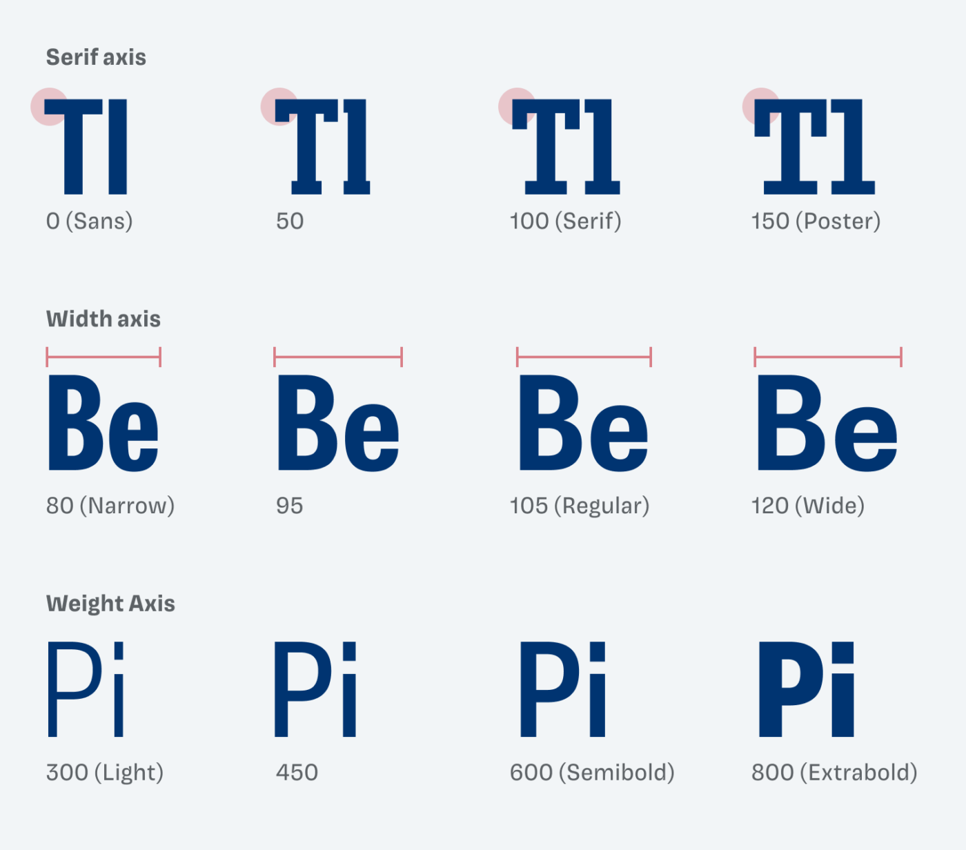
For user interfaces, you could decide to use Serif or even the Poster style to make things more striking, while still being super compact. José Scaglione, co-designer of the typefaces, recently guested on Pimp my Type, and we also mentioned that. However, since the shapes are rather closed and in sans-serif not that easy to distinguish, I would not it in a project where legibility is super critical. The same goes for super text heavy applications.
Recommended Font Pairing
Belarius is a rational, linear typeface. If you are looking for an intersting monospace typeface to combine it with, choose JetBrains Mono.

- Headings
- Copy
- UI Text

Learn more about pairing typefaces using the Font Matrix.
What do you think? Is Belarius something for an upcoming project? Tell me in the comments below!
BTW what’s your take on Roboto Flex (https://material.io/blog/roboto-flex)?
I have opinions on that. The parametric axes are a cool idea, but right now it screams misuse to me. Since this is super complex and complicated and requires a lot of visual awareness. I’m split. On the one hand I love new technologies and pushing the limits, on the other I think it’s not ready yet … however, I’ll definitely do something with this in the future. What do you think about it?
As a web designer I see a lot of potential. All the axes are available as simple CSS code, so I could use it everywhere on a website without any restrictions. When you think about Design System it’s a game changer. Just figuring out the fonts for a quote in article with a footnote, links etc is getting so much easier and faster! Especially when you combine it with Optical Size that makes alone font section of a Design System so much smaller!
As a graphic designer, it’s not a big deal actually and finding a case where ascenders can be regulated is almost impossible. Grade is probably the most useful parameter in regular Graphic Design.
Overall I think it’s a good trend for any font in the future. I don’t think we should be scared of possibilities. Nothing ventured, nothing gained.
I agree. What irritated me with Roboto Flex is mostly that compared to other Variable Fonts where you can combine any axis with any, it does not work with the parametric axes. If you know that, then it’s fine. Big fan of the optical sizing!
Given discussion of variable fonts it would be interesting to see Recursion feature in Friday Fonts. Given the range of variation it includes it is surprising it doesn’t have a width axis.
https://www.recursive.design/
I would be interested in your comment on Stephen Nixon’s other typefaces. His commentary on the design process and origins of Lang and Name Sans is actually quite touching.
https://www.arrowtype.com/