You don’t have the time to pick the best possible type combination for a design? You feel something is off, but you need to move on, and make it work anyway? Then this article and short video are for you. I’ll show you three quick hacks, how to make less ideal font pairs perform better, so you can move on in your project.
What is a bad font pair anyway?
But first, let’s find out what I mean by “bad”. The challenge in pairing type is to make obviously contrasting or harmonious combinations. Mixing two typefaces from the same category – like a sans-serif with another sans-serif – will most likely be irritating, if they are close together and/or for the same kind of text. Your reader might wonder: Is it the same or is it different? Like the example below, Poppins and Open Sans (yes, Open Sans 😉).
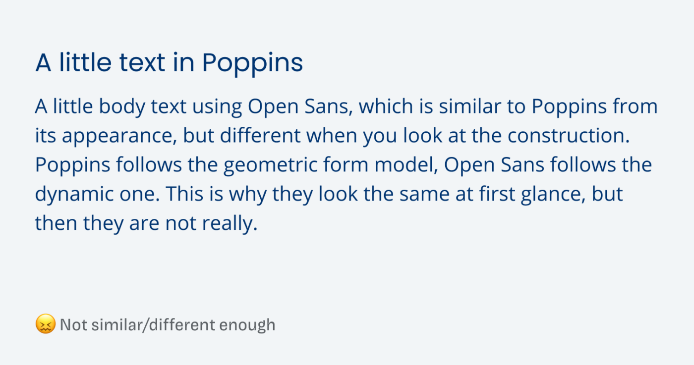
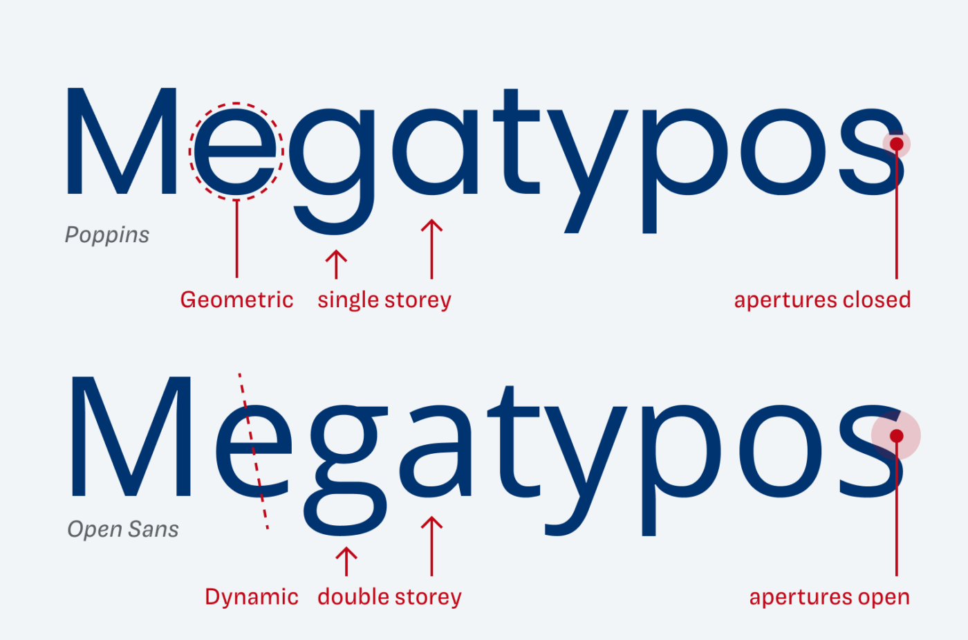
Both are linear sans-serif typefaces, so similar on a first impression. But their letter shapes are based on different constructions, which is the irritating part. Poppins follows the geometric form model, Open Sans follows the dynamic one (more about that in the Font Matrix article). This is why they look the same at first glance, but then they are not really.
So to resolve this a little without reevaluating your type choice, you have to add contrast in other ways. This will not solve the underlying problem, but distract from it, and therefore make it less obvious.
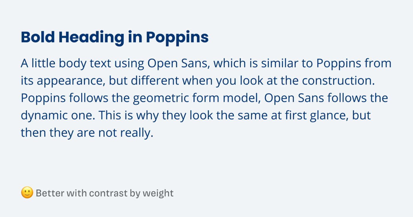
1. Contrast by weight
To make it more different, change the weight of one typeface. The contrast between the two kinds of text is more striking now, and will direct attention towards that. The most obvious route would be to make it bolder, but you could also go in the other direction, or change the weight of both typefaces.
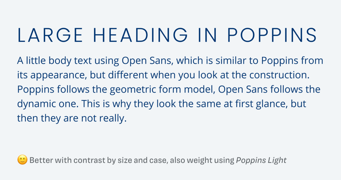
2. Contrast by size and case
Making one typeface significantly larger or smaller, will also help. And by changing the letter case to all caps, it will become harder to compare them, too. In the example below, I also set Poppins in Light, combining this with the first hack.
3. Contrast by distance
The further away both typefaces are, the less relevant will it become, as you can see below.
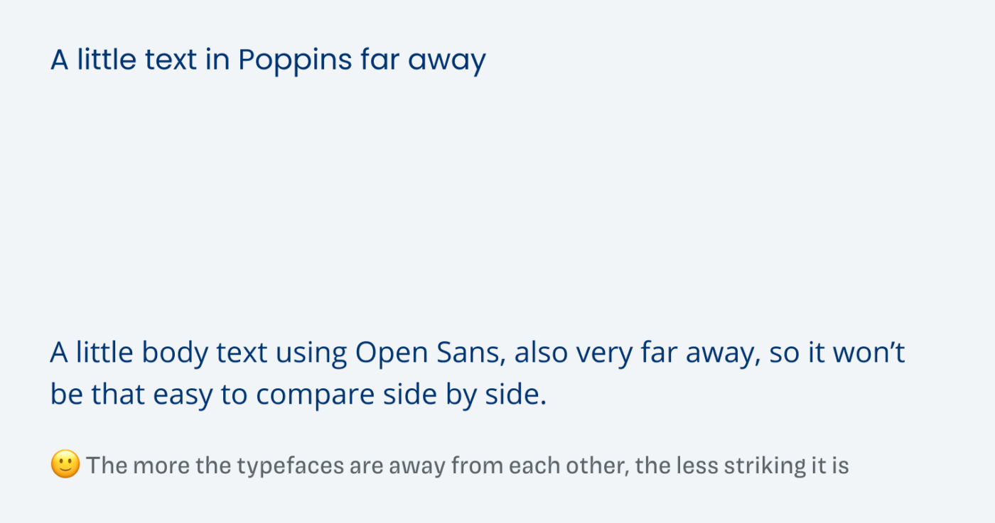
This will only work, if it is possible to move them away from each other. This might not be an option with a heading and body text. But it also tells you, that it might not be that relevant when there is a different typeface used far away from the other content. But then again, this all will not remove the problem for good.
So how can you do it properly? In Pairing Typefaces like a Pro I teach you how to pair typefaces right, without the guessing, so you improve your designs while saving time.
Pimp my Type on Patreon
Get several benefits while supporting my content creation.
Join Patreon
Is there a hack you use, to make less than ideal font pairs work? Share it in the comments below!