Display, Sans-serif typeface

from NaN
designed by Jack Llewellyn

Variable Font

1 axis: Weight

7 Styles

7 Weights: Thin to Heavy

Best for

  • Headings (display text)
  • Long reading text (body text)
  • User Interfaces (functional text)

License starting

around $40 (one style)
around $150 (bundle)

Specialty

A surprising display font with mind-bending inner and outer shape intersections, perfect for large sizes, posters, and glitch-inspired designs.

Win Nan Spaceland

Join Pimp my Type on Patreon until October 31st and you might win the entire family including the variable font. Many thanks to NaN for the generous support!

My NaN Spaceland Font Review

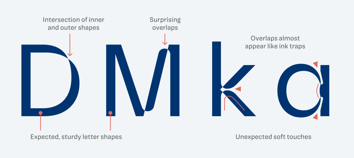
The concept that this unusual display typeface is based on is simply mind-bending. NaN Spaceland plays with the intersection of inner and outer shapes, creating a fascinating, contrasting typographic system for your artsy “glitchcore” display text. Find out what makes it so interesting.

Mind-bending visual effects Folding outlines. Where inner and outer space meet! It’s less noticeable in lighter weights. You can still sense a little of that contrast. Setting NaN Spaceland Light All caps seems very elegant.
The overlaps of negative space define NaN Spaceland’s unique look

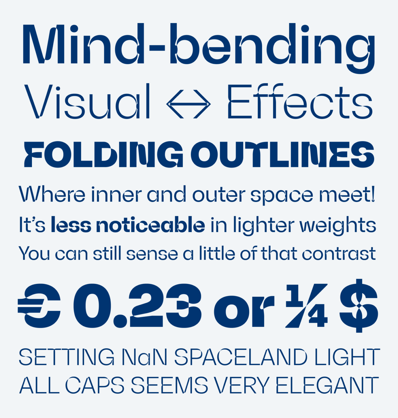
From its construction, NaN Spaceland is a sober grotesque-like typeface, similar to Inter or Helvetica. But the way the paths of the outer and inner shapes cross, gives the typeface its special twist. All spiced up with some rounded, organic touches that almost appear like ink traps in certain letters, like the lowercase “k” and “a”.

Showing details of the uppercase letters D, M, and lowercase letters k and a. Intersection of inner and outer shapes become evident, expected, sturdy letter shapes are mixed with surprising overlaps that almost appear like ink traps, with sometimes organic, softened shapes.
Sometimes the overlapping outlines create simpler, sometimes more complex characters

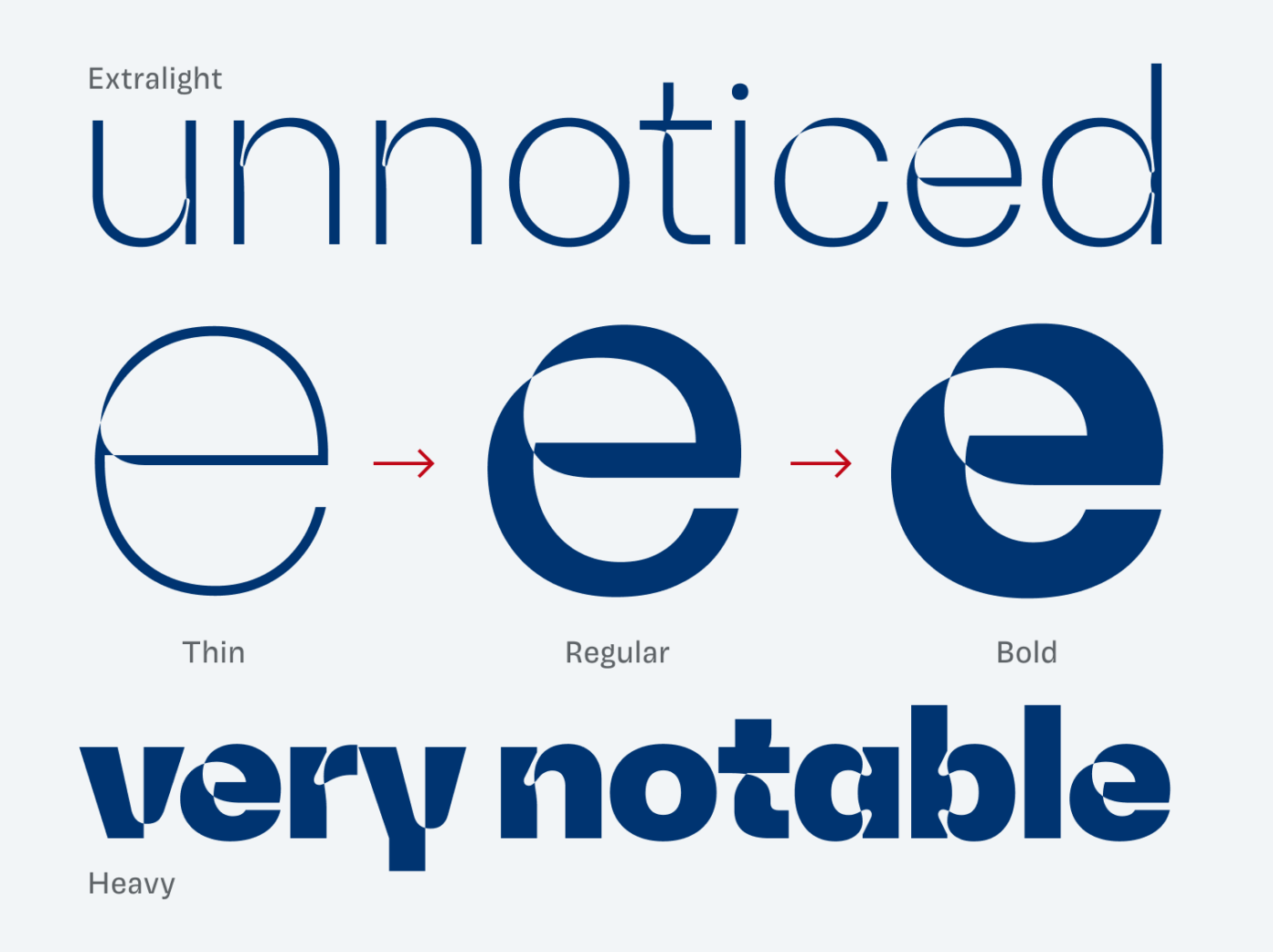
I enjoy that the execution of this concept feels very organic. It is not forced into every character, some letters remain plain, like “I”, “O” or “L”. Additionally, NaN Spaceland’s features only become evident as it gets bolder. You can still feel that something’s unusual in the light weights, though it’s subtle.

Comparing a lowercase e in Thin, Regular and Bold weights. In the light weights, the contrast is almost unnoticed, the heavier it gets, the more notable it is.
NaN Spaceland could almost seem broken in Thin and Light, if it’s not set large ernough.

One thing I came across during trying around with the typeface, was how cool it looks in a very specific weight and style. I’m sharing it here in a short video on my Patreon page.

NaN Spaceland used in a very interesting way, see on Patreon.

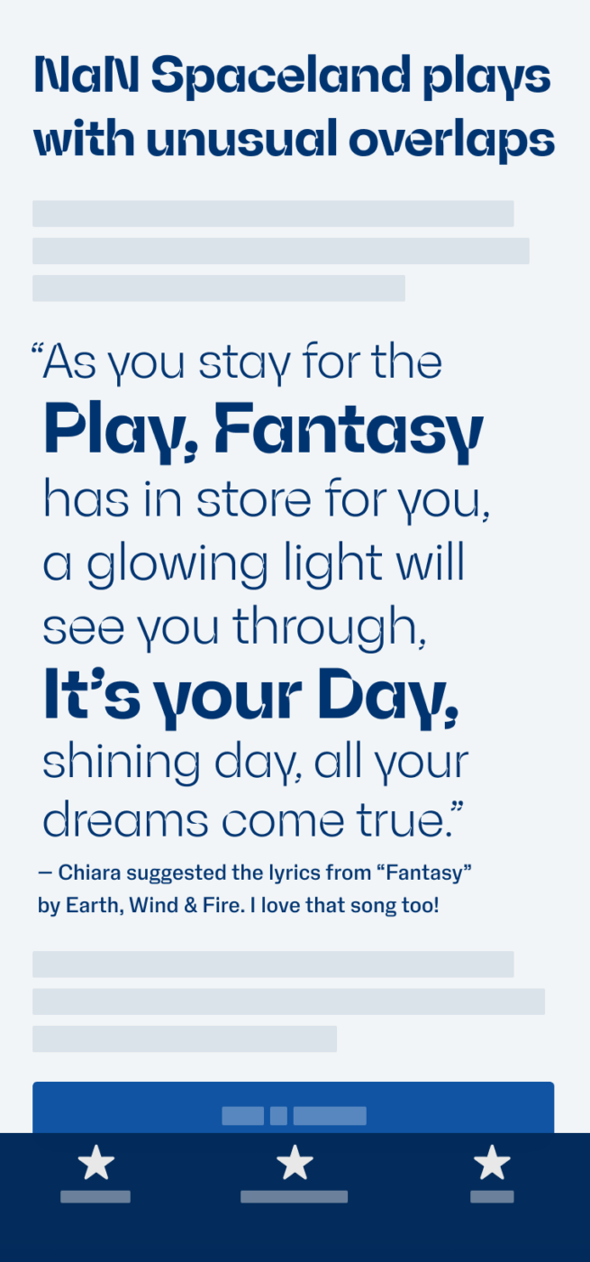
This typeface is best suited for sizes above 40 pixels. Whether used for posters, headings, or even logotypes, NaN Spaceland adds a special touch without being too extreme. So play around, discover and see how it works for you.

Font Pairings with NaN Spaceland

NaN Spaceland is a grotesque, contrasting sans-serif display font. I recommend pairing it with something similar or very different body text and small functional text.

NaN Spaceland
NaN Spaceland
  • Headings

Learn more about pairing typefaces using the Font Matrix.


What do you think of NaN Spaceland? Tell me in the comments below.

Typographic power to your inbox

  • Font Friday: I recommend one typeface per week, free fonts included.
  • Type Tuesdays: articles & videos that up your design game.
  • Join 2900+ typography enthusiasts, unsubscribe anytime.

Leave a Reply

Your email address will not be published. Required fields are marked *