
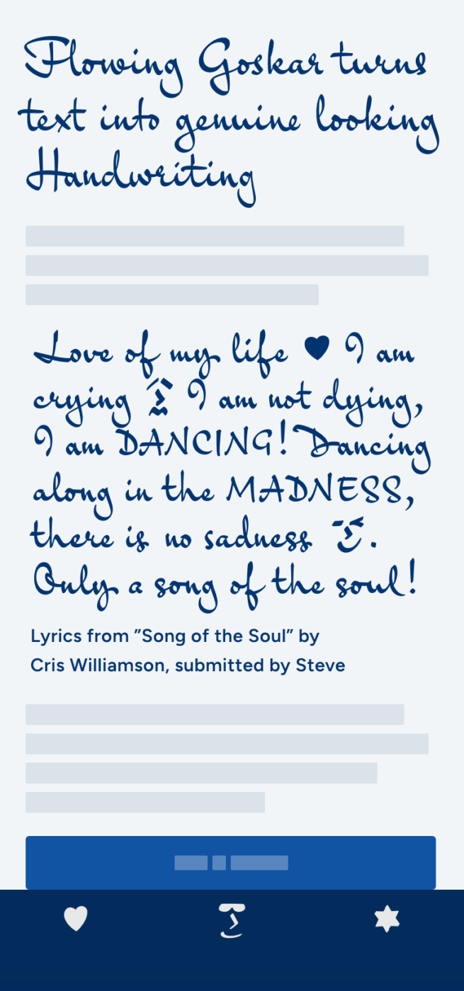
My Goskar Font Review
The charming script font Goskar creates a surprisingly realistic handwritten impression. This typeface feels casual, flowing, and authentic, but also elegant due to the excessive capitals and generous use of space. It is not the most legible choice, but that is one of two things that make it so intriguing to me.
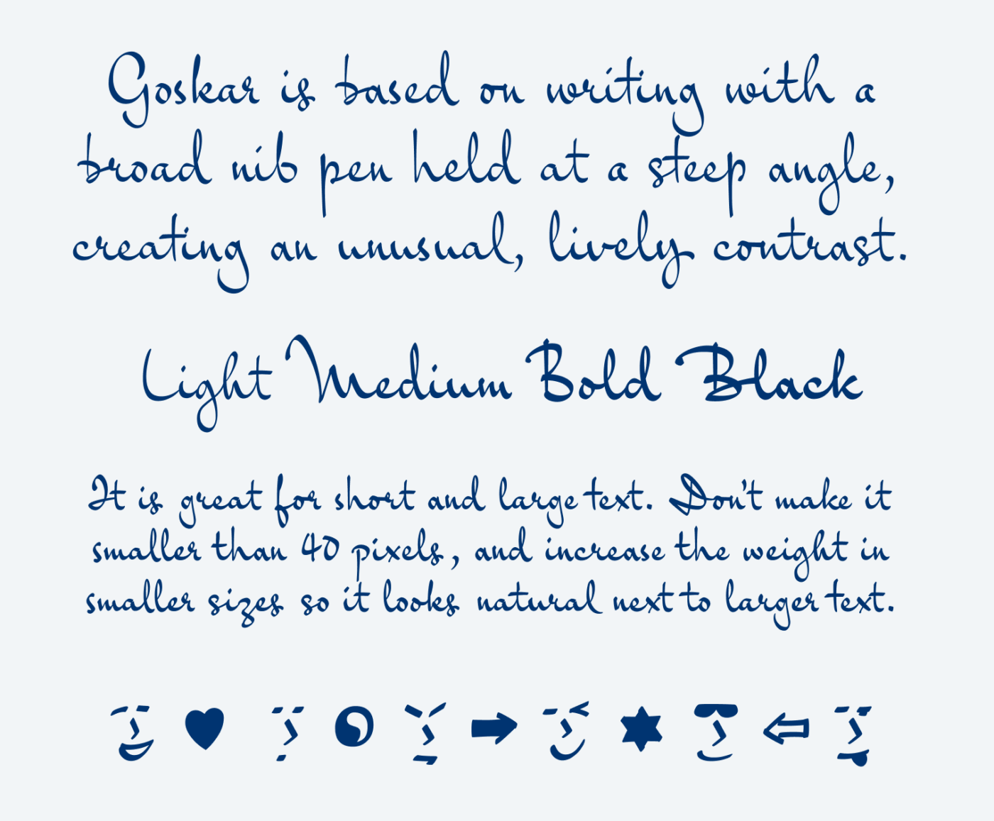
Goskar’s other peculiarity is the unusual contrast. Commonly a broad nib pen is held at an angle between 30 and 45 degrees, but Goskar shows a much steeper angle. This tiny design decision results in text that sometimes seem to be made out of a waving ribbon. It also gives the typeface a calligraphic touch, but without loosing its genuineness.
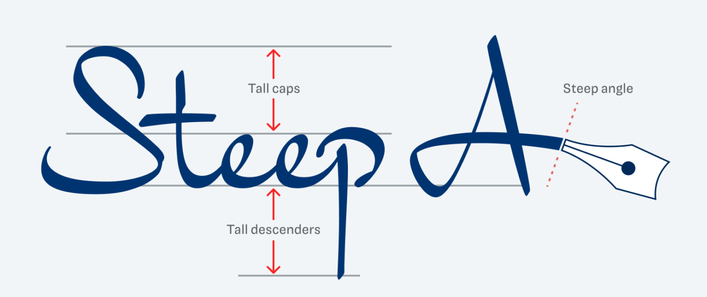
The lower case letters are fairly small in relation to the cap height, ascenders and descenders. This means you should set Goskar fairly large. To keep it readable, I would not go below 40 pixels. And better use the default line height, which is even below 100%. This will result in the tall ascenders and descenders touching at times, but I don’t see this as problematic, since it happens in normal handwriting too.
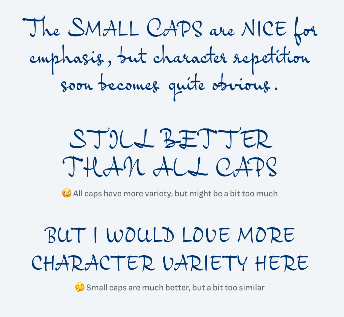
Goskar shows enough variety to create a realistic handwritten impression, especially with rare ligatures and contextual alternates turned on. However, there is one thing that does not work so well for me: the small caps. I appreciate this simpler version of capitals, but the obvious character repetitions soon debunk the handwritten look. So use them sparingly.
Overall, Goskar is a marvelous display typeface that convinces in packaging design, a logotype, and other large text. Highlight its specialty by combining it with one of my recommendations.
Font Pairings with Goskar
Goskar is a dynamic, contrasting, script style typeface. It is very different, but I would recomend combining it with something more calm and linear for body text and UI text.


Learn more about pairing typefaces using the Font Matrix.
How do you like Goskar? Tell me in the comments, also if you spotted a great font that I should review.
Looks like hieroglyphs 🤭 I’d choose small caps, freestyle, and a carefree design.