My Migra Font Review
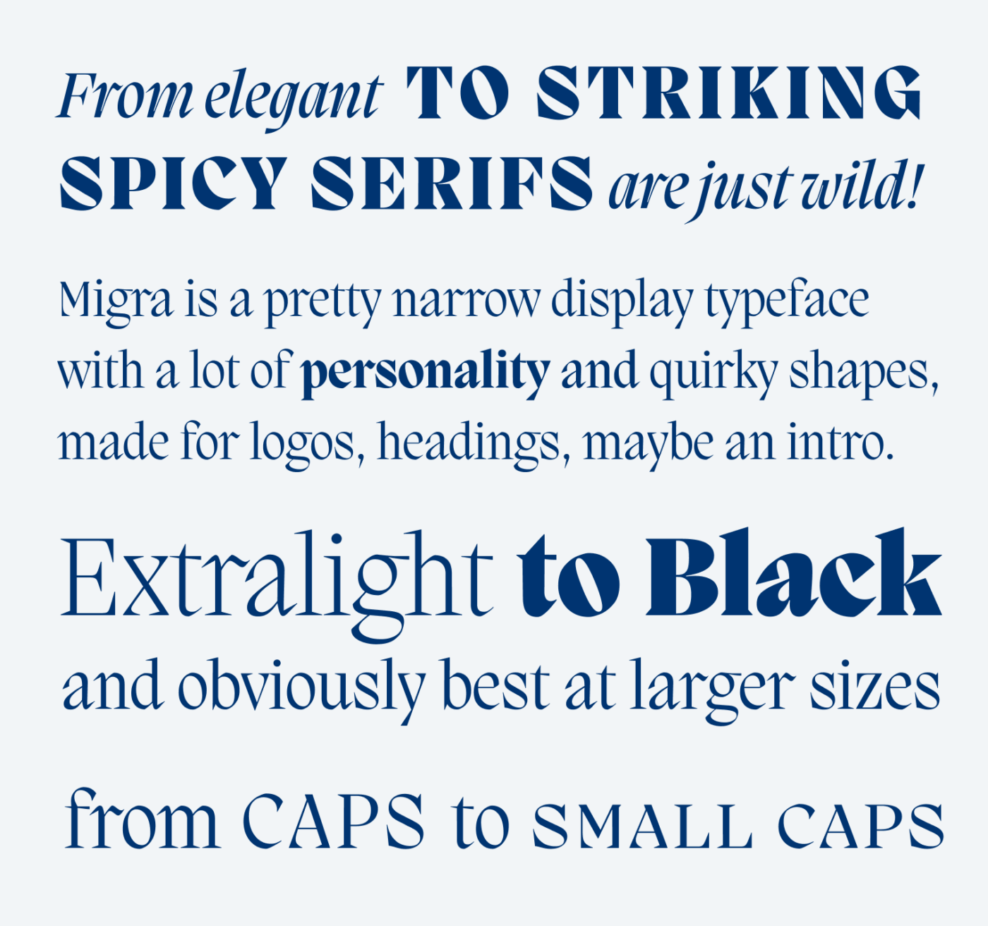
When looking at Migra, I was immediately taken by its wild energy. With its narrow proportions, the steep angle, fast curves, snappy shapes and spiky serifs, this typeface seems confident, daring and bold – even when set in Extralight 😉. But what exactly gives it that look? I had to go deeper.

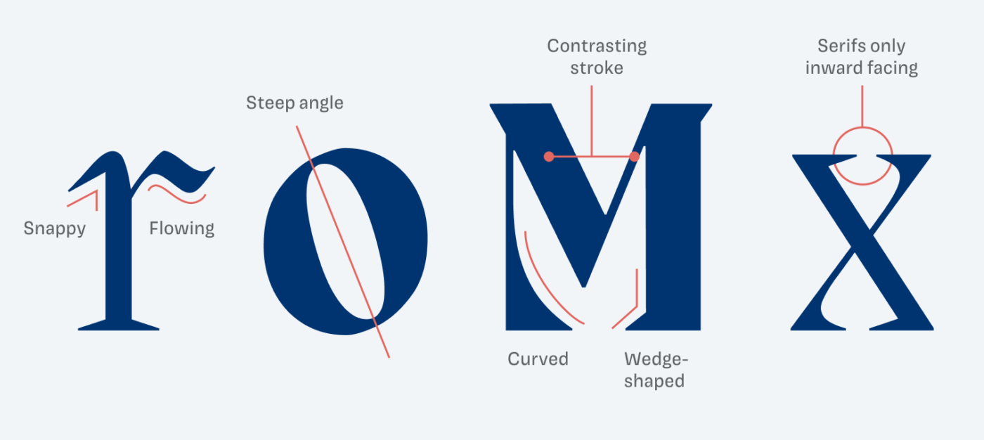
What Migra does extremely well is playing with opposites. Look at the lower case “r” for example. It can be snappy and spiky at its entry stroke, while being soft and flowing at the arch. Also the heavy stroke contrast and the sometimes curved, sometimes wedge shaped serifs, are two more characteristics of the typeface.

In itself, this might not seem so special, but you see how much Migra is breaking with conventions when comparing it to classic Times. Where Times plays it soft with a drop terminal, Migra goes wild. At letters with diagonals, Migra becomes even more interesting by only showing inward facing serifs.

Because Migra is that expressive, I recommend using it only for a little text in larger sizes. That’s where it can emphasize your message, brand or headings ideally. For anything else, look for a nice companion.
Font Pairings for Migra
Migra is a dynamic, contrasting serif typeface. Among others, this lets it pair well with calm and legible dynamic Darkmode for body text.
- Headings
Learn more about pairing typefaces using the Font Matrix.
Thanks to Jana for pointing me to Migra! Do you have another font recommendation I should share? Tell me in the comments!

