My thoughts on Courgette
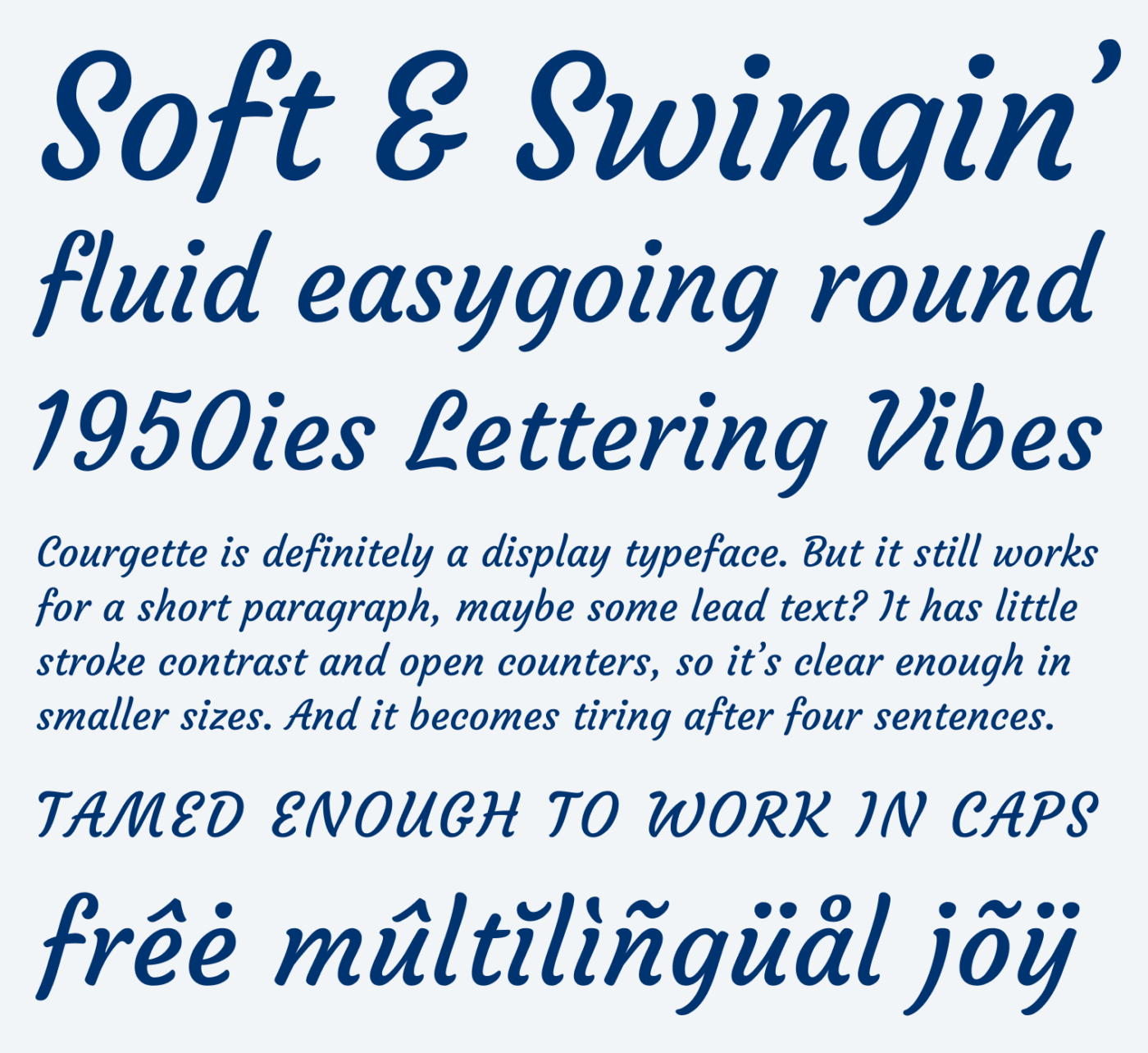
The free font Courgette perfectly conveys this easygoing, playful and charming vibe of American commercial brush lettering from the 1950ies. It is an unconnected script typeface, that comes with a lively bounce, low contrast and open letter shapes. This makes it quite legible, even in smaller sizes, though Courgette definitely performs best in headings or titles. The yet interesting but tamed enough letter shapes even works for a little text set in all caps.

What I appreciate about Courgette, is that it does not go over the top. It is not as exuberant as other script typefaces, it feels more casual and approachable. The loose spacing and disconnected letters contribute to that. But they are also something you should be aware of.

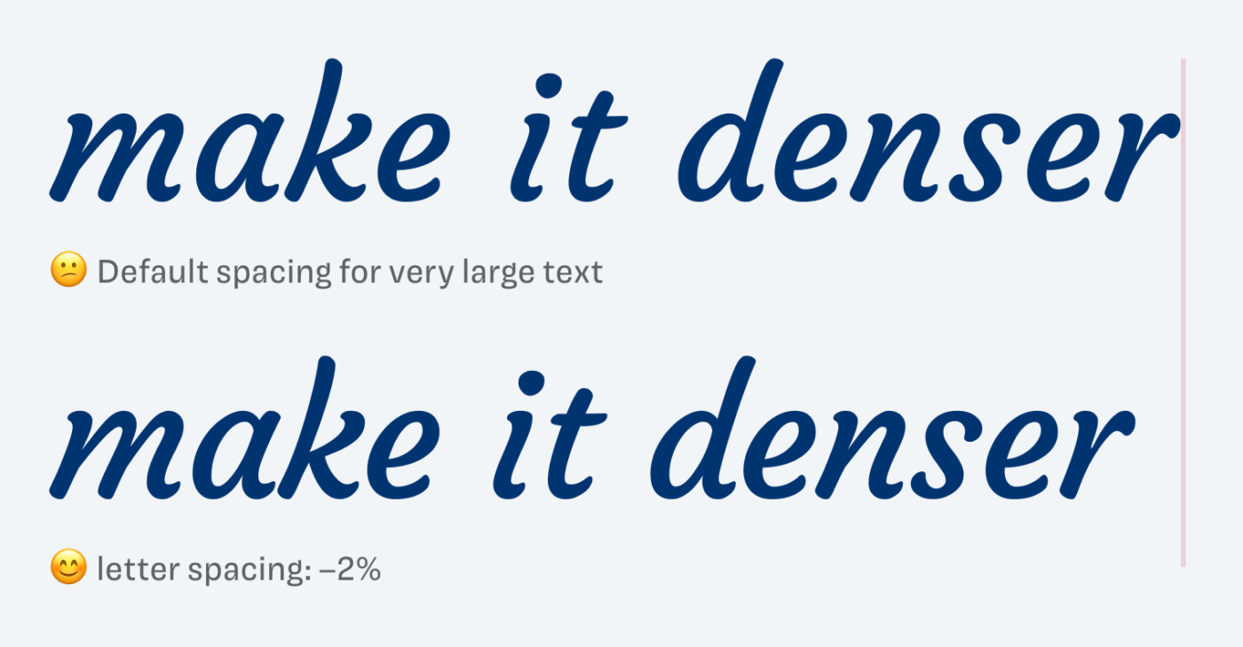
Set in font sizes of 38 px and larger, the words tend to lose their cohesion. In these cases, I recommend reducing the letter spacing up to a point where the letters almost touch. What also becomes more evident here is the quite large word space, which generally speaking could be a bit smaller. But besides that, a Courgette is a well-made typeface for charming titles and headings, maybe logotypes even.
Recommended Font Pairing
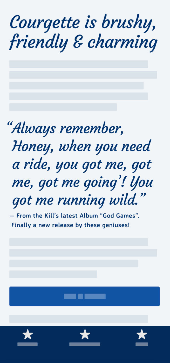
Mixing Courgette with Avería is visually quite interesting, but this might be for a short intro only, since Avería is not ideal for long reading text. If you are looking for something more robust that stills conveys a soft touch, I suggest pairing it with New Zen for body text.
- Headings
Learn more about pairing typefaces using the Font Matrix.
Do you swing along with Courgette? Tell me in the comments!

