My thoughts on Elevator & Escalator
“No one really needs another geometric sans”. I love this part of the specimen of Elevator and Escalator. And yes, this genre of typefaces is vastly too crowded with way too similar designs. However, these typefaces by XYZ Type really seem to follow their own aesthetics. They grew from a client commission to replicate existing signage from the 50ies for the renovation of a landmark New York City skyscraper. So you can still feel that historic vibe, with some interesting idiosyncrasies.
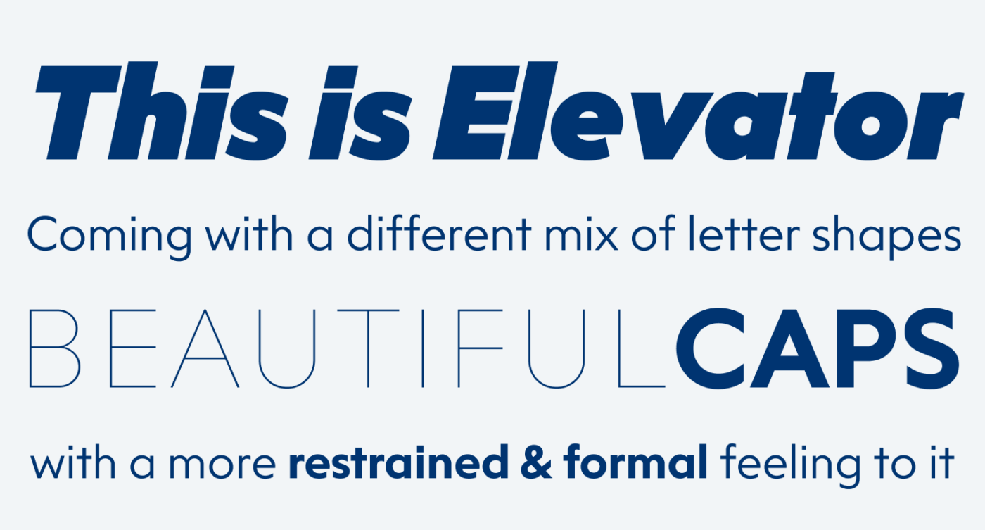
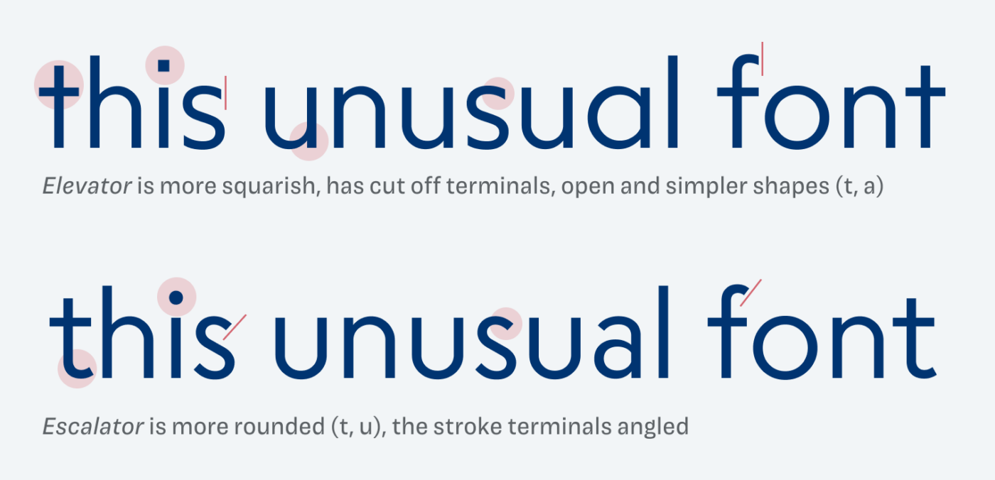
Elevator and Escalator apparently have the same base, which makes it easy to combine them (more on that later). But they are executed differently, which creates a very different feel for each. I find this so fascinating, since in type design, all these tiny decisions and details add up and eventually shift the mood of a design in another direction. So let’s compare them.
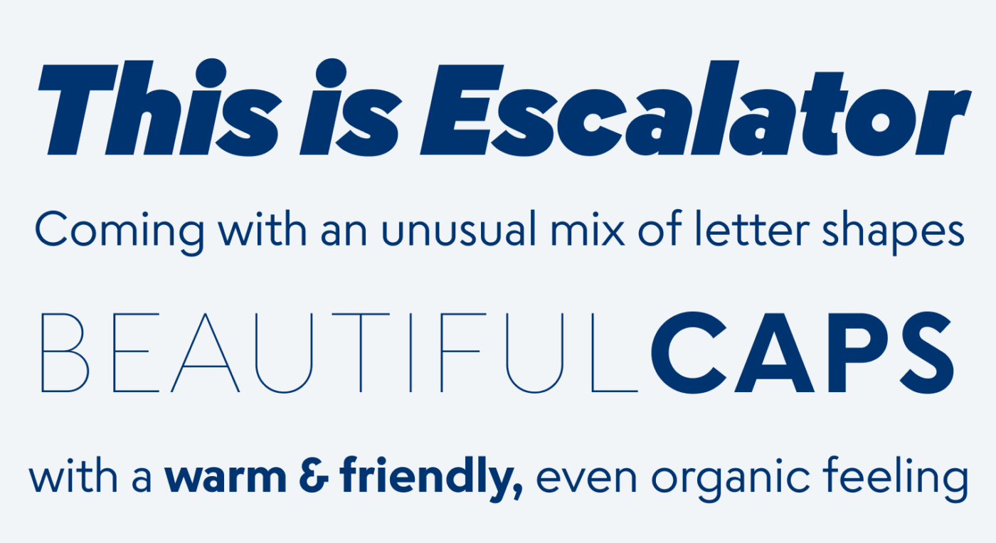
At first glance, they seem rather similar, especially in the samples above. But when you look at them side by side in body text, you will see the differences. Elevator is more restrained, more constructed and stiffer. I think it would perform better in large text, since it’s also a bit tighter. Escalator seems more organic, softer, friendlier and more suited for long reading formats due to the more unique letter shapes.
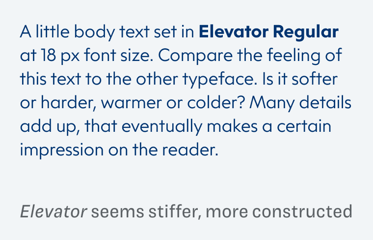
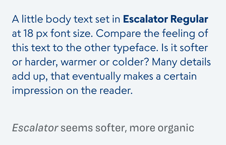
Zooming in a bit, you can see even better how the different families are constructed. How this feelings are evoked.
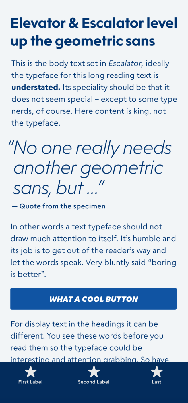
Elevator and Escalator are both variable fonts, equipped with the power of optical sizing, so the letter spacing will always be ideal for the specific size you set it in. I would looooove to see them in a UI design. Maybe Elevator for big text (the numbers are gorgeous) and Escalator for the tiny functional text. They would perform very well while still giving the application a unique feeling.
Font Pairings with Elevator & Escalator
Elevator and Escalator are both geometric, linear sans-serif typeface. Pair it with one of my suggestions when you want to give your typography a certain twist.
- Headings
- Copy
- UI Text
Learn more about pairing typefaces using the Font Matrix.
What do you think? Are Elevator or Escalator something for an upcoming project, or do you have a font recommendation? Tell me in the comments below!

Beautiful as the font titles of your site and… congrats for that 3.000 subscribers on Youtube !!! 🥳
Thank you, Caco 😍! And it truly is a beauty.
My vote goes to Elevator, 51% over 49% but both are greatly functional, born to be used in this decade.
Did you notice that customers and users are becoming coddled? They expect something stellar in everything.
Why not be just of service, like Elevator and Escalator? These guys are 🎯serving the purpose of long reading text, UI, and headlines. You name it, they do it!
Escalator could be used in print books while Elevator is more for paragraph-like web pages.
One thing that I don’t love in these geometric generic typefaces, regardless of E&E is they never work in Italic mode.🤔 Why bother Oliver?
Anyway, I didn’t come to write a long boring comment. Congratulations on your growth! Very well-deserved🙌🏻
I’ll do my best to contribute to a higher number, sharing, recommending, etc. ⭐
Yeah, in italic they are mostly slanted and that then is a bit too little contrast for body text. And in this case the kerning seems to be off as well slightly, as another subscriber rightfully pointed out.
Thank you for your continuous support, Jana ☺️! I really appreciate it.